The network for creativity
Join 1.25M professional creatives like you
Connect with clients, get discovered, and run your business 100% commission-free
Creatives on Contra have earned over $150M and we are just getting started
Back to feedPost
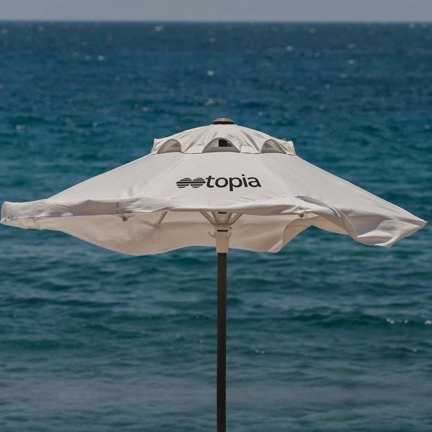
Ootopia is a Mexican brand specializing in luxury sunglasses. The name derives from "Utopia"—an idealized, perfect, and harmonious place.
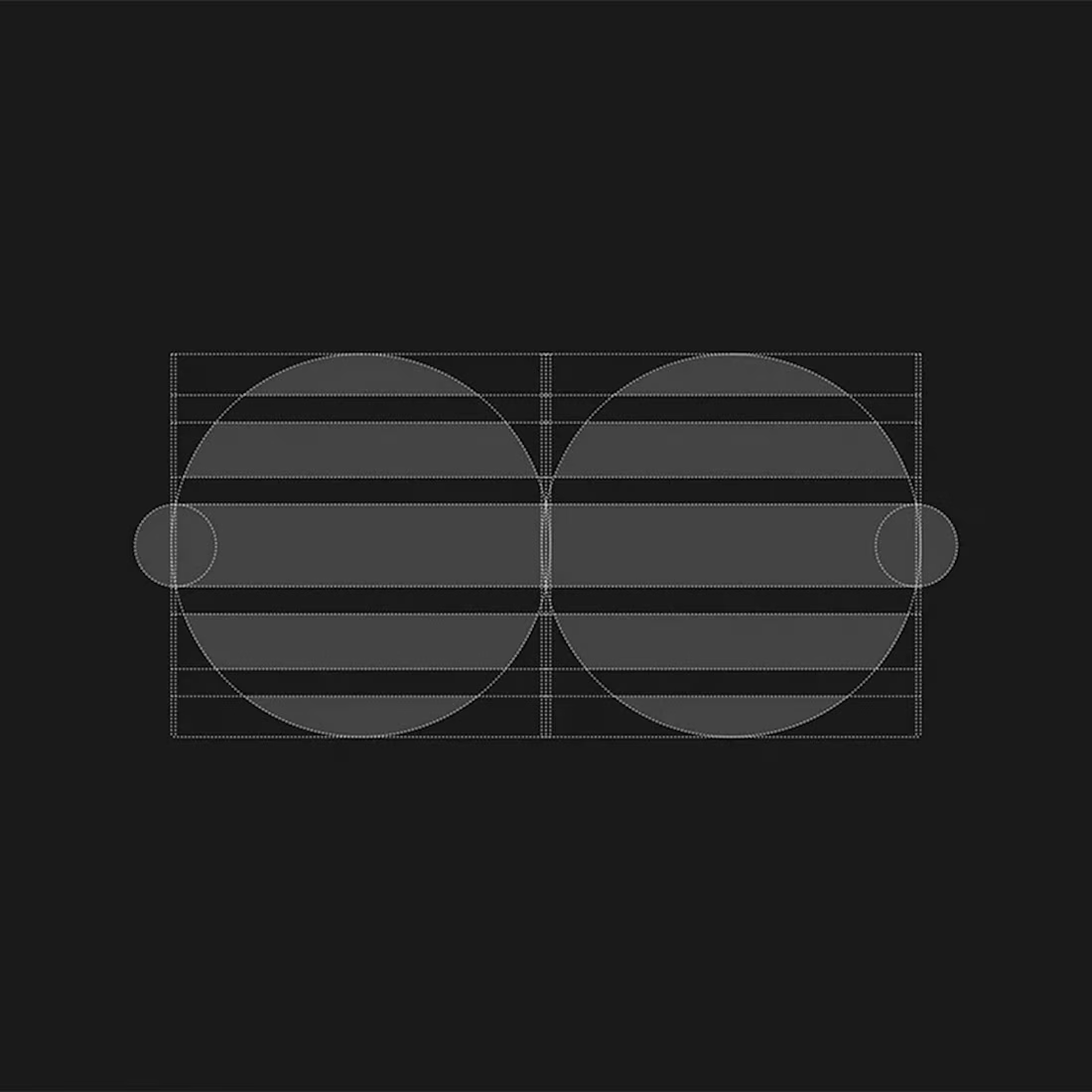
The Visual Strategy The design challenge was to translate the sensation of a "perfect view" into a minimal symbol. We constructed the icon by merging two core elements:
1. The Lens: Representing vision and the eyewear product itself.
2. The Reflection: The horizontal lines mimic the majestic sunlight reflecting on the sea waves, creating a rhythm of light and shadow.
The result is a sophisticated, geometric wordmark that positions Ootopia as a premium player in the fashion market, capturing the essence of a sun-drenched paradise.




Nice work

Thanks, glad you liked it!

Beautiful Brand design 😍
Really appreciate you saying that! Thank you

love the concept nice work
Thank you! I'm thrilled you love the concept. Really appreciate it!
your welcome bro, keep the great work you do

Wonderful logo, though a bit tricky because some people might skip the OO and read only “topia”.

Balanced and Apt logo.
Thank you! I'm glad the balance and aptness came through. Appreciate your professional eye!

can feel a "newtro" style in your design. It's beautiful.
Wow, thank you! I'm impressed you identified the newtro vibe. Really appreciate the kind words!

Fantastic job , any advices?
Thank you! My best advice is to use grids as a base, but always trust your eyes for the final result

the newtro style really amazing!!!!
Thanks! Nailing that newtro feel was the goal, so this means a lot. Appreciate it!

nicee!!!!
Cheers for that!

Excellent Work!
I sincerely appreciate that. Thank you!

Looks great product
Thank you! Really pleased you think so about the design

Love the concept. Give the right vibe!
That's exactly the response I was hoping for! Thanks for catching the vibe

Thank you for such a thoughtful analysis. You've articulated the core intention behind the work perfectly. I truly value feedback at this level of detail

Nice concepts
Appreciate it! The concepts were a fun stage to develop

Very nice job
Much appreciated, Yasmine. Thank you!

Clean execution.🙌
Thank you! Appreciate the feedback

Thank you, Masum. I'm pleased you think so!


Great work
Many thanks, Said! That's very kind of you!

Thanks, Daniella! We really wanted to capture that "sun-drenched paradise" energy

Great concept
Thanks, Samson! Glad you liked the story behind the symbol


so pro @Jeferson Gonçalves 🔥
Thanks, Ismel! Coming from you, that means a lot

Love it!
Thanks, Catherine & Vlad! Glad you loved it

Really nice work
Thanks, Bori! Glad you liked the final result
The network for creativity
Join 1.25M professional creatives like you
Connect with clients, get discovered, and run your business 100% commission-free
Creatives on Contra have earned over $150M and we are just getting started











