The network for creativity
Join 1.25M professional creatives like you
Connect with clients, get discovered, and run your business 100% commission-free
Creatives on Contra have earned over $150M and we are just getting started
Back to feedPost

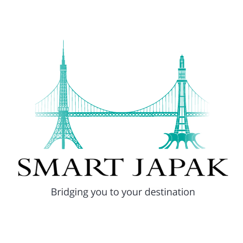
A logo design for a service providing company called SMART JAPAK. They facilitate Japanese nations in Pakistan or travelling to Pakistan. They also provide services to Japanese nationals who want something from Pakistan. Essentially they act as a bridge between Pakistan and Japan and thus the famous monuments of both countries in the bridge.


The network for creativity
Join 1.25M professional creatives like you
Connect with clients, get discovered, and run your business 100% commission-free
Creatives on Contra have earned over $150M and we are just getting started

Challenges
View all


Related posts

Crafting the Visual Identity for Elichi Coffee | Case Study
For Elichi, the goal was to build a brand identity that captures the ritual of craft coffee. The visual direction balances modern simplicity with a warm, sensory feel—creating a clean yet inviting identity across every touchpoint.
Design Highlights:
Custom Typography: Paired clean, modern letterforms with subtle editorial accents to establish an elevated, boutique feel.
Packaging & Collateral: Used generous white space and structured layout grids so the physical packaging feels premium in hand.
Palette & Materials: Blended deep, roasted tones with soft, muted neutrals to reflect the warmth of the space and the richness of the brew.
I’d love to get your feedback on this direction:
How does the balance between modern typography and warm tones feel to you?
Does the packaging strike the right balance between minimal and welcoming?


Cool work 🙌


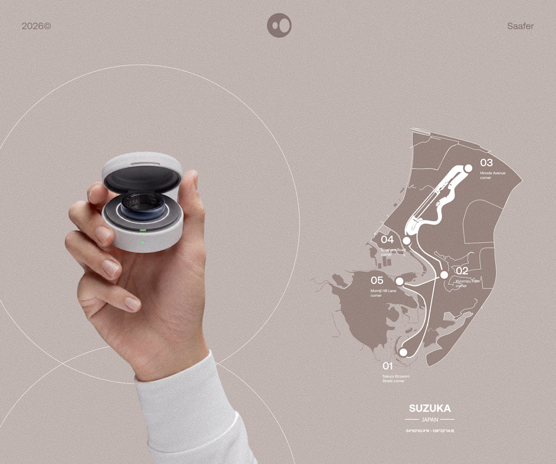
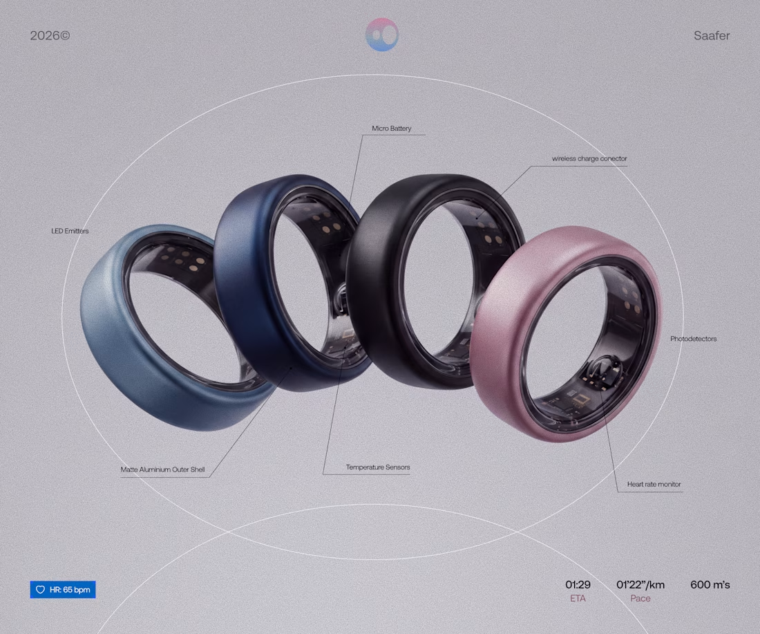
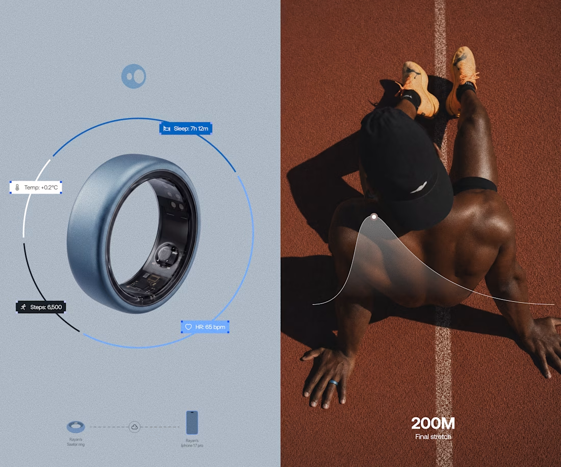
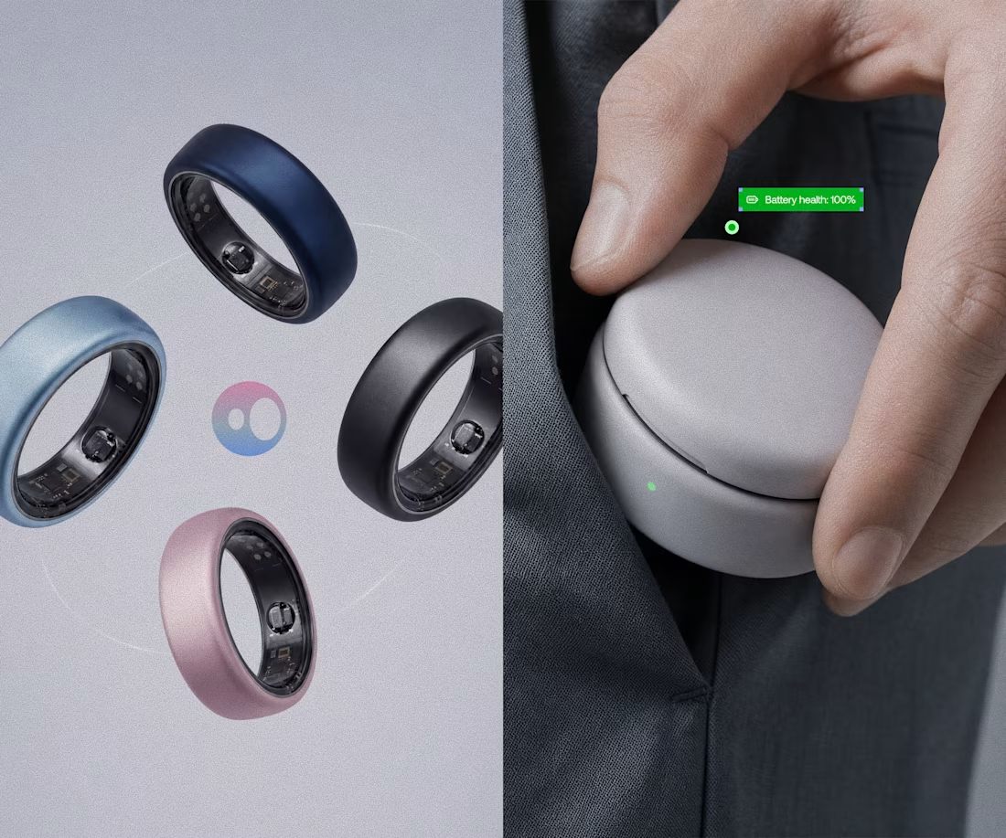
Model rendering and branding done for Saafer's smart ring (Health tech)



MERCH DESIGNS! toying with some material for a friend of mine, font styles created fully from scratch along with backgrounds & texture effects. thoughts? which of the two do you prefer?
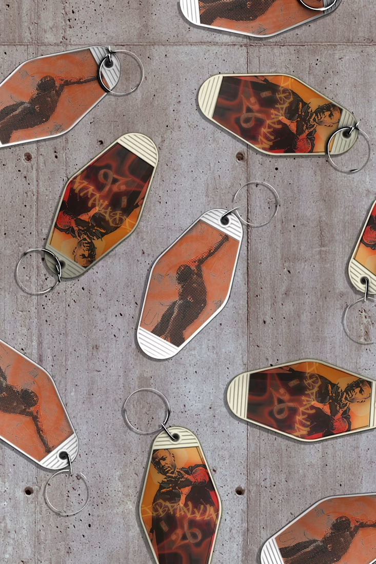

The custom lettering and layered texture give these a really tactile, merch-ready feel. I’d lean toward the option with the strongest contrast so the type stays crisp against the background.