The network for creativity
Join 1.25M professional creatives like you
Connect with clients, get discovered, and run your business 100% commission-free
Creatives on Contra have earned over $150M and we are just getting started
Back to feedPost
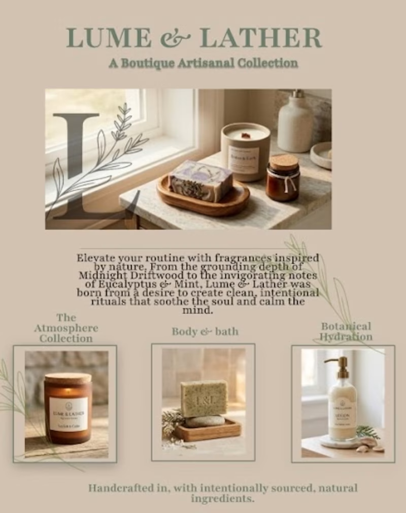
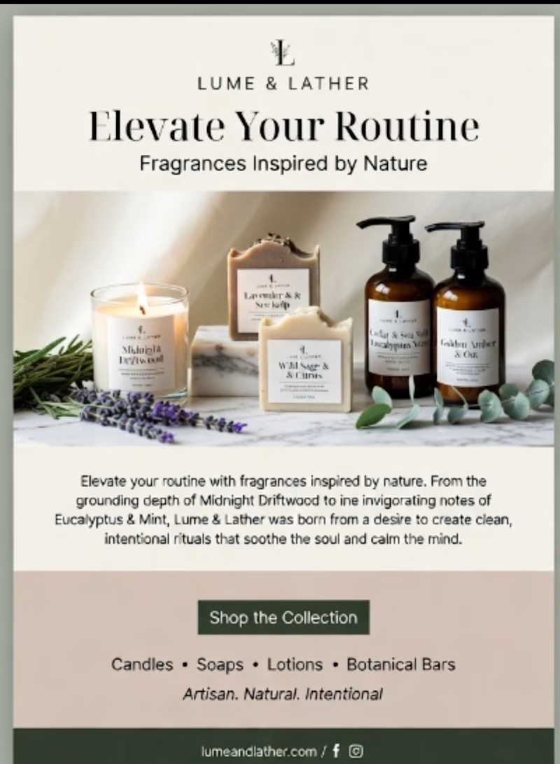
Taste Test
Which design feels more thoughtful to you?
6 voted
67%
3 voted
33%
9 votes
Closed

intentional, hands down. caught my eye before i even read the names.

Going for the ai generated version


Interesting! What drew you to the AI version? I’m always curious what resonates with different people!

Intentional design

Went with Intentional Design. The lifestyle photography does more work for this brand because an artisanal, handcrafted product needs tactile warmth, not a product grid. The AI one reads generic at a glance.
The network for creativity
Join 1.25M professional creatives like you
Connect with clients, get discovered, and run your business 100% commission-free
Creatives on Contra have earned over $150M and we are just getting started





Related posts

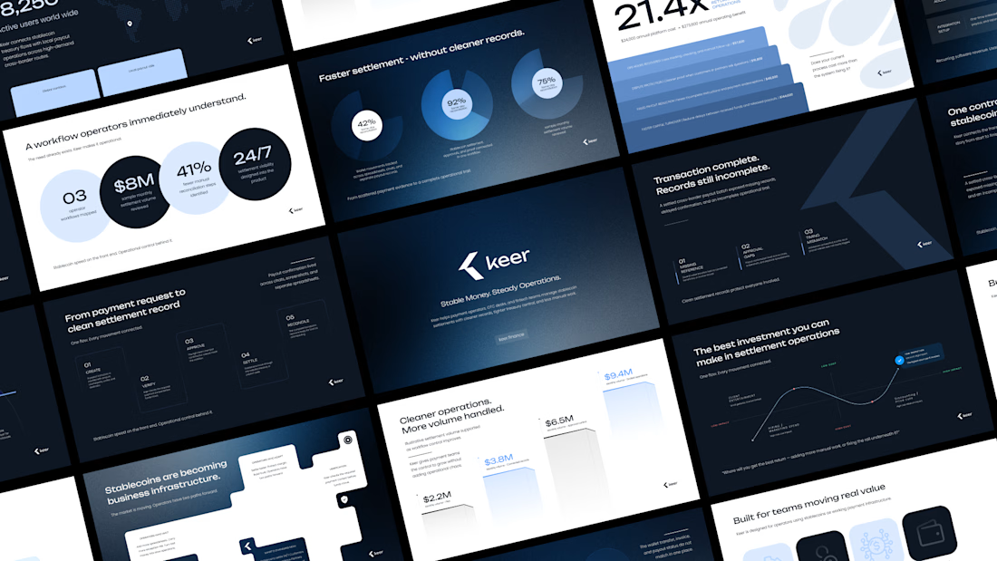
Minimalism isn't a style choice. It's a discipline.
Anyone can strip a slide down to one line and call it clean. The harder part is knowing what to keep, and why every element that stays has a reason to be there.
This deck runs on that principle. Dark base because contrast is the fastest way to direct attention. One accent color because more than one is a decision you haven't made yet. Grid-locked layouts because when the structure holds, the content doesn't have to fight for space.
I design across industries. Tech, finance, healthcare, consumer brands. But there's something about high-stakes products, the ones where a single presentation can move serious money, that pushes the design thinking further.
This is one of those.
I didn't design this to look like a fintech deck. I designed it to look like a decision has already been made, and the slides are just showing you why.
Does the vibe land for you?
Full case study Keer




Which Kajabi sales page design would you choose for this course? Vote for A or B and tell me what made the difference.

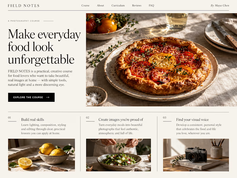
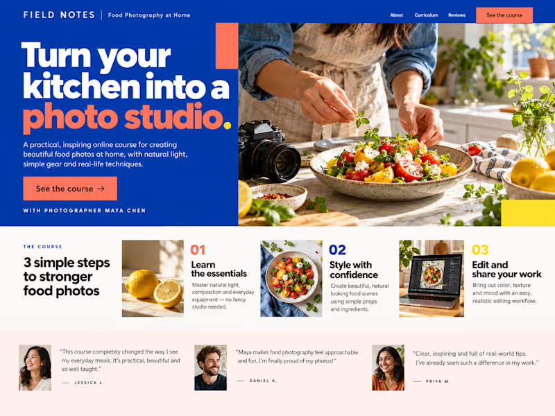
13 votes
Ends in 1d


The identity and guidelines I built received this feedback: ‘They make the identity feel genuinely usable rather than just beautiful.’ For a founder choosing a design partner, that’s a concrete part of the work to ask about.

