The network for creativity
Join 1.25M professional creatives like you
Connect with clients, get discovered, and run your business 100% commission-free
Creatives on Contra have earned over $150M and we are just getting started
Back to feedPost
Taste Test

Two concepts. Two different first impressions.
Exploring two visual directions for a finance and AI platform.
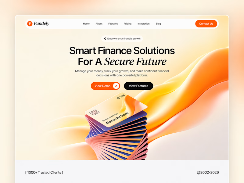
Option A | Fundely
Warm gradients, soft curves, and a clean layout. Designed to make finance feel simple, approachable, and easy to trust.
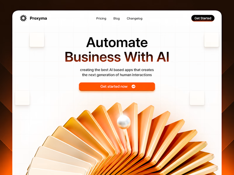
Option B | Proxyma
Bold typography, a structured grid, and a striking 3D visual. Designed to make AI feel confident, modern, and forward-thinking.
Both share the same goal: create a strong first impression through design.
But which direction communicates better?
A or B? I'd love to hear your perspective.
1 vote
Ends in 1d
The network for creativity
Join 1.25M professional creatives like you
Connect with clients, get discovered, and run your business 100% commission-free
Creatives on Contra have earned over $150M and we are just getting started
Related posts

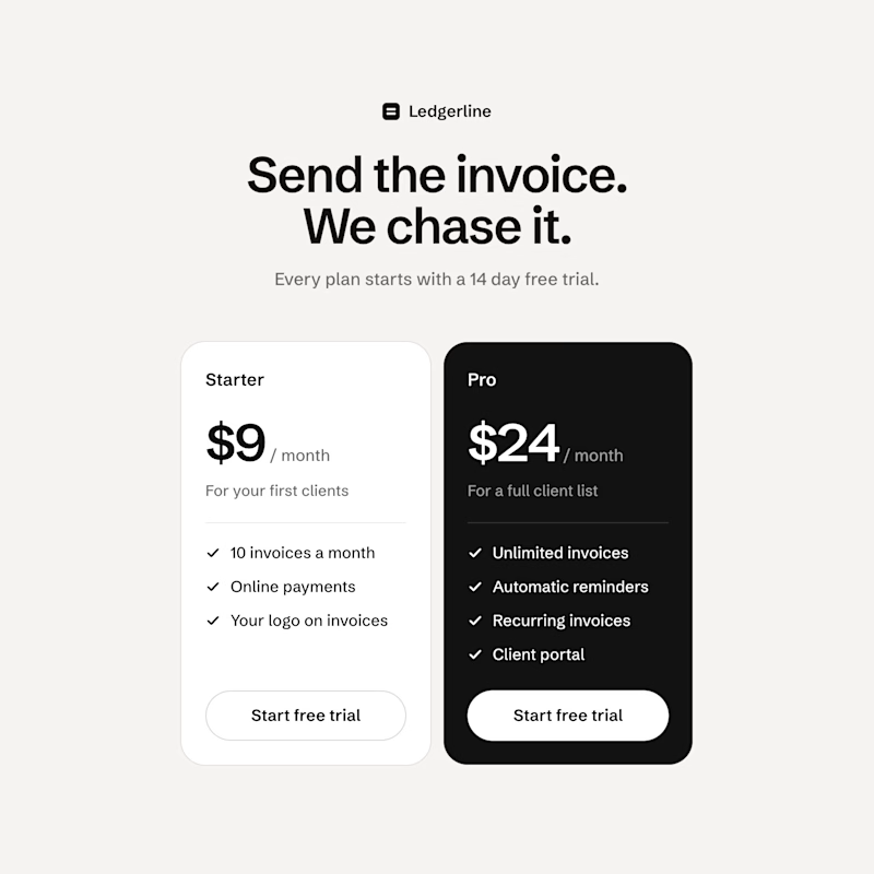
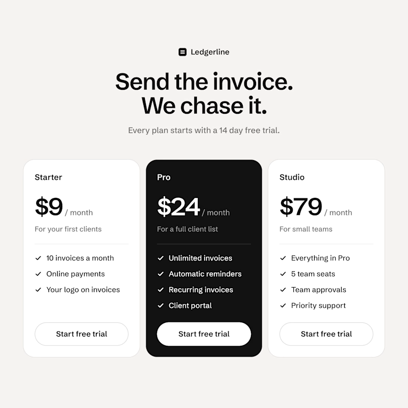
Built two pricing sections for a concept invoicing app in code with Claude Code. Same Starter, same Pro, same prices. B only adds a $79 plan that isn't really there to be bought.
Which one gets you to pick Pro, A or B?

0 voted
0%
24 voted
100%
24 votes
Closed

B for me. Next to $79, Pro at $24 looks like the sensible middle, and the dark Pro card already does half the work.


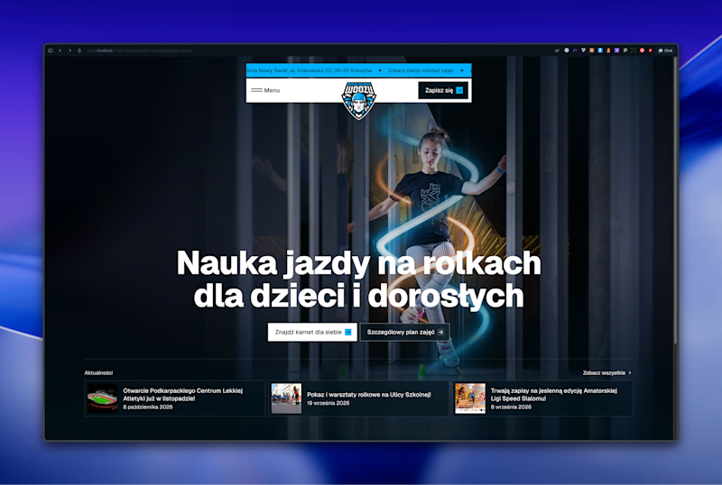
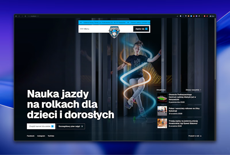

Left aligned for me. With that much body copy next to the headline it reads cleaner.

Most assistants talk. I wanted one that answers.
Muted Winter: a voice assistant that replies in three words, shows what it is doing with six petals, and dims itself after midnight.
Case study live
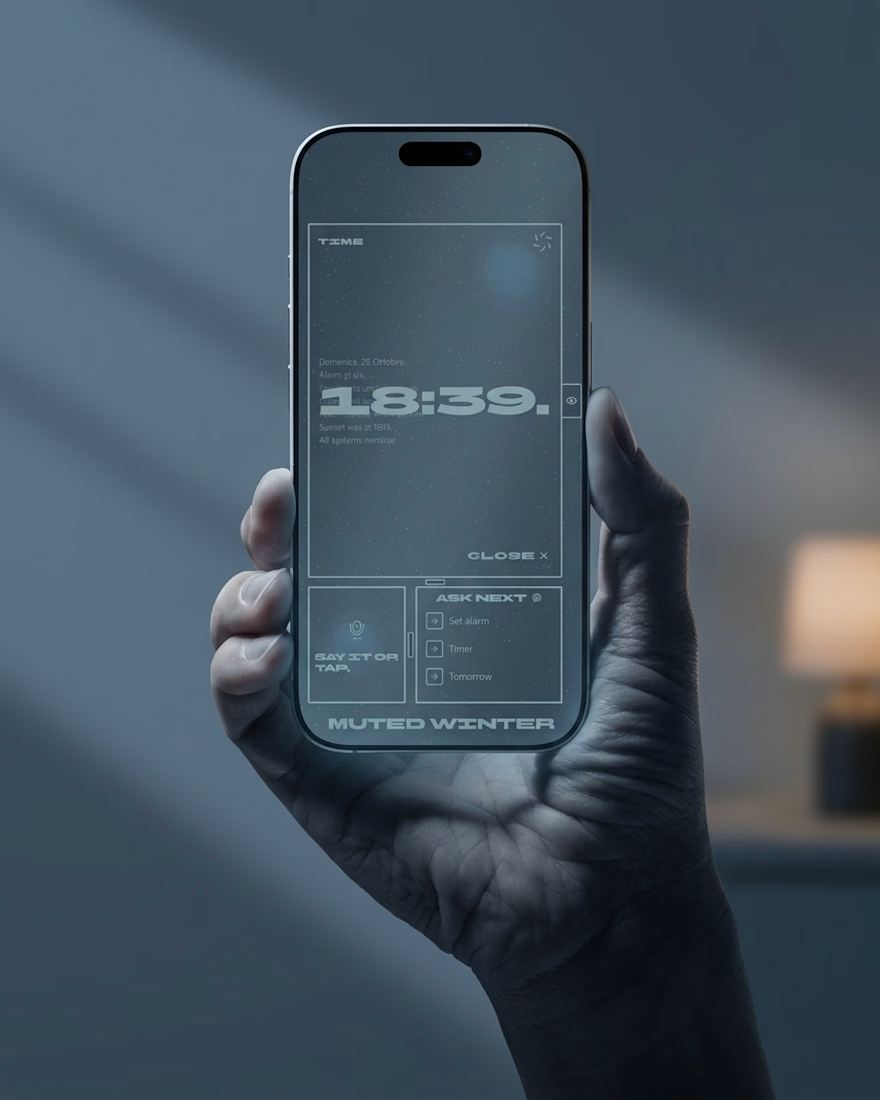
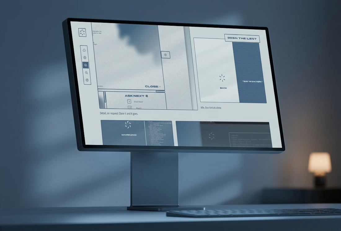
Three word replies is a smart constraint. The petals showing what it's doing is a nice touch.