The network for creativity
Join 1.25M professional creatives like you
Connect with clients, get discovered, and run your business 100% commission-free
Creatives on Contra have earned over $150M and we are just getting started
Back to feedPost

Brand Design will let you work with different businesses.
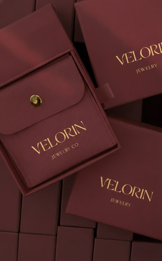
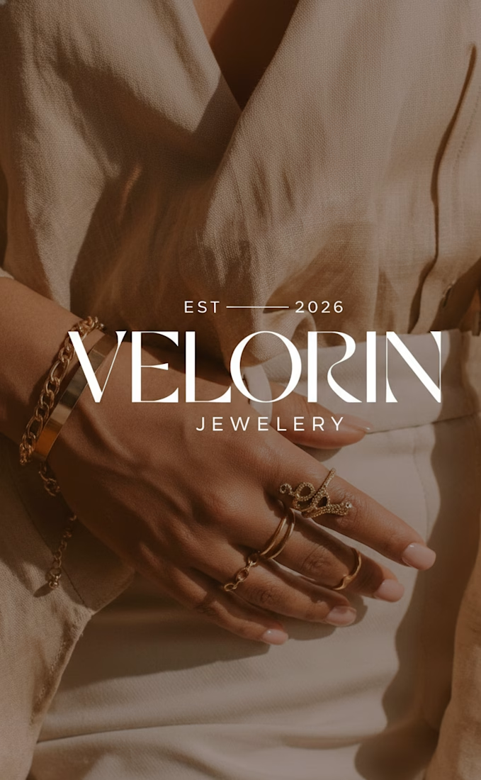
This is a brand identity for Velorin, a jewelry brand just starting out #branddesigner
Leave your thoughts on the design
The network for creativity
Join 1.25M professional creatives like you
Connect with clients, get discovered, and run your business 100% commission-free
Creatives on Contra have earned over $150M and we are just getting started





Related posts

Fillerkosm Brand Identity
Fillerkosm is a brand identity project built at the intersection of science, beauty and precision.
The creative process started from the meaning behind the name itself: Fillerkosm combines the world of aesthetic medicine with kosmos, the Greek idea of order and harmony. From there, I explored visual references connected to chemistry, space and refined beauty, with the goal of creating an identity that could feel technical, authoritative and premium without becoming cold or overly clinical.
The logo was developed as a direct extension of this concept. Two elliptical forms move through the wordmark like planetary orbits, while the circular elements at their extremities also suggest a molecular structure. The result creates a deliberate duality between the scientific precision of aesthetic medicine and the broader idea of harmony, balance and universal beauty.
Rather than designing a logo in isolation, the objective was to build a coherent visual language capable of expressing reliability, innovation and elegance across every brand touchpoint.

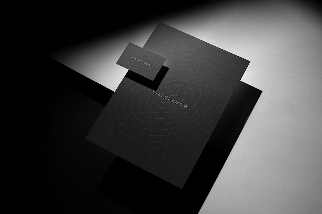
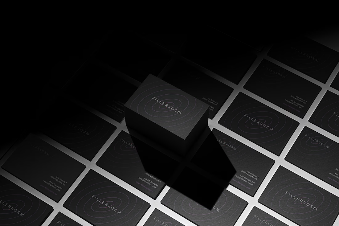
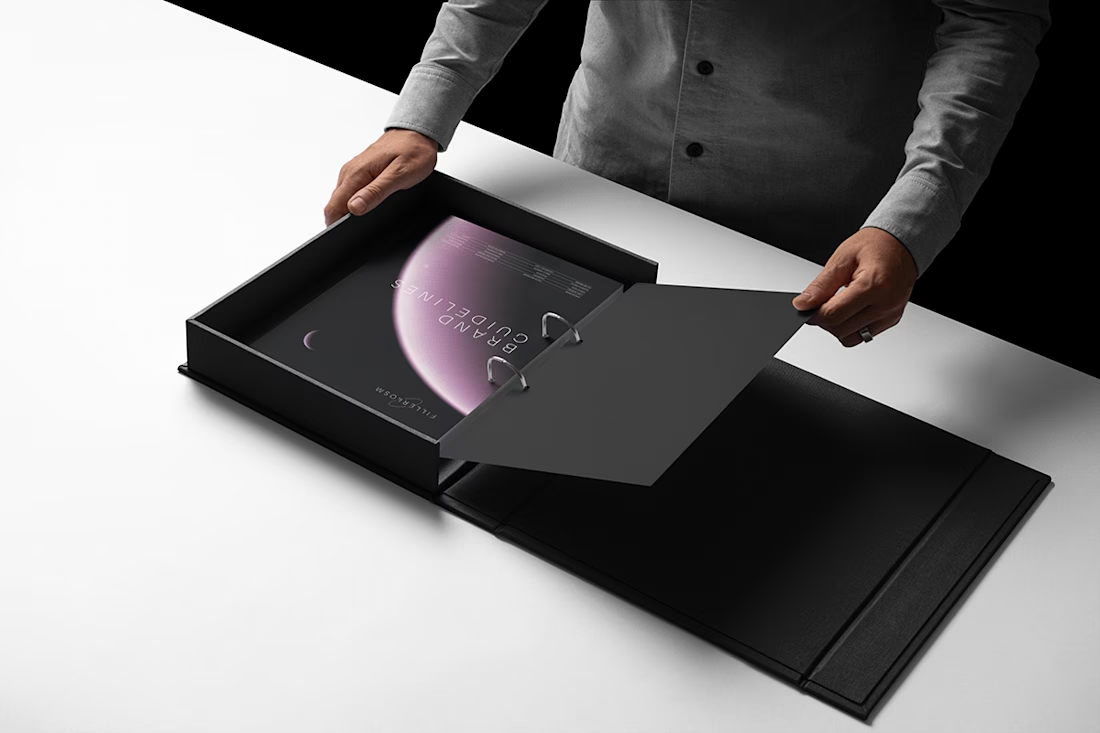

Monochrome with that one soft pink moment in the last shot. Really restrained.


New Brand Identity project alert! 🚨
GATE108 is a forward-thinking ecosystem bringing together people, ideas, experiences and new ways of living, working and connecting.
We’ve been their long-term design partner, shaping and continuously evolving a flexible visual ecosystem across visual strategy, brand identity, creative direction, digital experiences, event assets, 3D motion and social media.
Inspired by the idea of GATE108 as a gateway into a multidimensional world of people, ideas and possibilities, we’ve built a brand system designed to move, adapt and grow across physical and digital spaces.
As the brand evolves, we continue to create new expressions while keeping the wider ecosystem cohesive, recognisable and ready for what’s next.


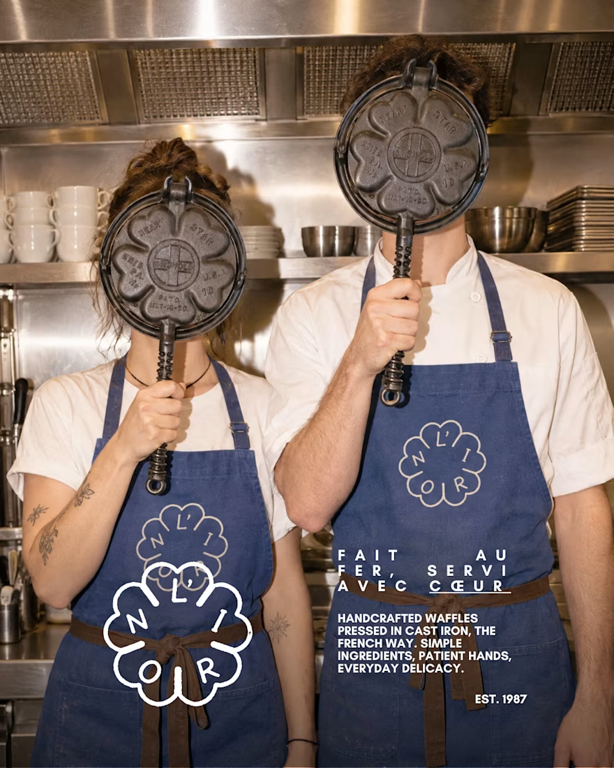
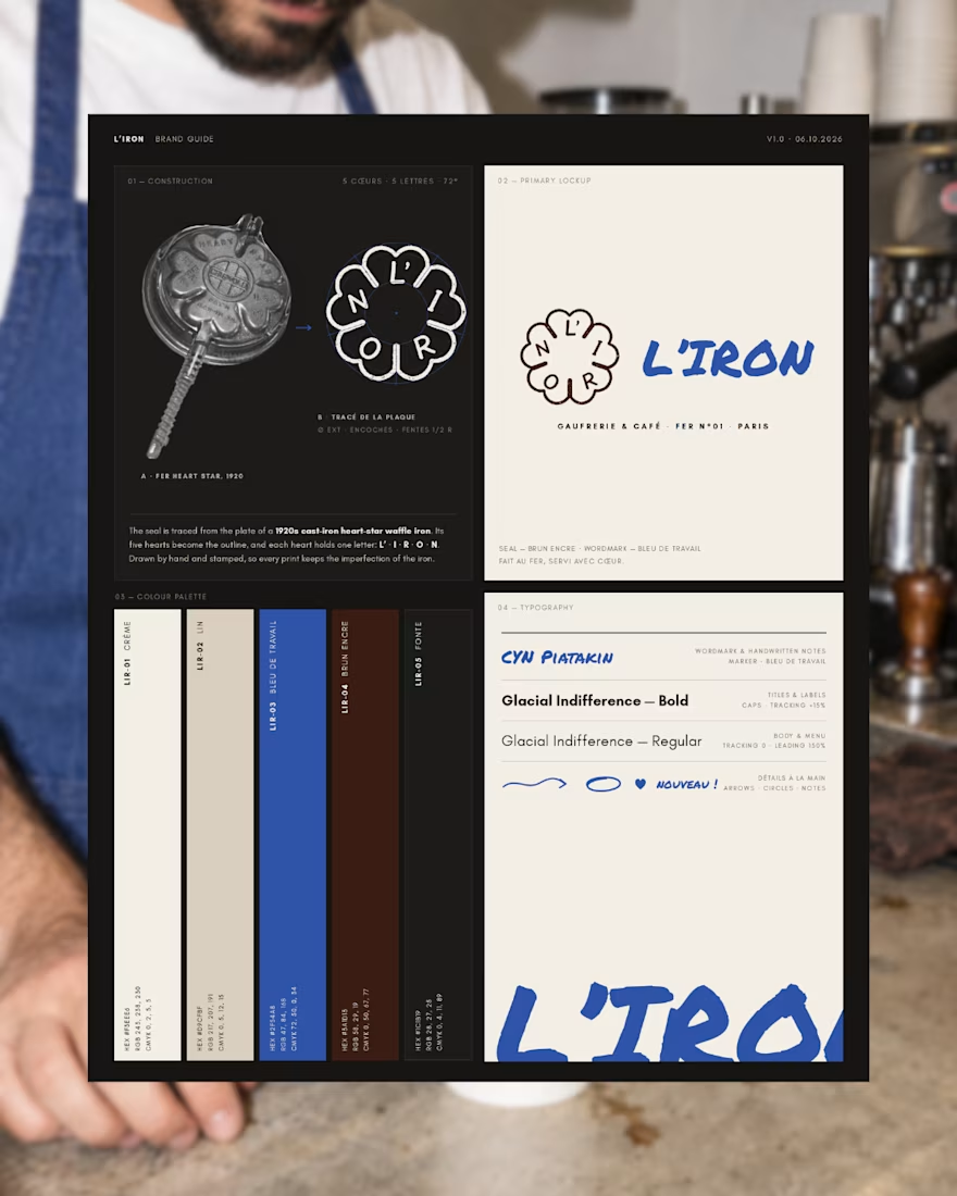
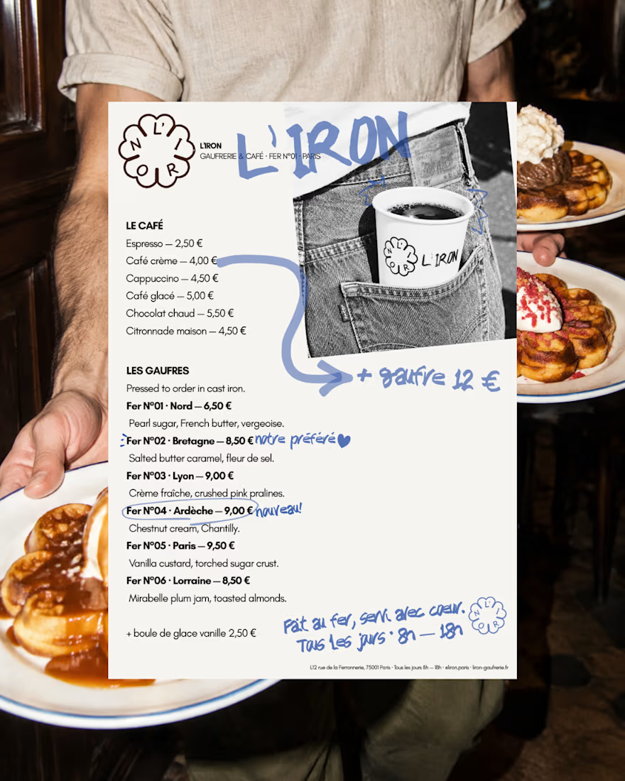
L'IRON is a brand identity for a modern French waffle house, created for the Designerbriefs weekly challenge (Brief 181). The logo is traced from the plate of a 1920s heart-star waffle iron: five hearts, five letters, L' · I · R · O · N. It works as a hand-stamped seal paired with loose blue marker notes, bringing an old iron craft into a café that feels young, warm and a little cheeky.
The project covers the logo, menu, packaging and a flash-lit, analog-style photo series.
Would you order a waffle from L'IRON? I'd love to know what you think of the logo and if it fits the brand.
See the full project on Instagram: https://www.instagram.com/p/Dd63blwDh7M/?utm_source=ig_web_copy_link&stkn=MzRlODBiNWFlZA==



So, so gooood!


