The network for creativity
Join 1.25M professional creatives like you
Connect with clients, get discovered, and run your business 100% commission-free
Creatives on Contra have earned over $150M and we are just getting started
Back to feedPost
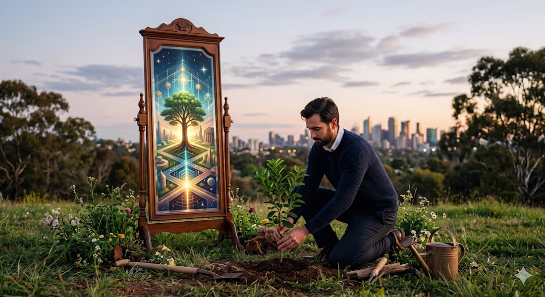
Our work is a mirror of our internal world. When we seek excellence in our projects, we are actually seeking order within ourselves. Don't just build a career; build a character that a career can stand upon.
The network for creativity
Join 1.25M professional creatives like you
Connect with clients, get discovered, and run your business 100% commission-free
Creatives on Contra have earned over $150M and we are just getting started
Related posts
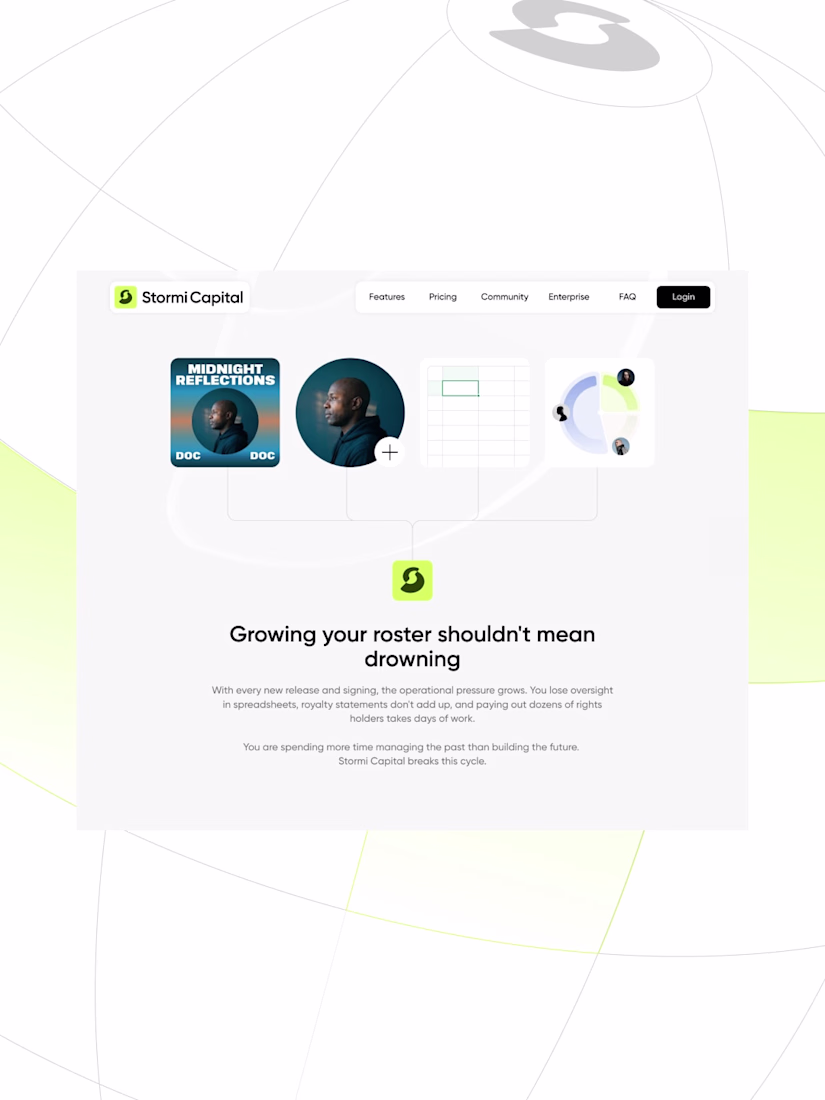
Your career deserves better. (2/2)
Easy to say. Harder to feel.
On Stormi Capital, every micro-interaction turn the promise into a feeling.
Nice 👍 work
I was on a call with the owner of a major architecture firm in New York.
The founder spent the first 20 minutes talking about their philosophy and abstract concepts.
He was looking for a way to capture the soul of a space in their projects. They had a problem with the agencies they worked with. They'd spent large budgets only to receive logo proposals with stylized ancient temples, roofs, or building parts.
They hated this literal approach.
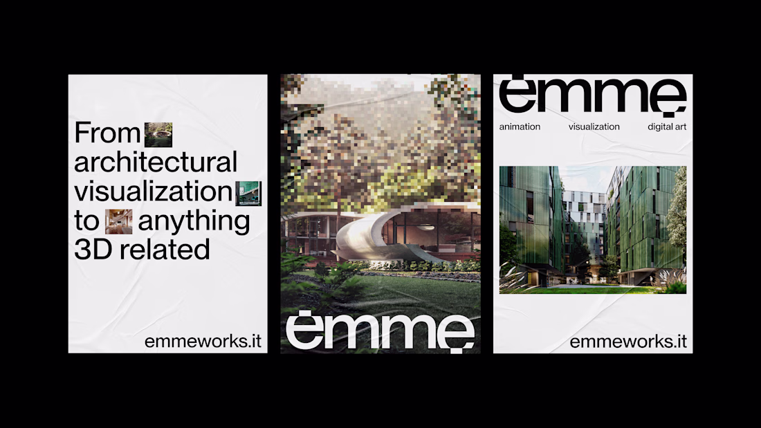
Architects and technical professionals often communicate conceptually. When this happens, it's better to bring the conversation back down to earth. So I shared my screen and showed him the identity I designed a few years ago for Emme.
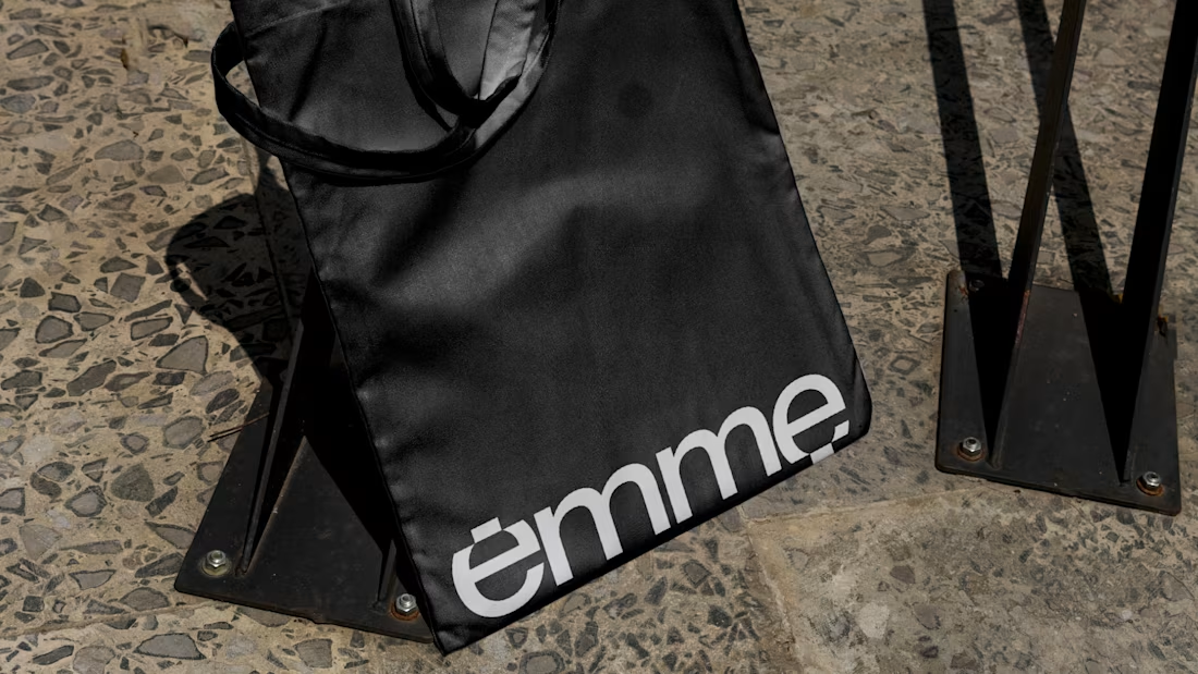
Emme is an Italian 3D architectural rendering studio I created the visual identity for. I showed him the action built into the typography. The letters are made of pixels simulating a render's calculation process.
It's an approach that conveys deep abstraction without relying on trivial symbols.
The founder suddenly stopped and said: "You managed to show what they do in a single word."
That was exactly what they were looking for.
Seeing that logotype was enough for him to understand I could turn an abstract idea into specific typography. The company's action and soul made visually tangible.
Trust clicks the second a client realizes you can translate their philosophy into a visual system that works.
Amazing!
Spent an unhealthy amount of time polishing the tiny details on this one 👀
Designed and animated this multi-page AI career advisory platform from scratch, from the custom cursor, images, to every tiny motion detail.
Really happy seeing it finally live in production ✨ https://mycareer.mycareerdreams.com/
Trending
Claude
Claude has entered the design space. How are you using Claude Design?
Contra University
Learn from expert creatives how to earn more using next-gen AI tools.
creativeaiflow
Creative AI workflows are evolving. What tools do you use, and what are their strengths and weaknesses?
portfolioreview
The best portfolios tell a story, not just show a grid. Share yours for feedback.
freelancerlife
Freelancer life is wins, pivots, and everything in between. What’s yours right now?
