The network for creativity
Join 1.25M professional creatives like you
Connect with clients, get discovered, and run your business 100% commission-free
Creatives on Contra have earned over $150M and we are just getting started
Back to feedPost
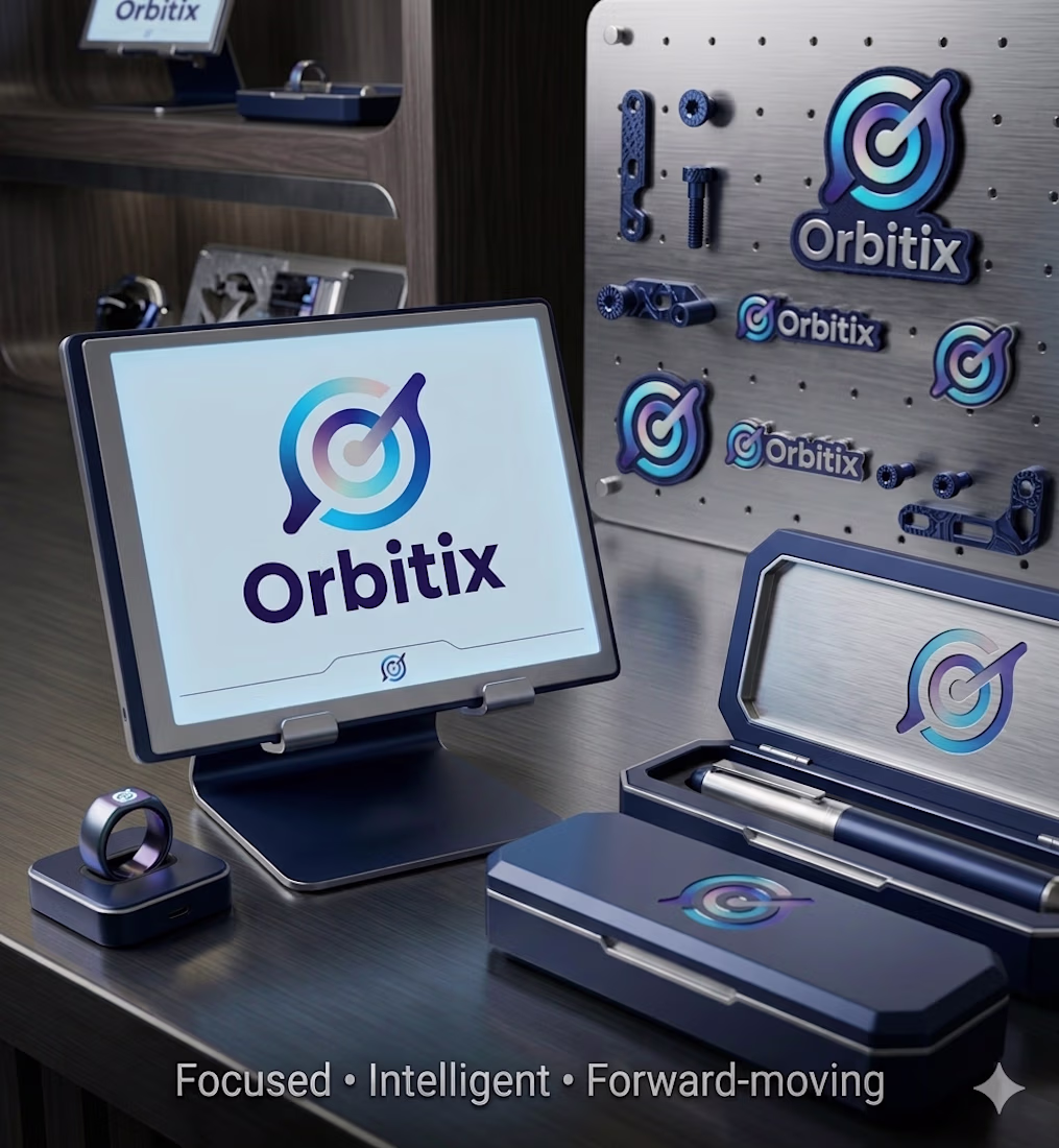
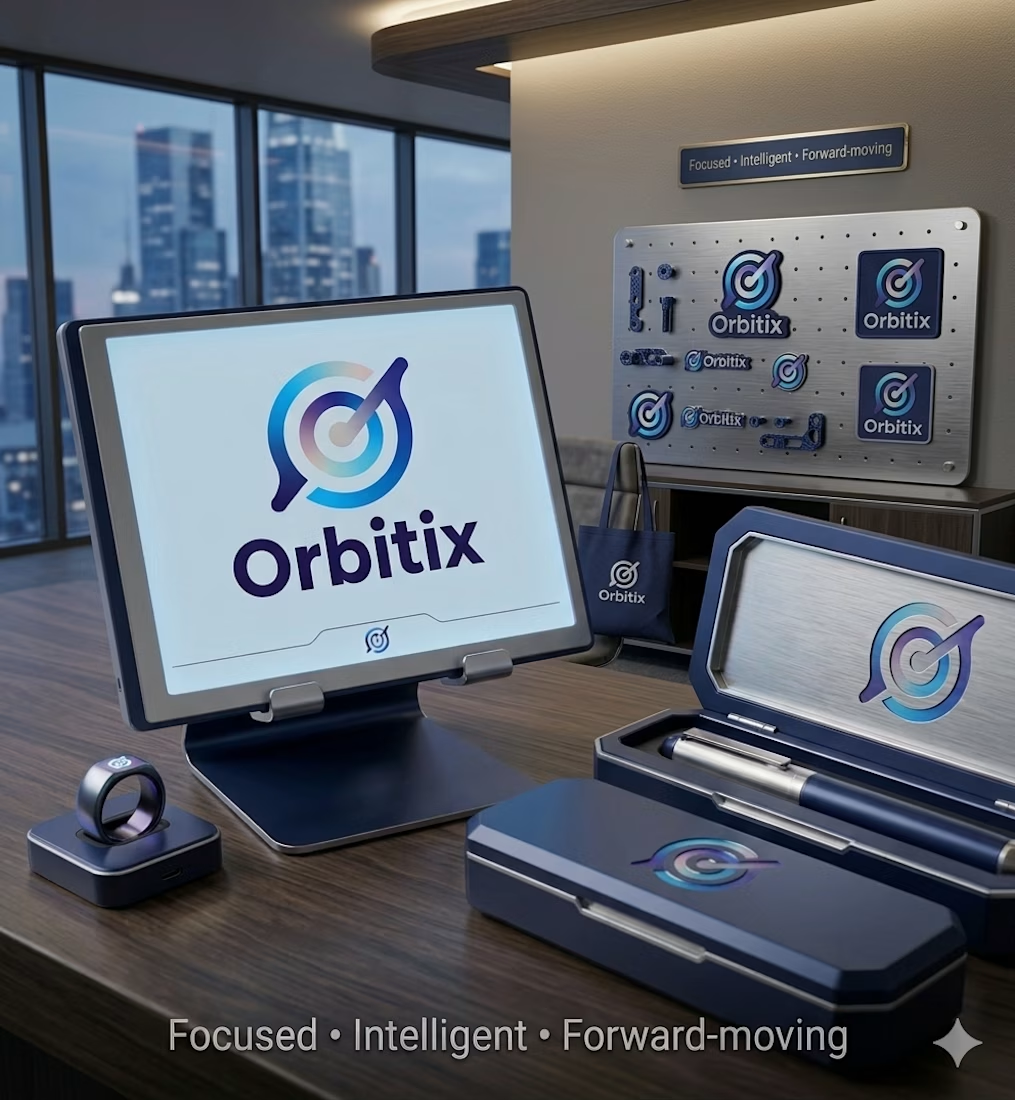
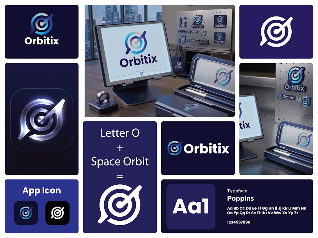
I designed this logo for Orbitix to capture the idea of staying focused and moving with purpose. The circular form represents an orbit, symbolizing consistency, flow, and staying on track. At the same time, it works like a target, which reflects precision and goal-setting.
The central point anchors everything. It represents the user’s core focus, while the surrounding rings show progress and structure. The angled pointer cutting through the circle adds direction and momentum. It suggests action, not just planning. It’s about execution.
I kept the form minimal but intentional. The slight break in the outer ring adds a dynamic feel, like motion in progress rather than something static. It also prevents the logo from feeling closed or rigid.
The gradient transitions from deep blue to lighter cyan to give it a modern, tech-driven look while also adding depth. It hints at growth, clarity, and forward movement.
The typography is clean and solid to balance the symbol. It keeps the brand grounded while the icon carries the motion and concept.
Overall, the logo is about alignment, direction, and staying in orbit with your goals.
The network for creativity
Join 1.25M professional creatives like you
Connect with clients, get discovered, and run your business 100% commission-free
Creatives on Contra have earned over $150M and we are just getting started
Related posts
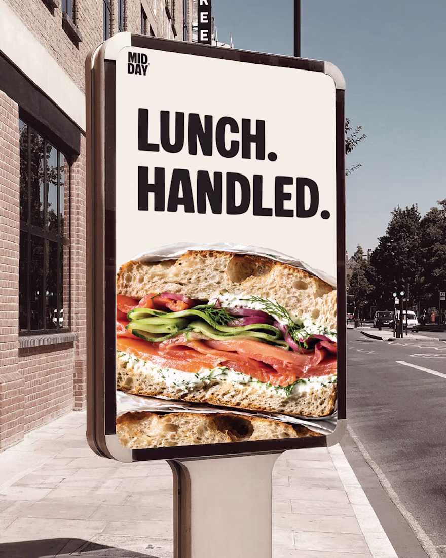
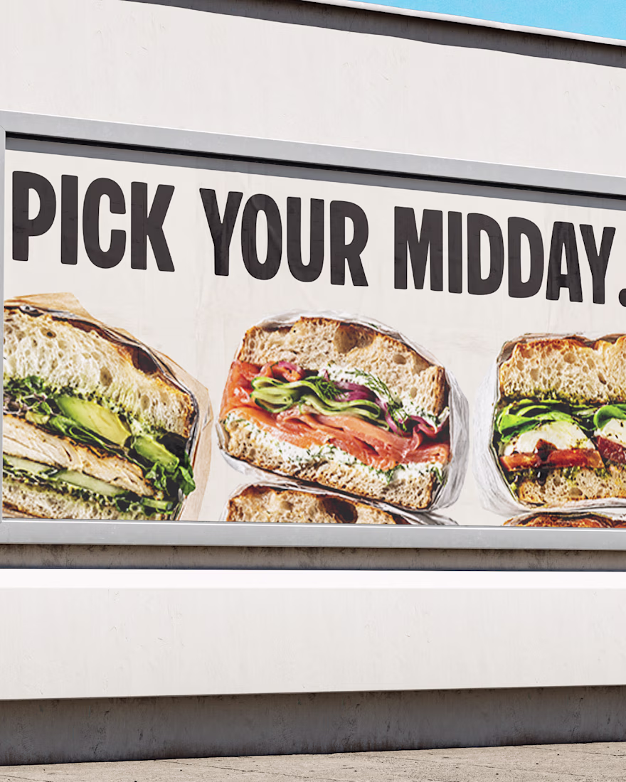
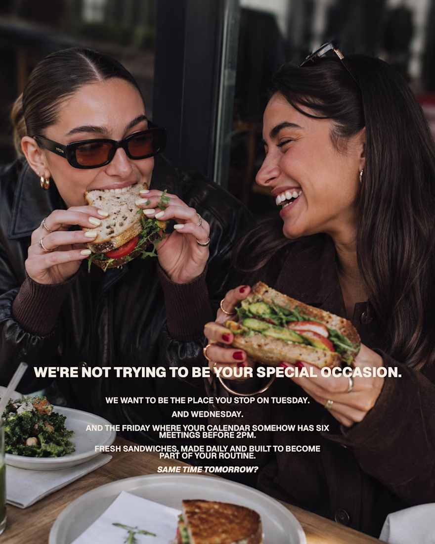
MIDDAY | Campaign & Art Direction
MIDDAY was positioned as a habit brand rather than a special-occasion destination.
The campaign language is direct, playful and grounded in the reality of a busy day. Good food, made properly, without turning lunch into a whole performance.
Not the place you save for someday. The place you return to every Tuesday.
Soon a deeper take and look in this personal project.
MIDDAY may not be a real sandwich bar yet, but the concept is ready to leave the mockups whenever someone wants to open the doors.
Lunch. Handled.
Amazing work
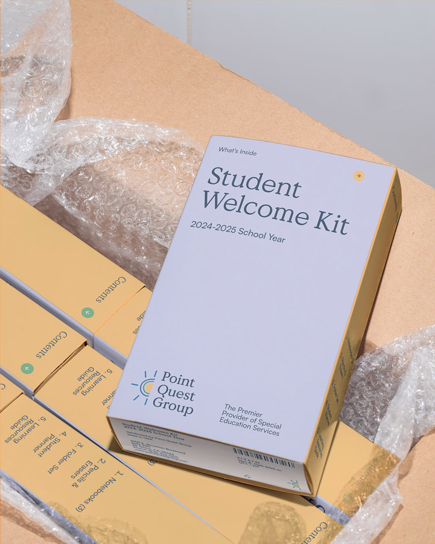
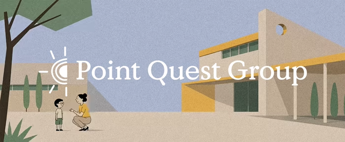
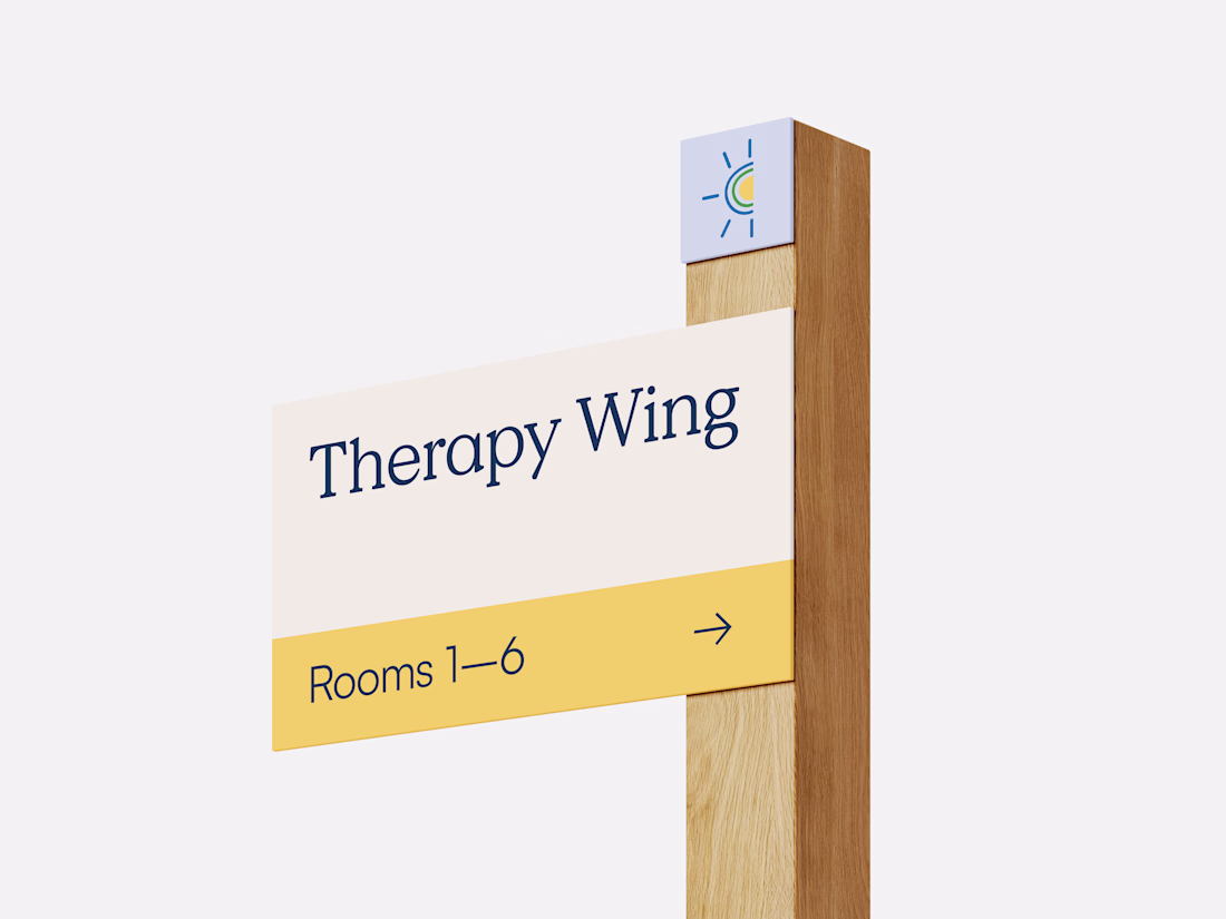
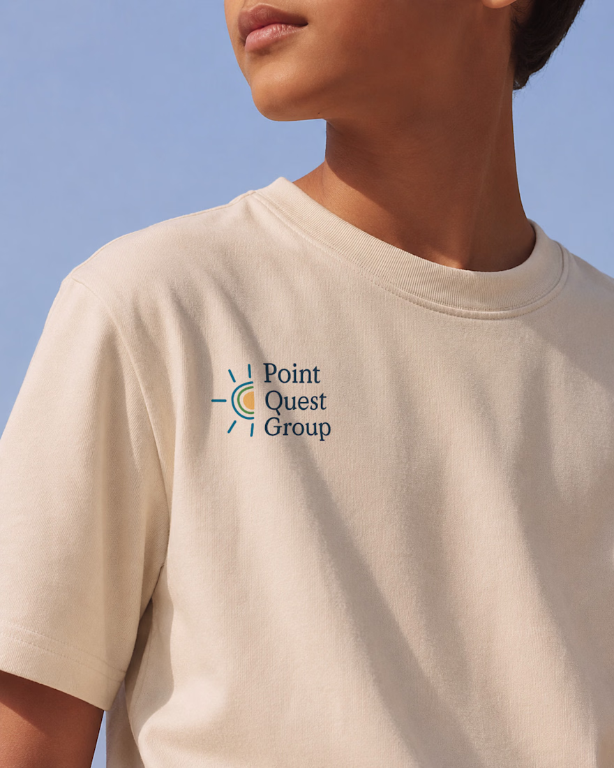
As Lead Brand Designer at Case Study Brands, I led the brand identity for Point Quest Group, an education organization. Starting with positioning and brand strategy, I translated the organisation’s goals into a cohesive visual identity designed to resonate with both school leaders and families. The final identity system balances credibility with warmth while providing a scalable foundation for future growth.
Great Work
MOONIQ — Visual Identity System
Mooniq is a leading digital marketing agency specialized in social media, blockchain, and Web2 consulting. Its new identity reflects a bold and futuristic vision, inspired by exploration and constant innovation. A system built to express ambition, trust, and elegance, positioning Mooniq as a guide for brands reaching new heights.
The brand required an identity that could embody its innovative spirit, strategic mindset, and futuristic vision.
This visual identity was designed to capture Mooniq’s essence: a forward-thinking agency inspired by the concepts of exploration, technology, and limitless growth. Every element of the system —from the logo to the typographic and chromatic choices— was created to establish a sophisticated and aspirational brand presence.
2025© - Jv® Studio. — Enmanuel Jimenez V. All rights reserved.
Featured project in Graphic Design / Branding by @behance
Art DirectionBrand DesignGraphic DesignAdobe IllustratorAdobe PhotoshopFigmavisualidentitybrandingcasestudy
Animation is dupe!
Trending
Claude
Claude has entered the design space. How are you using Claude Design?
Contra University
Learn from expert creatives how to earn more using next-gen AI tools.
creativeaiflow
Creative AI workflows are evolving. What tools do you use, and what are their strengths and weaknesses?
freelancerlife
Freelancer life is wins, pivots, and everything in between. What’s yours right now?