The network for creativity
Join 1.25M professional creatives like you
Connect with clients, get discovered, and run your business 100% commission-free
Creatives on Contra have earned over $150M and we are just getting started
Back to feedPost

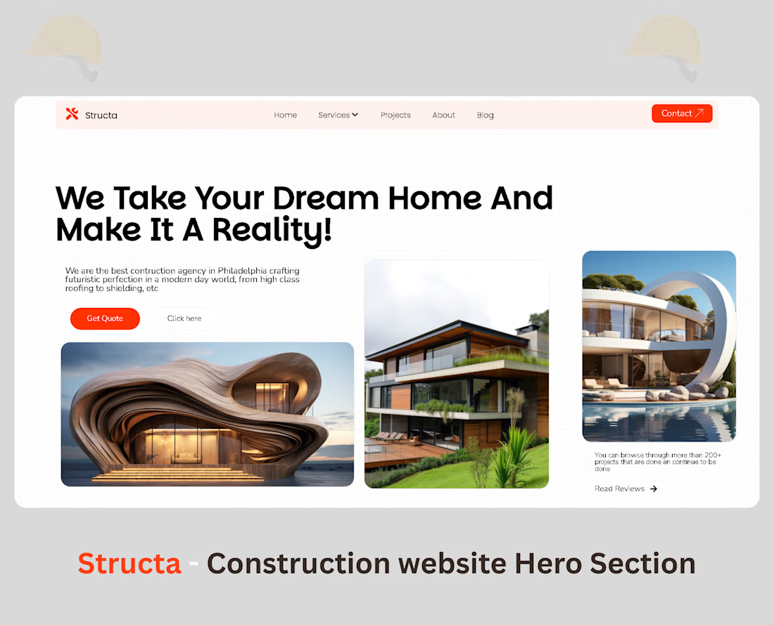
Structa is an inspirational modern design of what a construction agency's Hero section should look like💯

The network for creativity
Join 1.25M professional creatives like you
Connect with clients, get discovered, and run your business 100% commission-free
Creatives on Contra have earned over $150M and we are just getting started







Related posts

NEOL. Making of the Hero
NEOL develops CuGlide™, a copper-based lubricant technology that reduces wear between metal parts.
I recently designed their website. The hero was the hardest part: two gears in contact, with a thin copper film where they meet. That's why I built it in 3D instead of generating it: AI video can't give that level of control and precision.
From the first draft to the live site.


Sleek work!

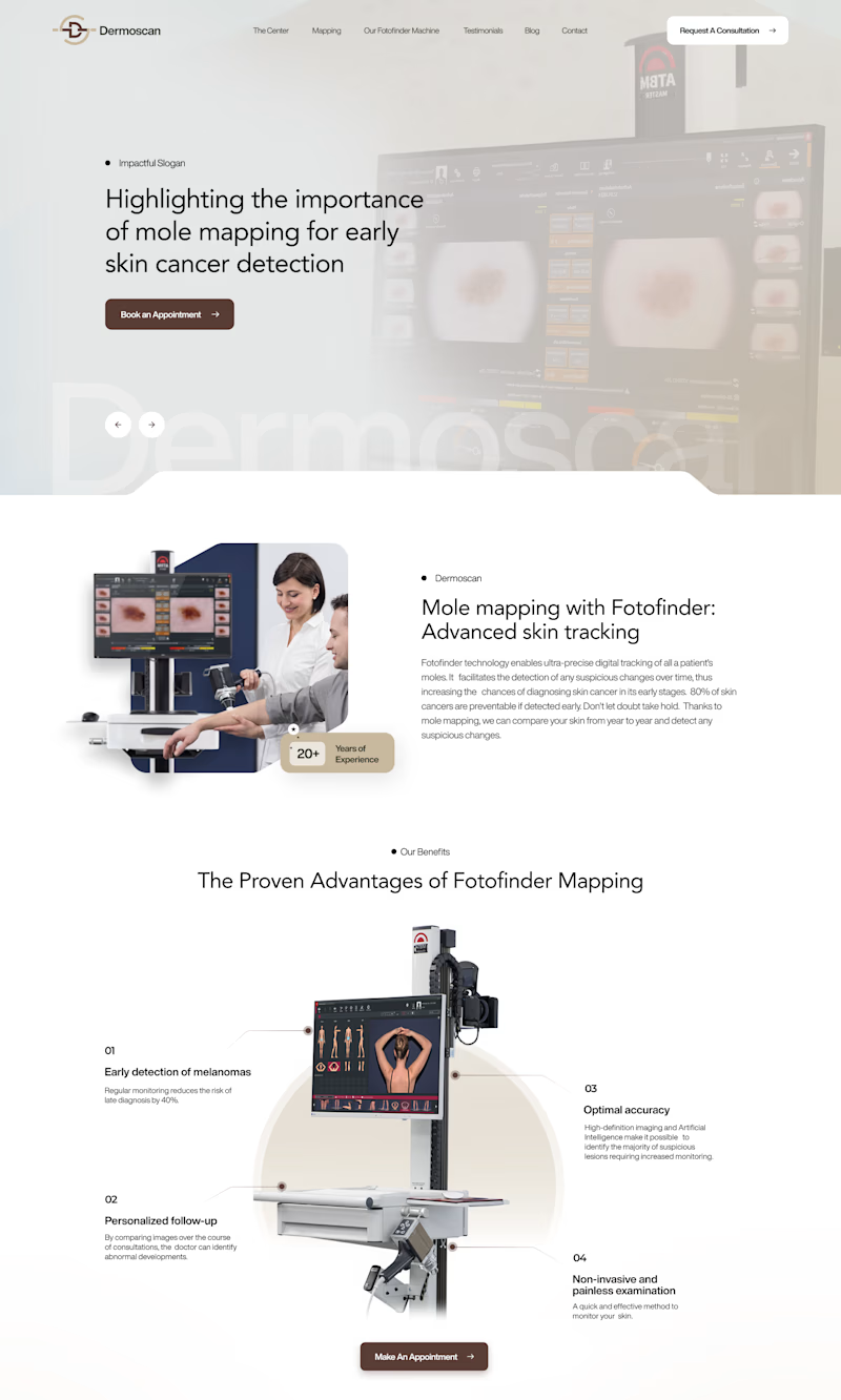
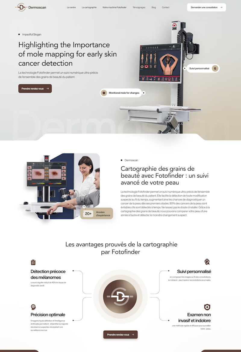
Same Dermoscan website, two hero layouts.
A: text left, machine image fills the right, clean and clinical
B: text left, Fotofinder machine right with floating feature callouts, feels more interactive
Which hero section communicates the product better at first glance? 👇
2 voted
18%
9 voted
82%
11 votes
Closed


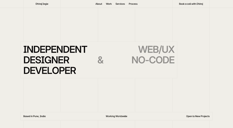
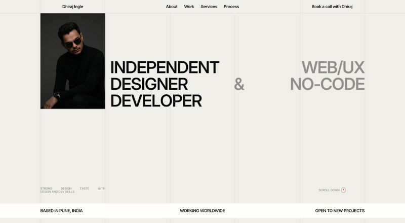

Option B looks better. Having your photo there makes the page feel personal and complete, while Option A feels a little empty on the left side. You could add a smooth cursor tilt effect to the portrait card so it reacts naturally to user movement.