The network for creativity
Join 1.25M professional creatives like you
Connect with clients, get discovered, and run your business 100% commission-free
Creatives on Contra have earned over $150M and we are just getting started
Back to feedPost
Taste Test

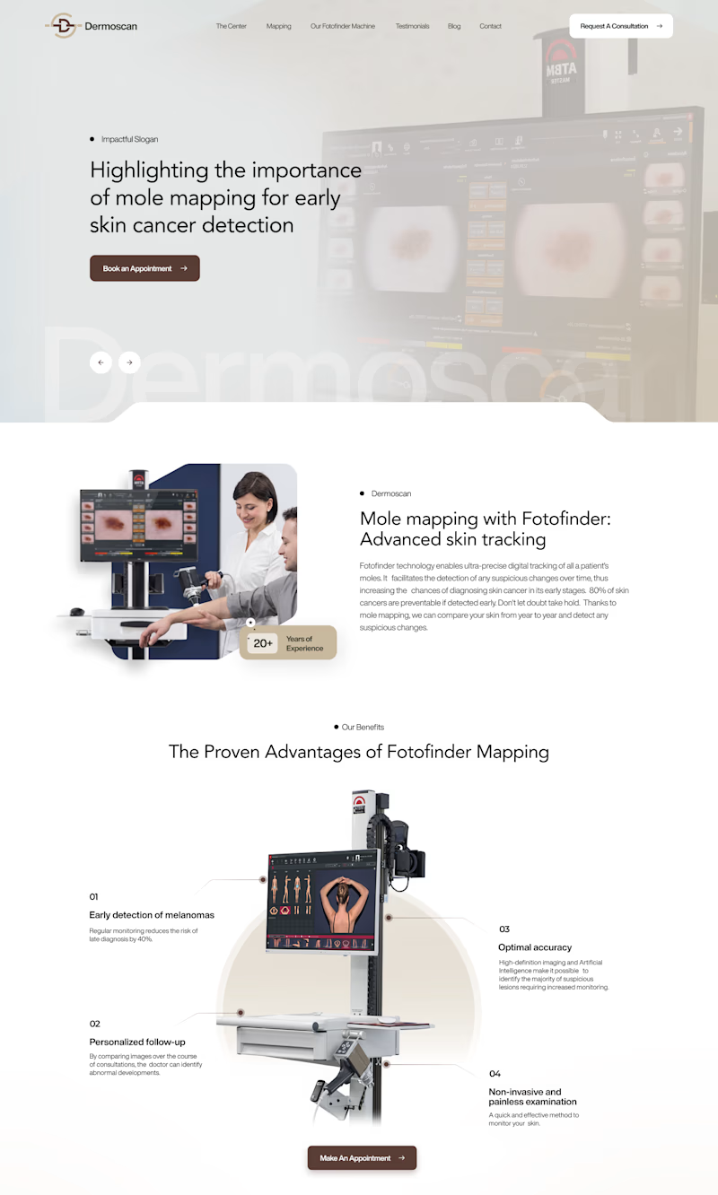
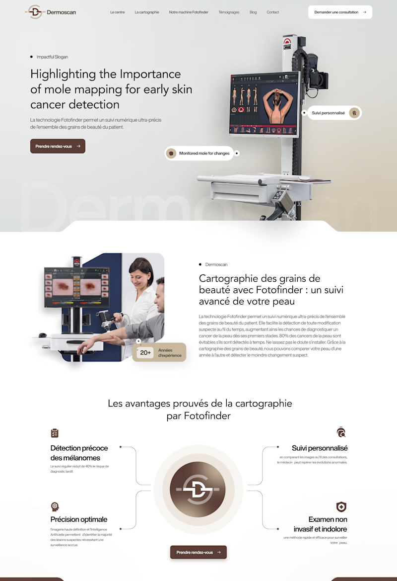
Same Dermoscan website, two hero layouts.
A: text left, machine image fills the right, clean and clinical
B: text left, Fotofinder machine right with floating feature callouts, feels more interactive
Which hero section communicates the product better at first glance? 👇
2 voted
18%
9 voted
82%
11 votes
Closed

For a clinical device like the Fotofinder, Option A communicates the product faster - the machine image fills the right and there's nothing competing for the eye between the headline and the hero proof. The floating callouts in B add a step of reading that works once the user is...

Like 2nd!

Option B is much clearer. Seeing the full machine right away makes it instantly obvious what kind of medical clinic this is.

Option B visually feels more like a beauty brand website design

Option B wins my eyes!!
The network for creativity
Join 1.25M professional creatives like you
Connect with clients, get discovered, and run your business 100% commission-free
Creatives on Contra have earned over $150M and we are just getting started

Challenges
View all


Related posts

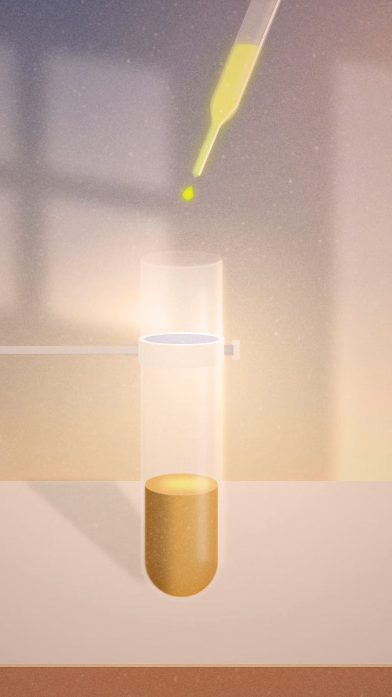
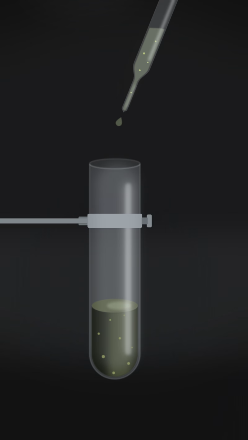
One lab experiment, two completely different moods. 🧪 Which one do you think fits best?

6 voted
67%
3 voted
33%
9 votes
Closed

A looks great!

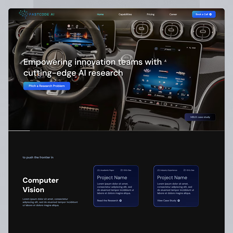
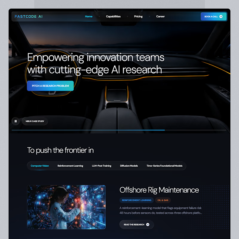
Same landing page, two passes on the surface.
Which one feels more finished?

6 voted
23%
20 voted
77%
26 votes
Closed

B is has more professional image 👍❤️

Words first or product first, which opening would you keep?
Same concept app, same brand, two different first seconds.
A opens on a bold question in big type. B drops you straight into the app planning a week.
We built six openings for one launch and these two are the furthest apart.
Which one stops your thumb?
https://contra.com/p/7XmrRUrA
https://givemeprompts.com

3 voted
60%
2 voted
40%
5 votes
Closed
Love A! ❤️