The network for creativity
Join 1.25M professional creatives like you
Connect with clients, get discovered, and run your business 100% commission-free
Creatives on Contra have earned over $150M and we are just getting started
Back to feedPost
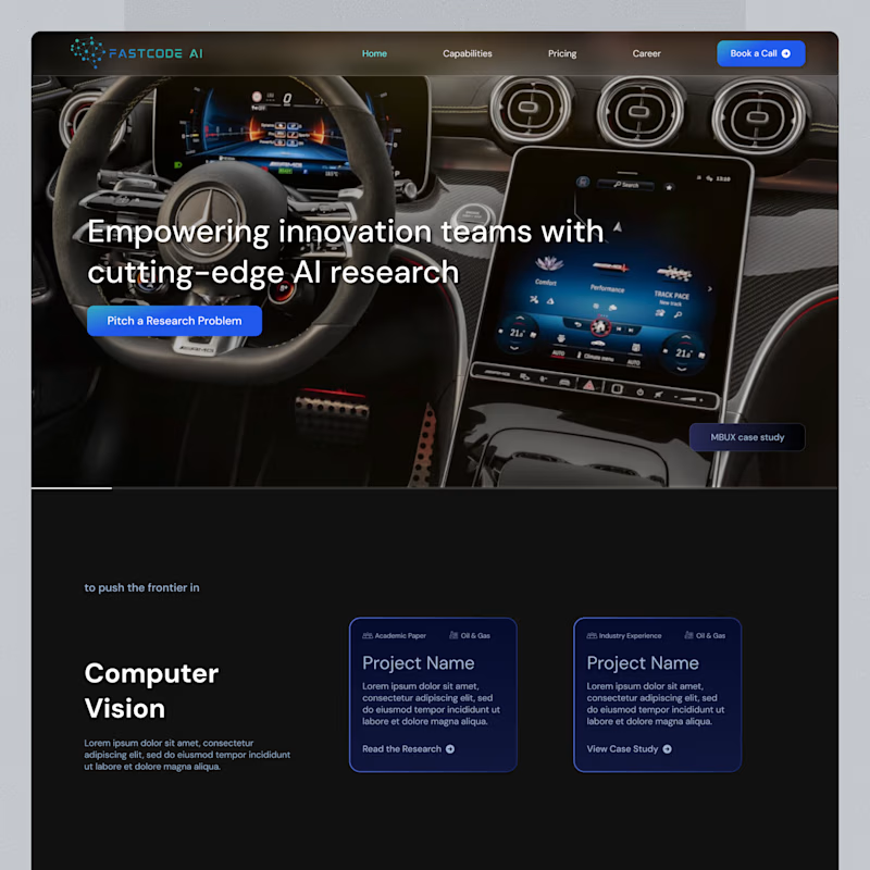
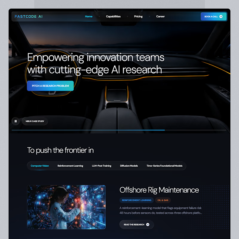
Taste Test
Same landing page, two passes on the surface.
Which one feels more finished?

8 votes
Ends in 1d


Thanks!

B feels more finished!
Weldone
Thank you!

I go with b. Only because the background is dark , which make text readable
Thank you for your thoughts

b makes the text more visible!
Thanks!

B for sure!
Thank you!

B is has more professional image 👍❤️
It's nice that you noticed that. Thank you 😊
Great job Artur ❤️


Nice design !
The network for creativity
Join 1.25M professional creatives like you
Connect with clients, get discovered, and run your business 100% commission-free
Creatives on Contra have earned over $150M and we are just getting started






Related posts

Two cuts of the same Outlier promo. 24 seconds each, one framed wide, one framed for the phone. 1 or 2. Why?🤔
8 voted
50%
8 voted
50%
16 votes
Closed

Going with 2. Most people will watch it on their phone anyway and the tighter framing feels punchier. 1 looks more cinematic though.

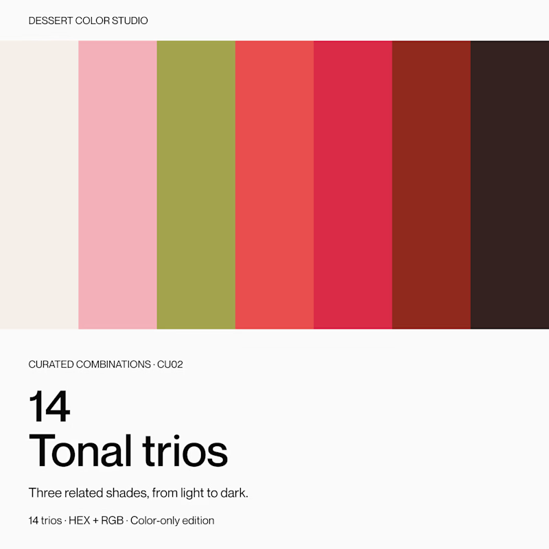
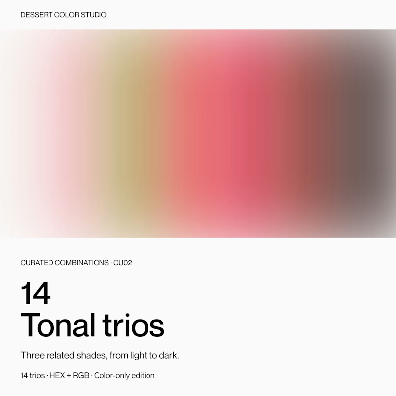
If you were browsing color resources, which cover would make you click to see more?
Same product inside: 14 tonal trios, with three related shades in each.
A or B? Curious what makes you choose one over the other.
9 voted
56%
7 voted
44%
16 votes
Closed

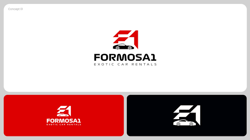
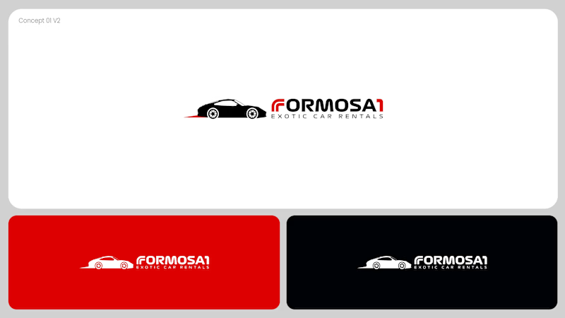
Two logo concepts for Formosa1 Exotic Car Rentals. Which one wins?
A: bold geometric F1 monogram, car tucked inside the mark. Strong and iconic.
B: car silhouette leads, red wordmark with a speed streak. Fast and clean.
Drop your vote 👇
17 voted
53%
15 voted
47%
32 votes
Closed
Both are great but I feel that was something special in the bottom one that's why I choose it❤️❤️