The network for creativity
Join 1.25M professional creatives like you
Connect with clients, get discovered, and run your business 100% commission-free
Creatives on Contra have earned over $150M and we are just getting started
Back to feedPost

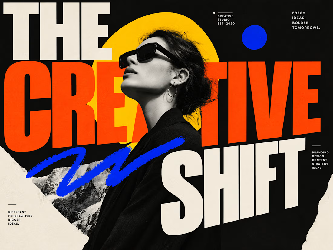
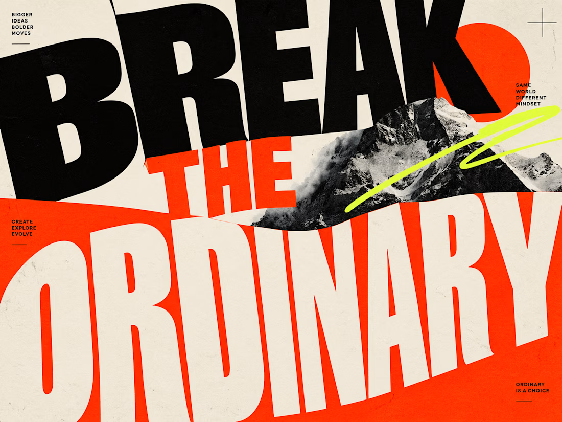
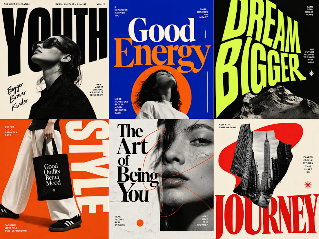
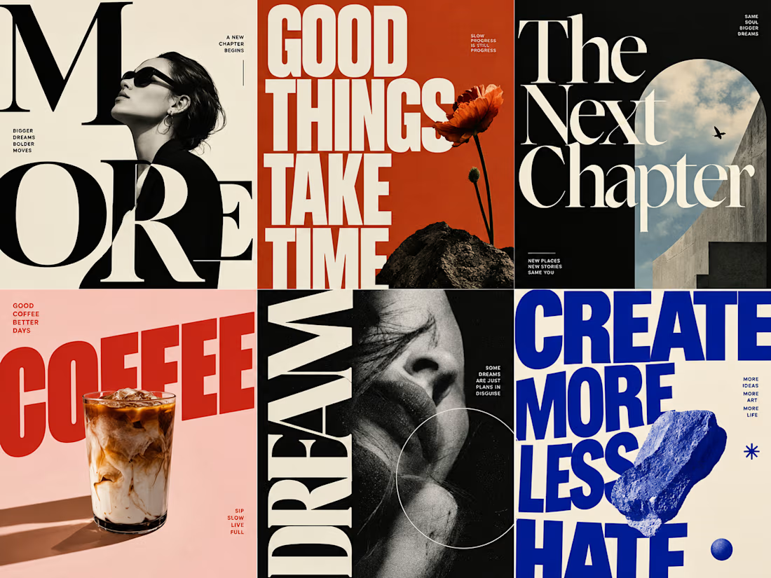
I experimented with oversized typography across editorial layouts, posters, and social media covers. What do you think about the typography, layout, and color combinations? Which design catches your eye the most? I’d love to hear your thoughts! ✨


The network for creativity
Join 1.25M professional creatives like you
Connect with clients, get discovered, and run your business 100% commission-free
Creatives on Contra have earned over $150M and we are just getting started
Challenges
View all


Related posts

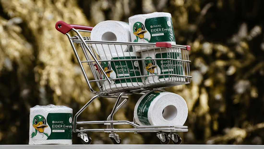
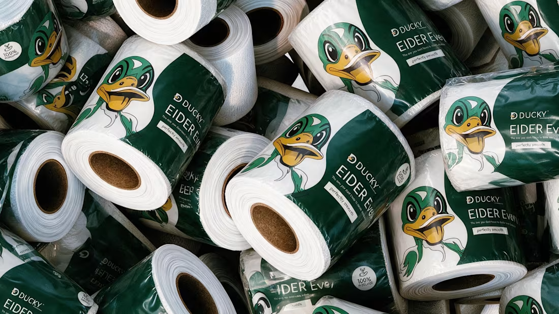
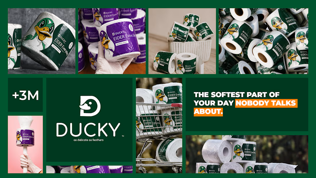
The softest part of your day nobody talks about 🦆
Spent the past week designing EIDER — a toilet paper brand built on a simple bet: even the most overlooked product in the house deserves real design attention.
No cartoon mascots. No literal bathroom jokes. Just calm pastel tones, restrained typography, and a quiet geometric duck mark — named after the eider duck, source of the softest down there is — that rewards a second look instead of shouting for one. 🪶
Sometimes the funniest thing a brand can do is take itself seriously.



Love the branding, it’s clean, balanced, and easy to follow.

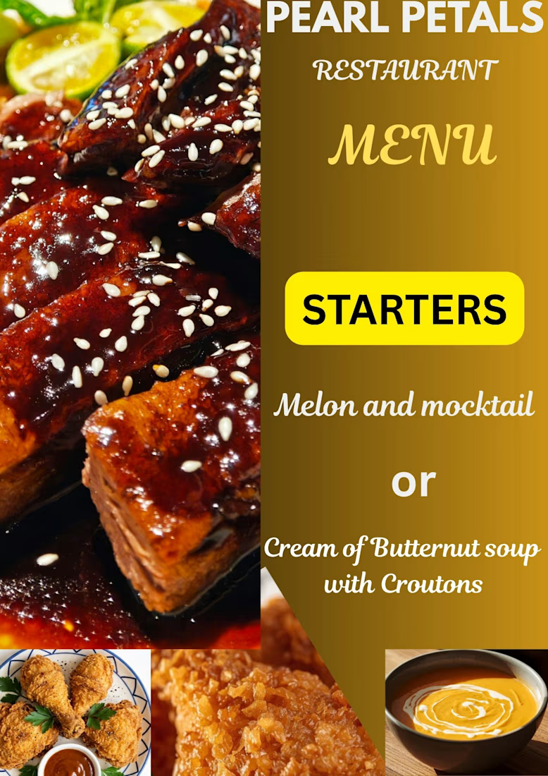
A great menu isn't just a list of items—it’s an extension of a restaurant's brand identity. I love working on layouts that balance clean typography, visual hierarchy, and an appetizing aesthetic to elevate the customer experience.

Good!
Designed a vibrant and personalized digital event flyer to celebrate Stacey’s special day. The goal was to craft an energetic, joyful visual that combines a rich purple-and-blue gradient aesthetic, clean typography, and custom photo integration to create a memorable keepsake.
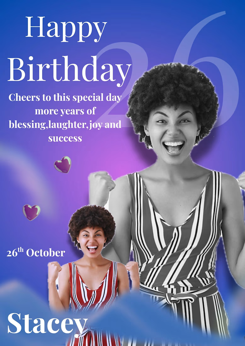

The blend of the purple blue gradient with the custom photo gives the flyer a lively feel that ties the whole celebration together.