The network for creativity
Join 1.25M professional creatives like you
Connect with clients, get discovered, and run your business 100% commission-free
Creatives on Contra have earned over $150M and we are just getting started
Back to feedPost
A great menu isn't just a list of items—it’s an extension of a restaurant's brand identity. I love working on layouts that balance clean typography, visual hierarchy, and an appetizing aesthetic to elevate the customer experience.

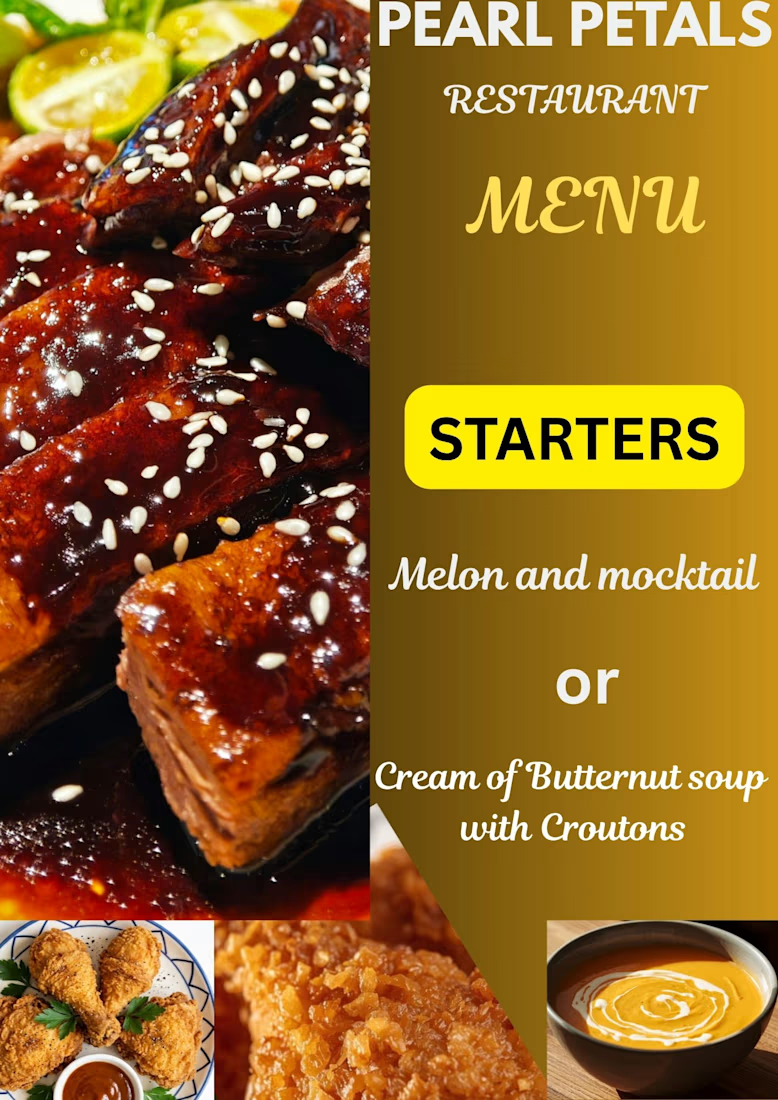

That focus on visual hierarchy to guide diners through the menu while keeping the typography clean really ties the brand feel to the food experience

Thank you! Achieving that balance between clean typography and clear visual hierarchy was key to making sure the menu feels as intentional and inviting as the food itself.
The network for creativity
Join 1.25M professional creatives like you
Connect with clients, get discovered, and run your business 100% commission-free
Creatives on Contra have earned over $150M and we are just getting started





Related posts

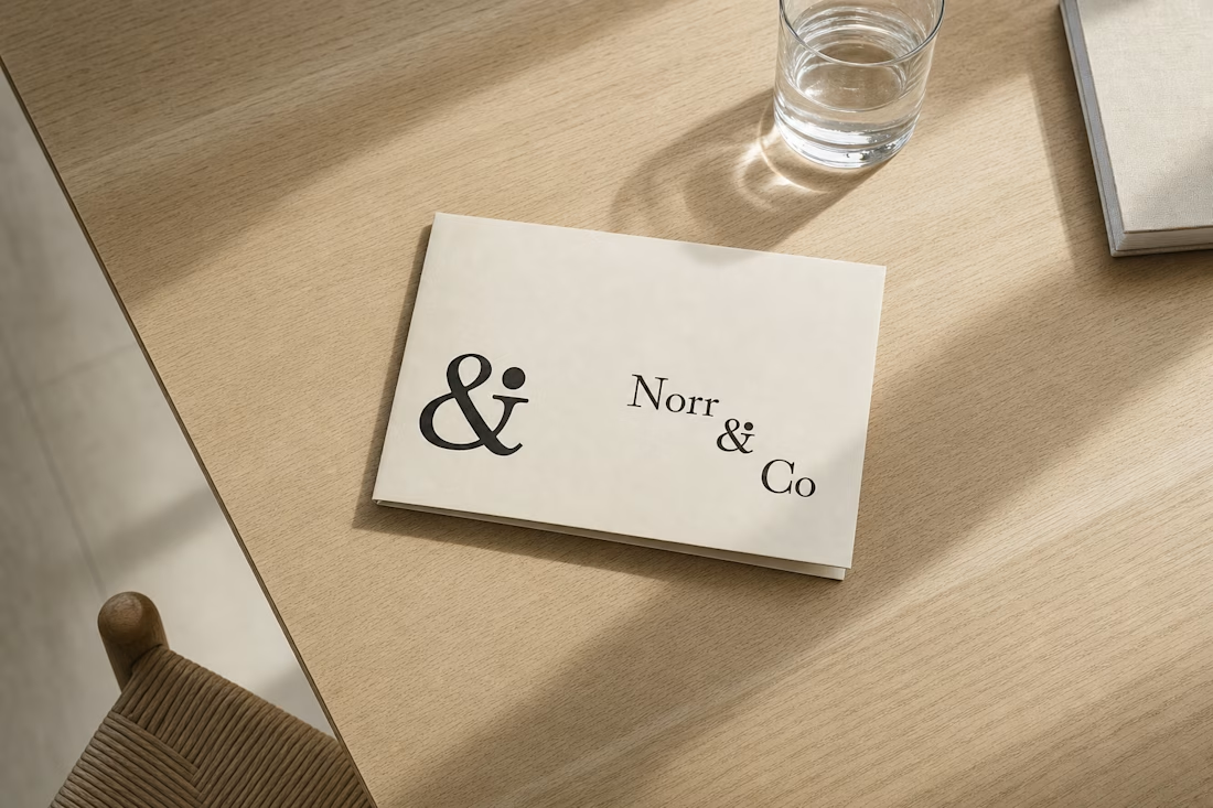
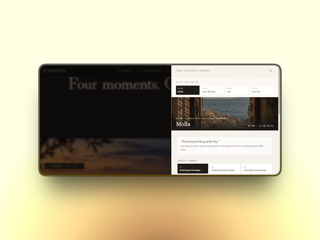
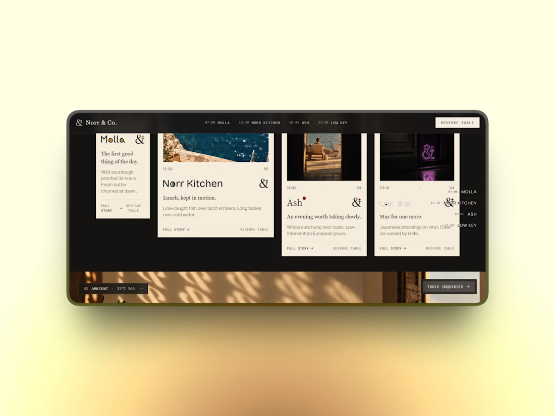
quietly finished a full brand system for a fictional hospitality group — one parent identity, four sub-brands, each tuned to a different hour of the day but sharing the same DNA underneath.
a single dot that changes meaning depending on the moment. a mark that knows when to stay quiet and when to take up space.
case study dropping soon

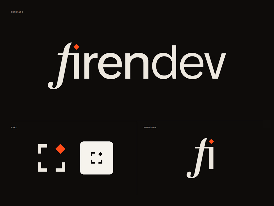
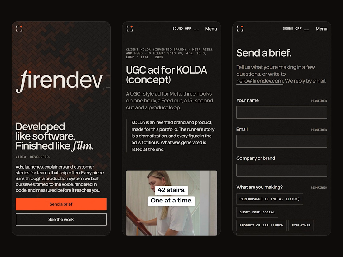
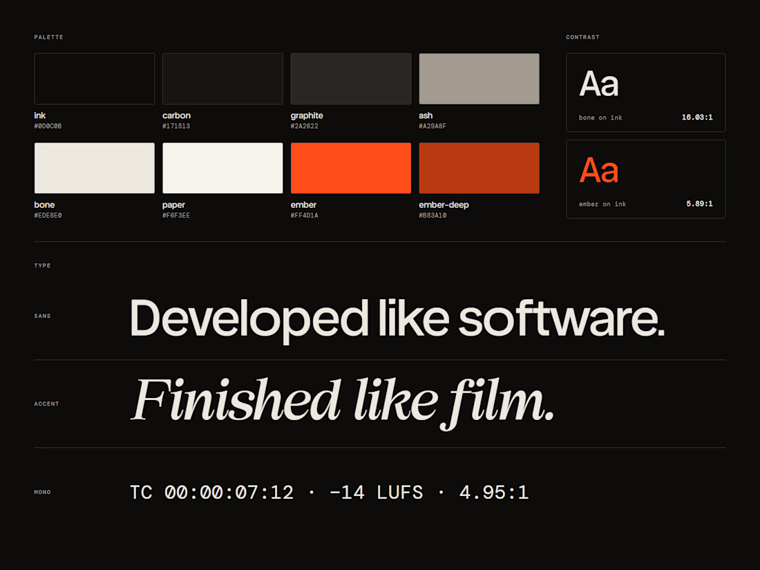
firendev: brand identity and website.
firendev is a video studio, and the name carries the whole brand. Fire, for the spark that starts every piece. Firenze, for a craft measured with proportion and geometry. Develop, in its two senses: developing film and developing software. One line holds it together: developed like software, finished like film.
Everything else grows from that. The spark is the dot of the i. The floor is the herringbone brick of Florence's Duomo. The mark is a camera frame waiting for its spark.
I'd love your honest take on the mark and the hero.
Full case study: https://contra.com/p/bWEMrvZW-firendev-brand-identity-and-website




It's a great design 🔥
I liked the animation in Hero; I'm curious which library you used.

A set of three social media designs created for the same café brand, featuring a consistent visual style, engaging layouts, and cohesive branding across the campaign.

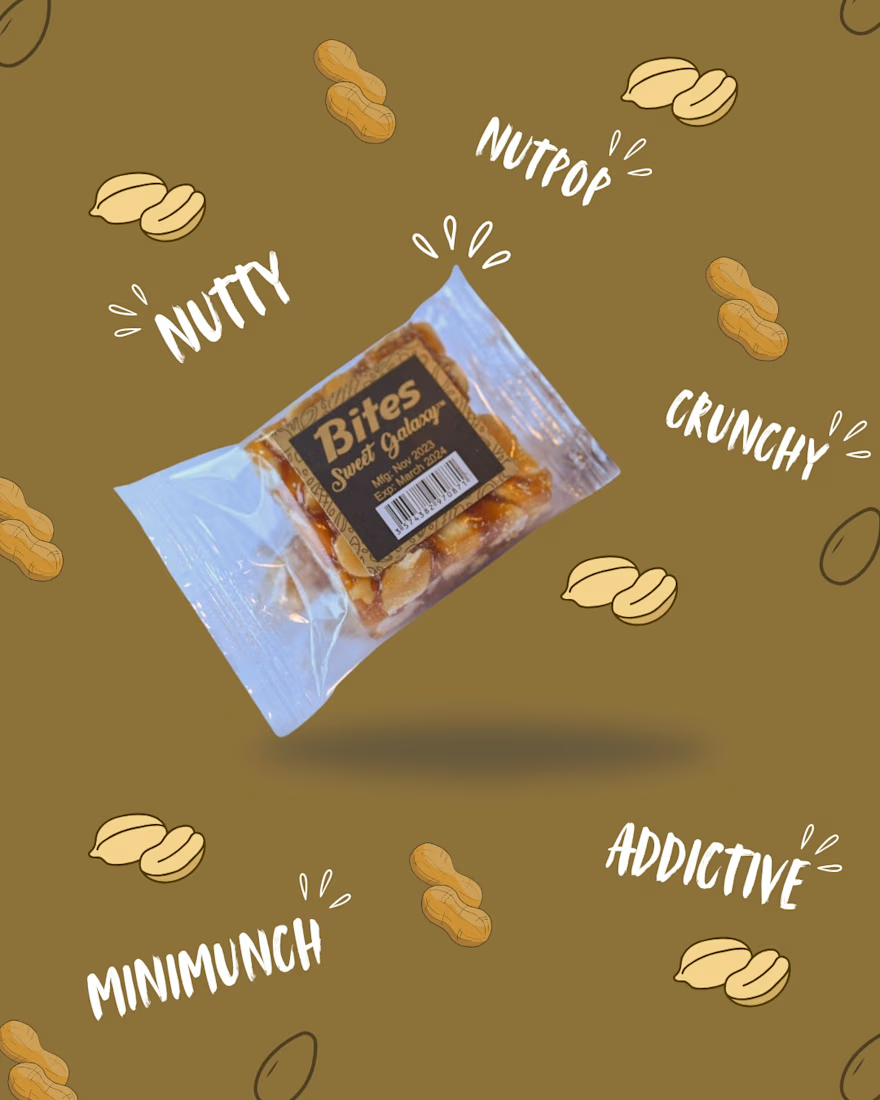
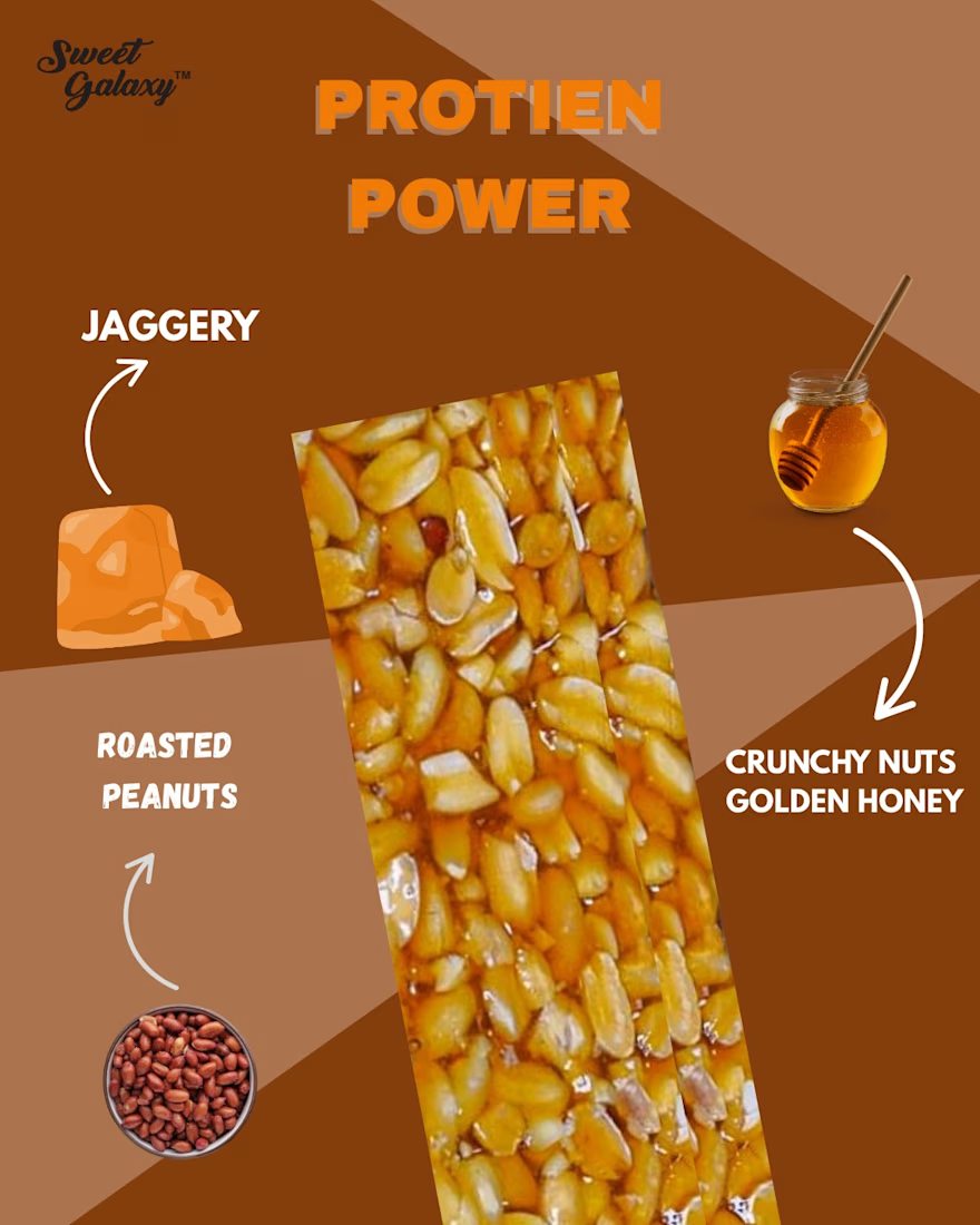
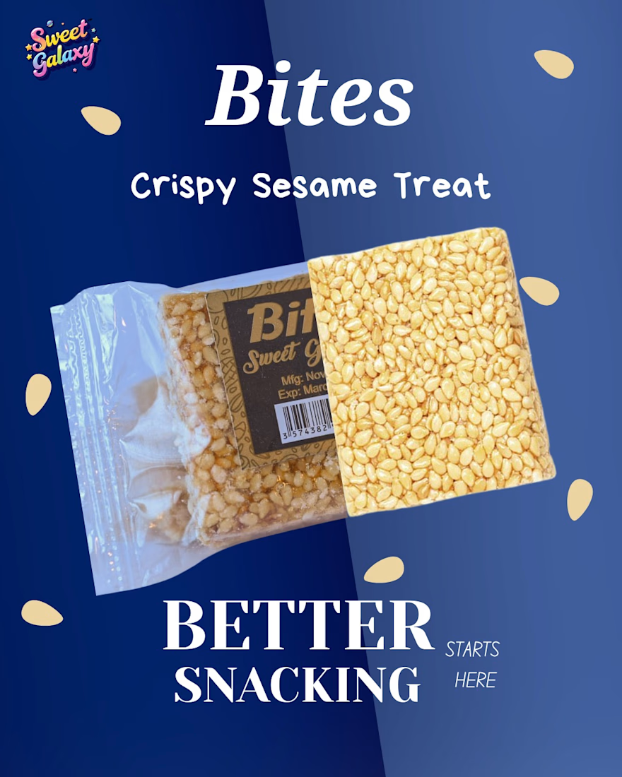

Very playful and cohesive branding! Love the warm colours and fun typography. 🥜✨