The network for creativity
Join 1.25M professional creatives like you
Connect with clients, get discovered, and run your business 100% commission-free
Creatives on Contra have earned over $150M and we are just getting started
Back to feedPost
Taste Test

Ok so I always felt that my portfolio was not mine, so I started working on it's redesign (a no ending work it seems), and I want to have your insights on these versions, (They still need polishing but would love to decide a direction before doing it) I wanted to ask y'all which version you like the most? What it makes you feel? Is there any version that make you trust more? Is it clear enough what I do? Anything else you want to add?
All insights are well received and I love when you put your thoughts into a lovely comment!

3 voted
15%
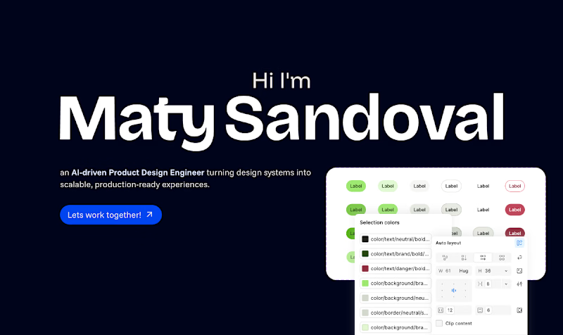
17 voted
85%
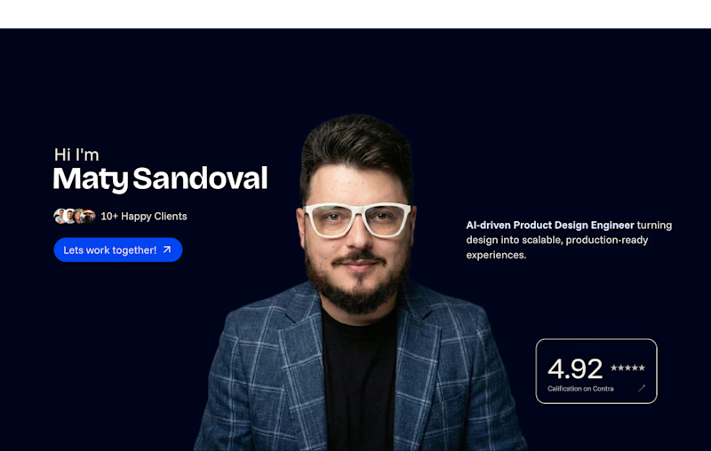
20 votes
Closed

Design System Hero, easily. Personal hero shots work great once someone already trusts you, but a design-system-first opener tells a stranger what you actually do in the first two seconds, which matters more for cold traffic. Is this mainly getting seen by warm referrals or cold visitors right now?
This is more a redesign of my personal portfolio, I’m looking for something that feels like me but yet communicates correctly. Thanks for your feedback

personal one is good
Thanks for voting! I would love to know why you picked that option

Going With Personal Hero
Thanks you so much! Is there a reason behind why you chose that version?

I really like the personal hero, it adds a closeness and reassurance that someone is actually going to care about your project.
Thanks a lot for your insights! It's actually what I'm looking to communicate, I'm real, I'm here, I'm human

personal!
Thanks for voting! Can you tell me why you chose that version over the other one?

Hi Maty, I totally understand what it’s like to work on your own portfolio, it’s one of the hardest things to work on because you’re never really satisfied with it! :D
I voted for “Personal Hero”, I prefer it because it gives the portfolio more of your own identity. In the...
This is huge! thank you so much I really didn't thought about that, besides of the name it can be anyone else's loved this comment!
Yes, exactly! I’m so glad you found it useful. I’m always happy to help whenever I can :)


Personal hero feels more like you.
The network for creativity
Join 1.25M professional creatives like you
Connect with clients, get discovered, and run your business 100% commission-free
Creatives on Contra have earned over $150M and we are just getting started





Related posts

Which hero visual feels right for this brand?
While working on the homepage for Halfspace, a website design and SEO agency, I explored two different hero visuals for the same headline and layout. Same message, same structure, just a different visual metaphor and mood.
Option 1 - Rocket Launch. Bold, literal, and energetic, visually reinforcing the "launch your business" message with motion and fire.
Option 2 - Glass Cube. Abstract, sleek, and premium, giving a more refined, tech-forward feel without relying on a literal metaphor.
Would love your honest UX/UI take, which direction feels more impactful, memorable, and aligned with a web design/SEO brand, and why?
11 voted
41%
16 voted
59%
27 votes
Closed

Both design are great; it's hard to choose one





Option B feels nothing but premium

Two cuts of the same Outlier promo. 24 seconds each, one framed wide, one framed for the phone. 1 or 2. Why?🤔
8 voted
50%
8 voted
50%
16 votes
Closed

Going with 2. Most people will watch it on their phone anyway and the tighter framing feels punchier. 1 looks more cinematic though.