The network for creativity
Join 1.25M professional creatives like you
Connect with clients, get discovered, and run your business 100% commission-free
Creatives on Contra have earned over $150M and we are just getting started
Back to feedPost
UI/UX Portfolio Website — Built with Google Stitch
Project Links
Google Stitch Project
Live Prototype
What I Built
I designed and developed a modern personal UI/UX portfolio website that showcases my work, design process, services, achievements, and professional experience.
The goal was to create a portfolio that feels unique, memorable, and highly personal rather than relying on the common portfolio templates found across the web. The final experience combines editorial typography, premium visual design, interactive project showcases, and a strong personal brand identity.
The Problem
As a UI/UX designer, I wanted a portfolio that truly reflected my design philosophy and differentiated me from the countless portfolio websites that follow the same layouts, patterns, and visual styles.
While researching inspiration, I noticed that many portfolio websites looked similar and lacked originality. I needed a faster way to explore creative directions, test ideas, iterate on layouts, and build something that felt distinctive without spending weeks creating every concept from scratch.
How I Used Google Stitch
Google Stitch became the core design tool throughout the project.
I used Stitch to:
Generate initial portfolio concepts
Explore multiple layout directions
Design and refine individual sections
Experiment with typography and visual hierarchy
Iterate on project showcase layouts
Improve spacing, composition, and structure
Continuously refine the overall experience through prompt-driven design iterations
Rather than generating a single design and stopping, I used Stitch as an iterative creative partner throughout the entire process.
Each section of the website was designed, reviewed, refined, and improved step by step using Stitch.
Outcome
The final result is a distinctive personal portfolio website that effectively showcases my work and design thinking while avoiding the generic patterns commonly seen in portfolio design.
Google Stitch significantly accelerated the creative process by helping me move rapidly from concept exploration to polished visual execution. Instead of spending hours creating and rebuilding layouts manually, I was able to iterate quickly, test ideas, refine designs, and focus on creating a stronger overall user experience.
This project demonstrates how AI-assisted design workflows can help designers explore ideas faster, improve creative decision-making, and build high-quality digital products more efficiently.
Feedback on Google Stitch
My experience with Google Stitch was extremely positive. The ability to generate, iterate, and refine designs through natural language prompts made the design process significantly faster and more flexible.
The biggest advantage was rapid experimentation. Stitch allowed me to explore multiple directions, refine individual sections, and continuously improve the experience without restarting from scratch.
For UI/UX designers, Stitch is especially valuable during the concepting and early design phases because it dramatically reduces the time required to move from ideas to visual solutions.


Didn’t think the bar could go higher and then you posted this.

Thank you!

Really like this, especially the intention of breaking away from generic portfolio templates. The focus on personal design language and iteration shows through clearly in the structure.
I also joined the challenge and explored a different direction in Stitch

on.contra.com
Introducing Voya: Revolutionize Your Travel Planning Experience
Connect with next-gen talent and tools to get work underway. Hire more independents. Start more projects. Get more creative.
Thanksss!!
The network for creativity
Join 1.25M professional creatives like you
Connect with clients, get discovered, and run your business 100% commission-free
Creatives on Contra have earned over $150M and we are just getting started







Related posts

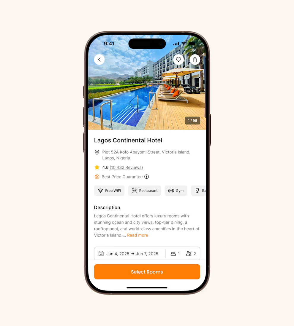
Hotel details screen for a booking app I’ve been designing.
Focused on clear information hierarchy, visual comfort, and helping users make quick booking decisions.
Excited to start sharing my work here 🚀


It's basic design but it's great❤️

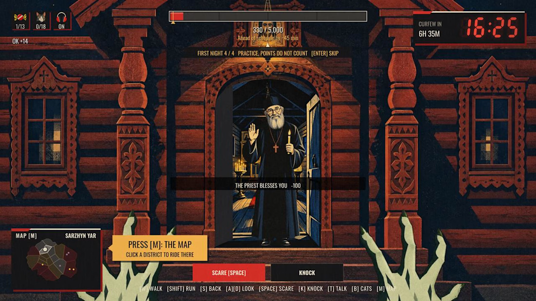
Night Quota – a Halloween game about my hometown
Monsters work one night a year. In Kharkiv, that night ends at 11 p.m. Not because of monsters. Because of the curfew.
Pick one of four monsters, walk the streets, scare people, knock on doors, and hit your quota before dawn. After eleven the streets empty and the job gets harder.
I’m from Kharkiv and I miss it, so I rebuilt it as a game. 18 districts, each started from my own photo of a real street and drawn as a constructivist poster, the style the city is known for. Every district has a local with a story about Kharkiv. The passers-by are people I love: my friends, my daughter as a little witch, and my cat Lisa, who hides in every district.
Features used: Rive CLI + GPU Canvas (both), Scripting, Data Binding, State Machines.
How it’s made
• Rive CLI + Claude Code: I’m a designer, not a game developer. I described the game, the agent wrote it, I watched the live preview and corrected it.
• RML for the scenes, Luau scripting for the logic: the night clock, the districts, the scares, the dialogues.
• GPU Canvas: one WGSL shader over the whole game. Curfew frame, searchlights, air-raid flash, a camera shutter for cat photos, the dawn report developing out of a halftone raster.
• Data Binding drives the HUD, State Machines run the buttons.
• Rive Editor to play it and check every screen.
• Higgsfield for character art, from my own references and photos.
Play it on desktop, with a keyboard and mouse.
Give it about 20 seconds to load, the whole city is in there.


The combination of clawed hands and the friendly priest is awesome! 😂🔥

A generative ambient station of drones, rain, and distant thunder.
I built this project to test A generative ambient station of drones, rain, and distant thunder. The core engineering challenge was sustaining uncompromised 60 FPS rendering using Web Audio API while handling continuous user interaction without framework overhead.
WHAT I WAS TESTING:
I focused on two core engineering benchmarks:
Continuous algorithmic generative music that never repeats, with sub-bass drone layers
Atmospheric rain, vinyl static, and distant thunder audio synthesis
THE TECHNICAL SIDE:
Built entirely with native Web Audio AudioNodes. Oscillators tuned to just-intonation intervals modulate lowpass filters, while brownian noise generates random rain and thunder rumbles.
Everything executes in the browser using Web Audio API, Generative Ambient Synthesis, Binaural Noise Engine. No third-party frameworks, no heavy runtime bundles, and zero external tracking.
WHAT I LEARNED:
Audio clipping easily occurs when multiple generative sound layers peak concurrently. Implementing a master dynamics compressor node preserved acoustic clarity.
Finding the sweet spot between mathematical precision and frame budget took careful profiling, but the result runs at a steady 60 FPS even on modest hardware.
TRY IT YOURSELF:
The live build is deployed on my JSFiddle. Open it in your browser, test the controls, and observe the render response times.
If you are building high-performance 3D, physics, or creative web systems and want to collaborate, reach out here on Contra.


its real?