The network for creativity
Join 1.25M professional creatives like you
Connect with clients, get discovered, and run your business 100% commission-free
Creatives on Contra have earned over $150M and we are just getting started
Back to feedPost

Tiya Beauty — Premium Brand Identity for Fresh, Fruit-Powered Skincare
A vibrant, elevated brand identity created for Tiya Beauty, an Australian skincare brand focused on fresh fruit-based cosmetics for healthy, naturally radiant skin.
The objective was to build a visual world that feels fresh, premium, feminine, modern, and naturally luxurious—while communicating the energy of fruit-powered skincare and the quality expected from a contemporary beauty brand.
Creative Direction
The identity combines deep emerald green, soft cream, peach, grapefruit, warm sand, and botanical tones to create a distinctive balance between nature and sophistication.
The existing Tiya Beauty logo became the foundation for a broader visual system built around fresh ingredients, healthy skin, Australian lifestyle, and modern beauty culture.
Elegant editorial typography, sunlit product photography, botanical details, fruit-inspired color accents, and refined packaging create a brand experience that feels premium without losing its natural freshness.
Brand Concept
Fresh ingredients. Radiant skin.
Tiya Beauty is positioned as more than a cosmetics brand. The identity communicates a lifestyle centered around healthy skin, natural ingredients, freshness, self-care, and effortless beauty.
The visual system was designed to feel aspirational enough for premium skincare while remaining bright, approachable, and relevant to modern beauty consumers.


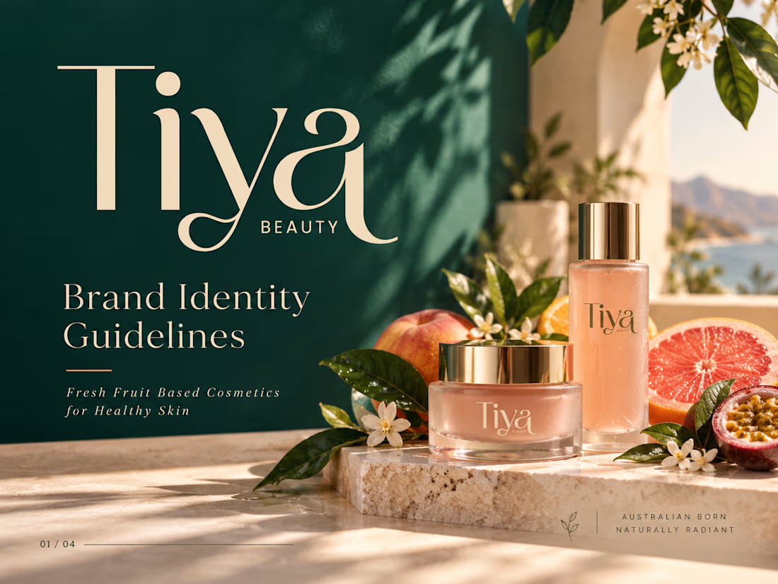
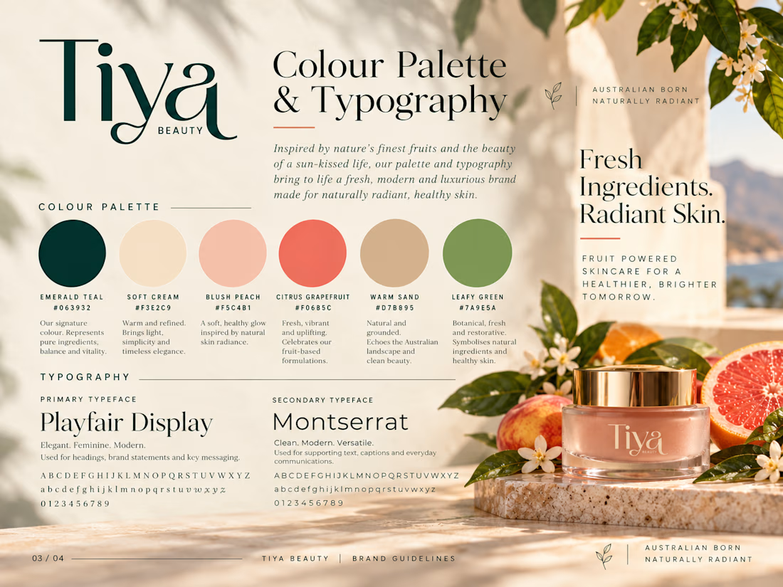
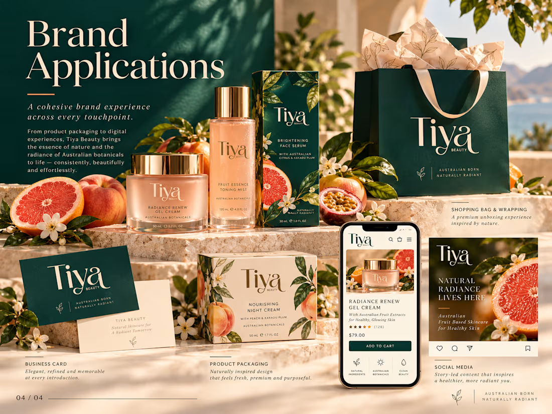

The emerald and grapefruit pairing feels fresh without going candy-colored, which is a hard line to walk with fruit skincare. On the ecommerce side, brands like this often win on the PDP when each fruit gets its own illustration or macro shot tied to a specific benefit. Are you...
The network for creativity
Join 1.25M professional creatives like you
Connect with clients, get discovered, and run your business 100% commission-free
Creatives on Contra have earned over $150M and we are just getting started





Related posts

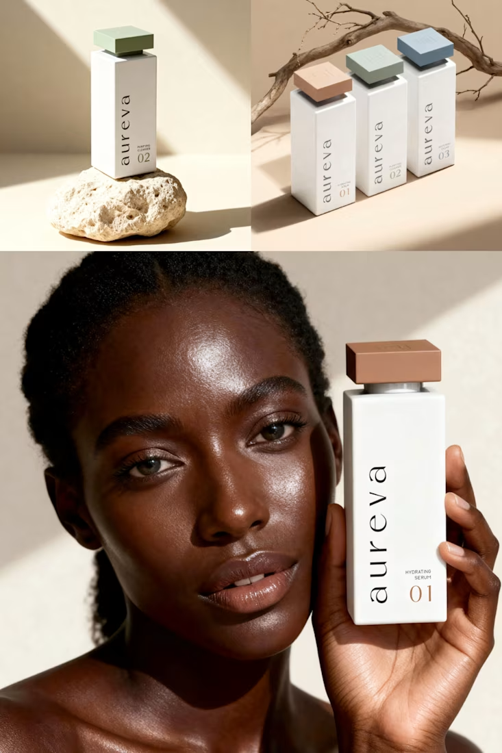
A closer look at Aureva, a Paris-based skincare brand I worked on.
The brief was to create a brand identity and packaging that felt premium yet approachable. I paired distinctive typography with soft earth tones, using color to give each product its own place within the range.
The full case study is now on my profile.

Premium branding

Solene: skincare e commerce website, built in Framer
Skincare shopping should feel as good as the routine itself. For Solene, I designed and built a full online store with a soft, warm identity: a bold maroon and pink palette, big expressive type and real-skin photography.
What's inside:
A hero that sets the brand tone straight away
A Bestsellers section for quick browsing
Category pages for Cleanse, Hydrate and Protect
A shop page with price slider, filters, sorting and hover image previews
An Our Story page with brand values
A clean, confident footer
Need a website for your beauty or lifestyle brand? Let's talk.


The hover image previews on the shop page caught my eye - they let shoppers sense texture instantly without an extra click.

Zyro - Activewear and Fitness Brand