The network for creativity
Join 1.25M professional creatives like you
Connect with clients, get discovered, and run your business 100% commission-free
Creatives on Contra have earned over $150M and we are just getting started
Back to feedPost

Vestra is a residential construction firm outside Amsterdam with nine years of solid, disciplined work. But almost no visibility. Good execution wasn't the problem. Perception was.
Challenge
Every tender Vestra submitted looked like every other contractor's tender. A generic logo, a template deck, a PDF that got skimmed once and set aside. Developers weren't comparing build quality, they were comparing brand presence, and Vestra had none. The firm was losing bids to companies with weaker portfolios simply because they looked more established.
Process
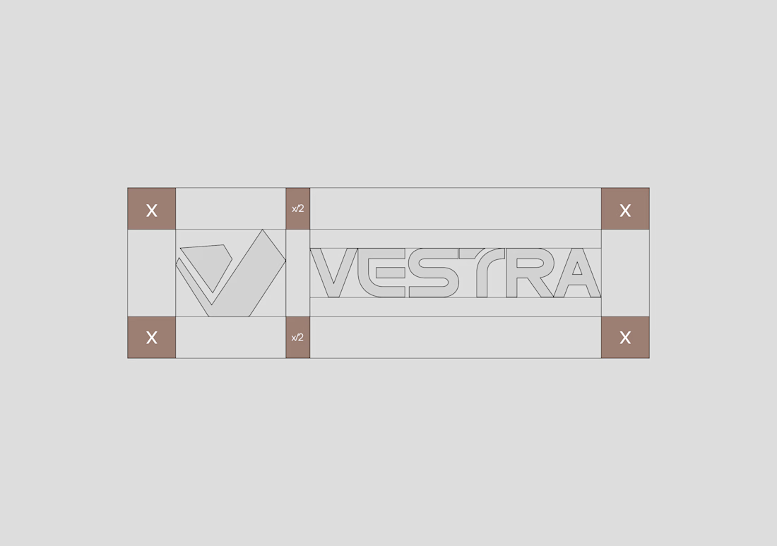
The starting point was the company name itself. We built the mark as an extension of the initial "V" shaped and angled to read as architectural form rather than typography. Every fold in the mark had to hold up as a structural line, not just a stylistic one.
Solution
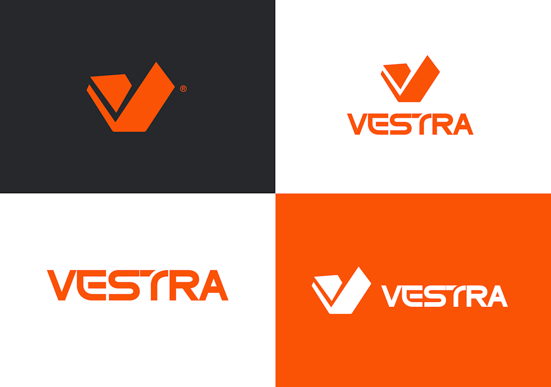
A complete identity system built around a single mark: the "V" rendered as an architectural silhouette, sharp angles, clean intersections, a shape that reads as building as much as it reads as letter. Paired with a bold, structural wordmark, the identity carries across every surface; site signage, tender covers, stationery, with the same disciplined geometry.


The network for creativity
Join 1.25M professional creatives like you
Connect with clients, get discovered, and run your business 100% commission-free
Creatives on Contra have earned over $150M and we are just getting started
Trending
retrofuturism
Share your favorite designs from the past exploring the distant future. Or your own take on the aesthetic 🚀
halftone
Dots. Texture. Grain. Let's see your designs using the halftone technique.

Midjourney
Creatives are showing off what they're making with Midjourney.
colorgrade
Video editors sound off: How do you enhance the mood of your video in color grading?
Related posts


I needed to repost something about how the imagery and colors combine with the logo here. I really love this branding I created.

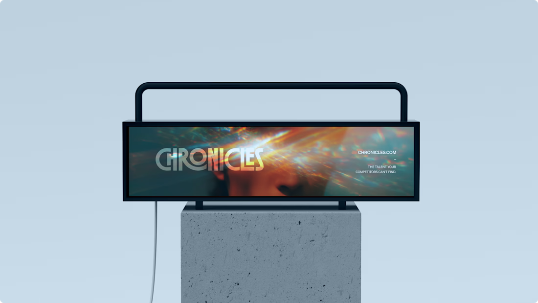
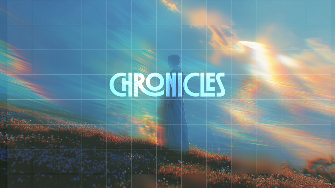
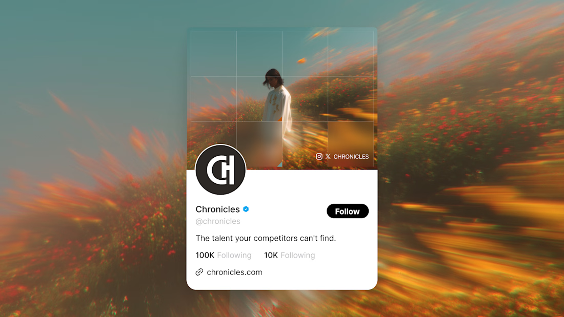
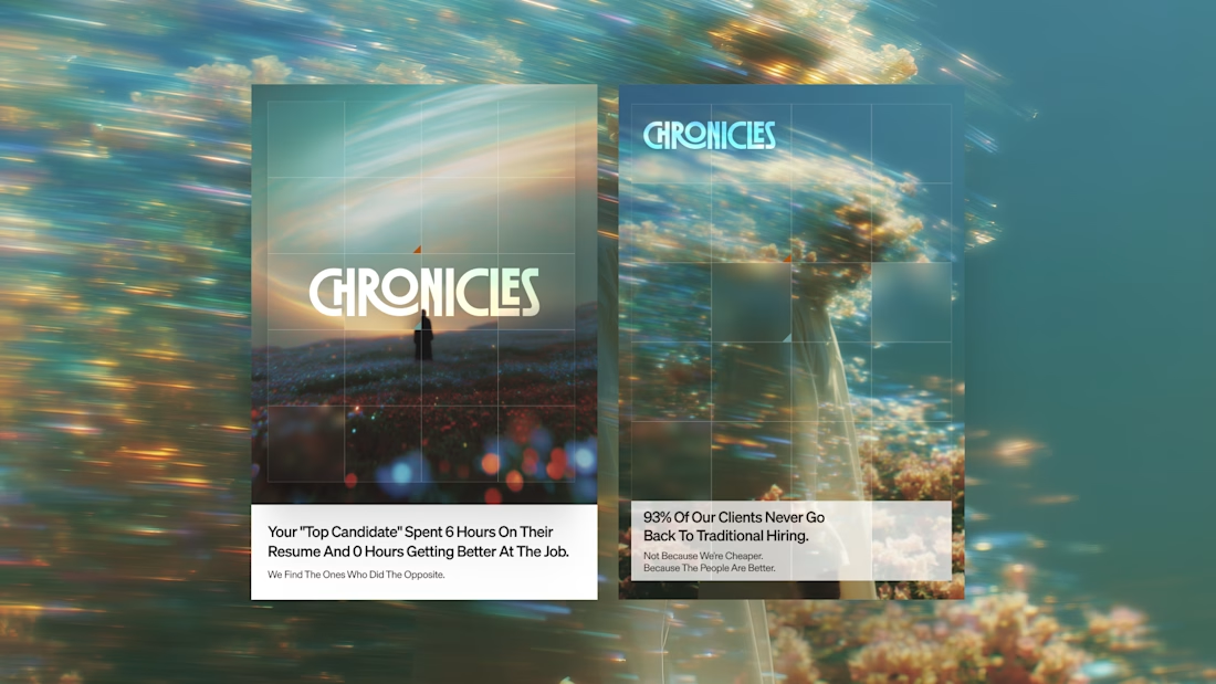

Really nice, @Daniel G Bright 👍

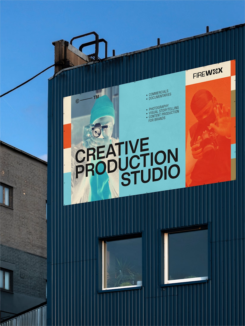
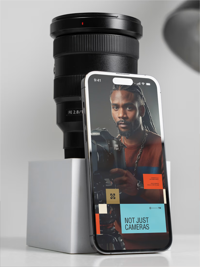
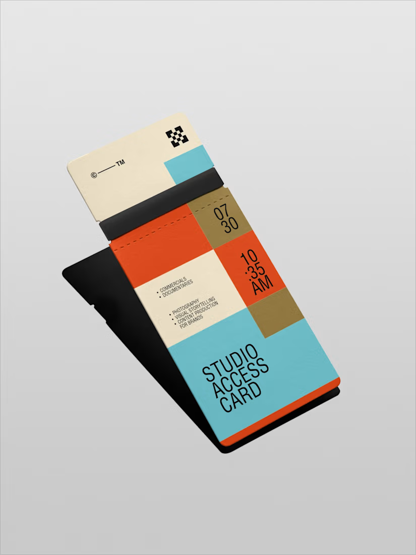
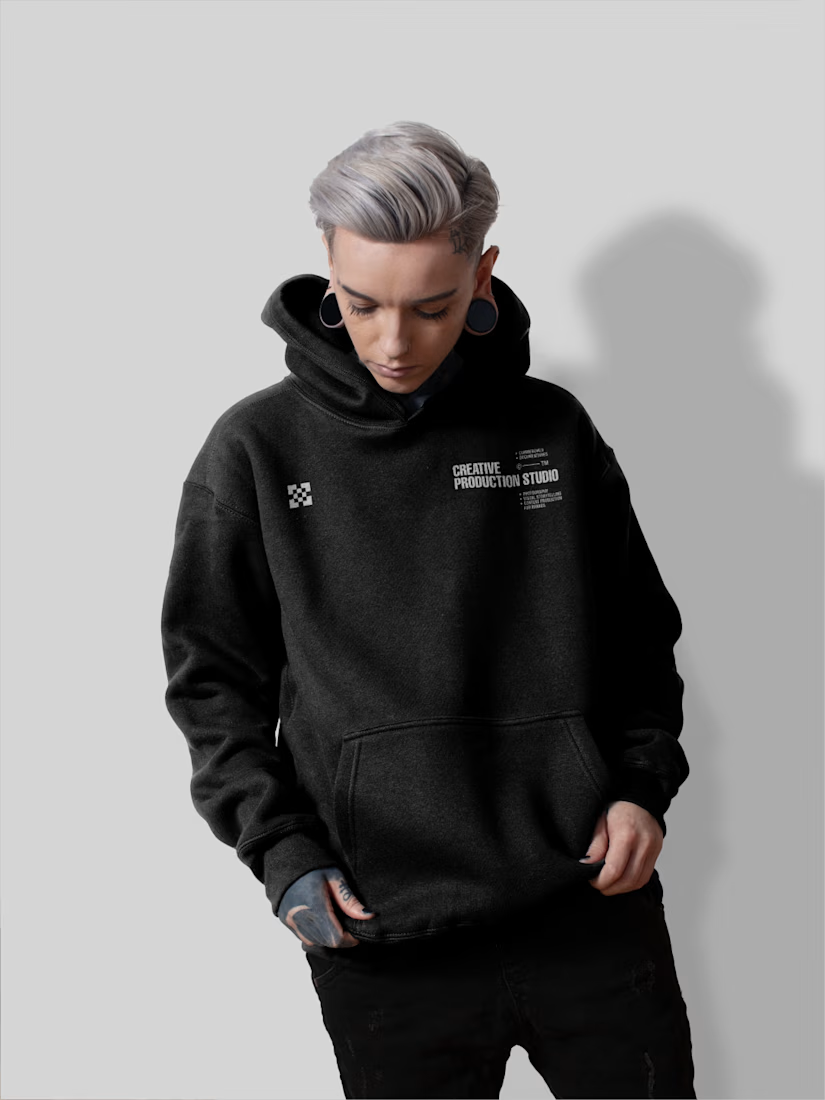
What happens when you treat a pixel not as the smallest thing in the room, but as the most important?
You get FIREWOX Studios.
I did not approach this as a branding exercise. I approached it as a declaration. Every color chosen, every grid drawn, every letterform placed had to answer one question — does this belong to a studio that makes work worth remembering? Anything less than yes did not make the cut.
The pixel became the foundation. Not as a style reference. As a philosophy. Every film ever made, every photograph ever taken is nothing but a precise arrangement of pixels making a decision together. I wanted FIREWOX to operate the same way. Deliberate. Structured. Every element doing exactly what it was put there to do.
The pixel pattern, the six-color system, the weighted logotype — none of it is decoration. It is infrastructure. Built to hold its character across every surface, every format, every context — without flinching.
I did not design a brand. I constructed a frame.
Full case study here: https://www.behance.net/gallery/253226945/FIREWOX-Studios-Brand-Identity
PhotographystudiologocommercialdesignBrand DesignLogo DesignAdobe IllustratorAdobe PhotoshopAdobe Suite


Super cool work 🙌

Your Brand Is Speaking Before You Do
Customers form an opinion about your business before they ever experience your product or service.
That opinion is shaped by your brand.
Not just the logo.
Not just the colours.
The entire identity.
Barbr Bento Motion was created to explore how a complete branding system can shape that perception through consistency, structure, and purposeful motion.
Instead of presenting individual assets, we focused on revealing how every piece of the identity - from typography and colour to brand applications and supporting graphics - works together to communicate one clear message:
Professional businesses build professional brands.
Because the strongest brands don't simply look premium.
They make customers feel confident enough to choose them.
If your visual identity isn't communicating your business's value, it may already be costing you opportunities before the first conversation begins.
Looking for a brand identity that helps your business earn trust, attract better customers, and stand out in a crowded market? Let's build a brand that works as hard as you do.