The network for creativity
Join 1.25M professional creatives like you
Connect with clients, get discovered, and run your business 100% commission-free
Creatives on Contra have earned over $150M and we are just getting started
Back to feedPost
Taste Test

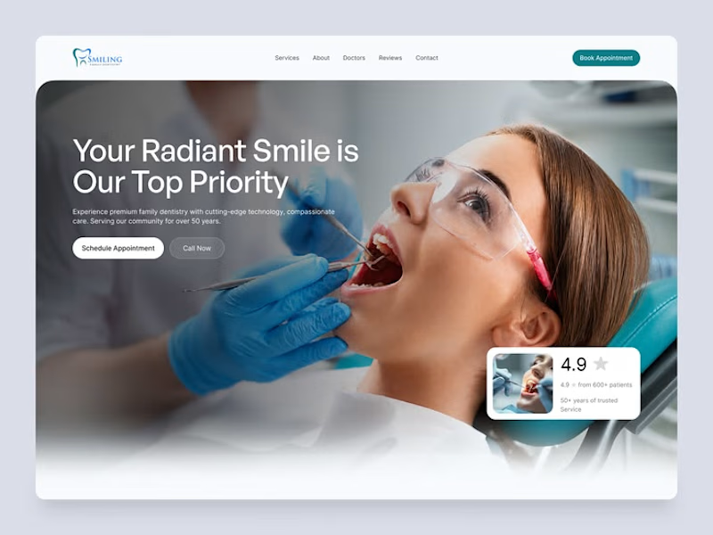
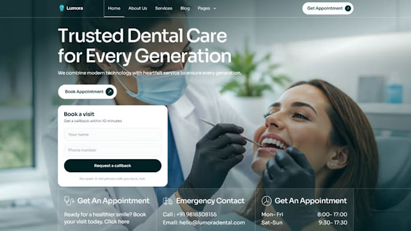
Modern dental clinic website design focused on trust, comfort, and easy appointment booking.
Clean medical layout, professional visuals, and clear calls-to-action designed to reassure patients and convert visitors into booked appointments.
5 votes
Ends in 1d

The booking panel sitting in the hero makes the next step obvious without crowding the smile photo. Trust reads clearly from the type and those calm medical tones.


easy appointment booking on a dental site is smart. option 1 or 2?
The network for creativity
Join 1.25M professional creatives like you
Connect with clients, get discovered, and run your business 100% commission-free
Creatives on Contra have earned over $150M and we are just getting started

Challenges
View all


Related posts

Working on the homepage for Still Blooming, a wedding and floral studio, I explored two different layout directions for the hero section. Same brand, same copy, just a different structure and visual rhythm.
Option 1 : Left Aligned. Text sits on the left with supporting content beside it, giving an editorial, asymmetrical feel.
Option 2 : Centered. Everything is stacked and centered, giving a clean, balanced, more classic hero layout.
Would love your honest UX/UI take which direction feels more elegant, functional, and true to a wedding/floral brand, and why?
22 voted
41%
32 voted
59%
54 votes
Closed

Great Design :)

Designed a dashboard concept for tracking net worth across every asset type — stocks, crypto, property, pensions, funds, cash, and liabilities — all in one place.
Instead of the usual pie chart or bar graph, the centerpiece is a dial: a single, glanceable gauge showing where your wealth actually sits. Behind it, a quiet grid of every asset category fades in and out of visibility, reinforcing that everything's accounted for even when it's not the focus.
Dark UI, a single confident green accent, and a lot of negative space — built to make a genuinely overwhelming task (seeing your entire financial picture at once) feel calm instead of cluttered.


wow the animation feels super smooth, what is this animation for?