The network for creativity
Join 1.25M professional creatives like you
Connect with clients, get discovered, and run your business 100% commission-free
Creatives on Contra have earned over $150M and we are just getting started
Back to feedPost
Taste Test


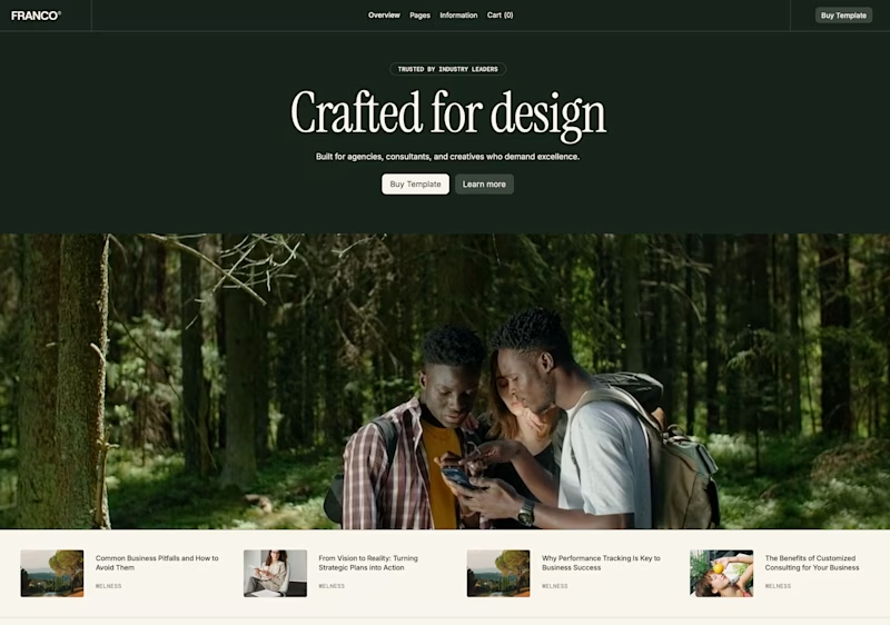
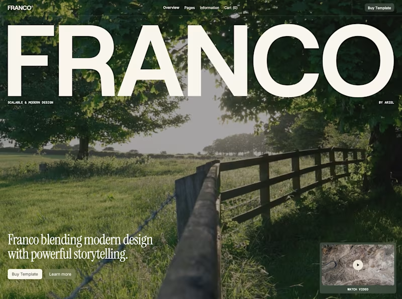

The small treatment feels more editorial and lets the imagery breathe, while the oversized version turns the name into the experience. I’d choose based on whether the brand wants quiet confidence or an intentionally maximal first impression.


Typography is usually an expression of the brand itself. It's not about the size of the font but more about the personality of the brand it's audience. The personality of the brand is what defines the typography style and size, not the feeling of. This being said, both the designs are nicely done 👍 .

bold one

Bold for me. The oversized name gives it character, and the landscape keeps it from feeling crowded.

Bold, but only because that photo has enough negative space to carry it. If the background were busier I'd flip to Classic without hesitating. Is the rest of the site leaning more editorial or more portfolio grid?


name across the whole screen, every time
The network for creativity
Join 1.25M professional creatives like you
Connect with clients, get discovered, and run your business 100% commission-free
Creatives on Contra have earned over $150M and we are just getting started
Trending
retrofuturism
Share your favorite designs from the past exploring the distant future. Or your own take on the aesthetic 🚀
halftone
Dots. Texture. Grain. Let's see your designs using the halftone technique.

Midjourney
Creatives are showing off what they're making with Midjourney.
colorgrade
Video editors sound off: How do you enhance the mood of your video in color grading?
Related posts

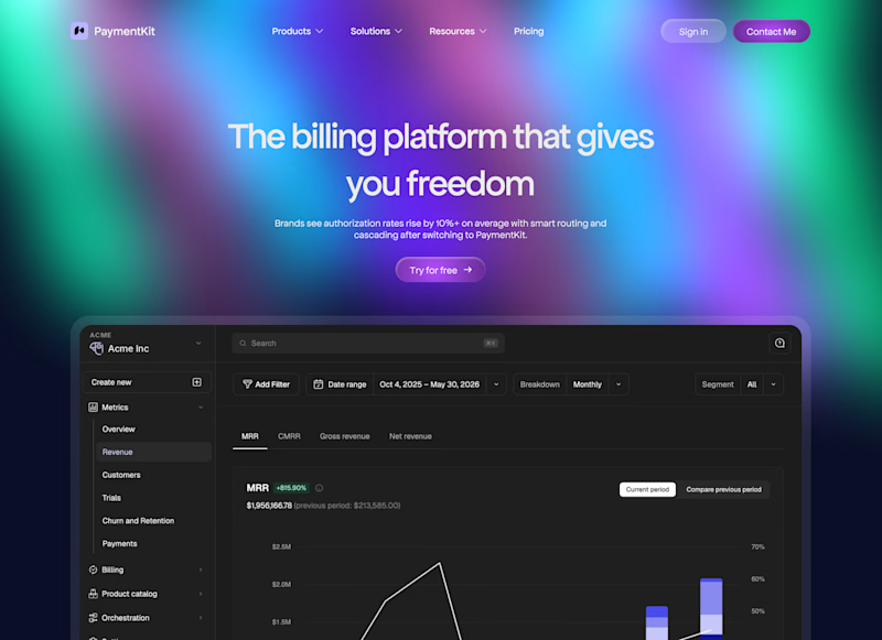
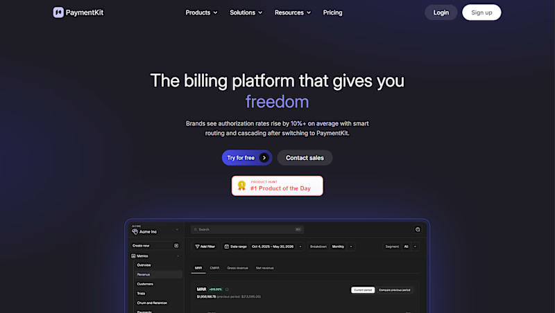
While working on a website, I explored two different approaches for the header design. Same brand, same content, just a different feel and interaction style.
Option 1 - Classic
Option 2 - Modern
Would love your honest UX/UI take, which direction feels cleaner, more functional, and better suited for the overall experience, and why?
7 voted
23%
23 voted
77%
30 votes
Closed

Modern gives a really good feeling and make everything is clear


Wonderful

What does the exact moment you fell for this craft actually look like?
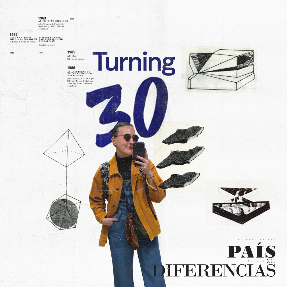
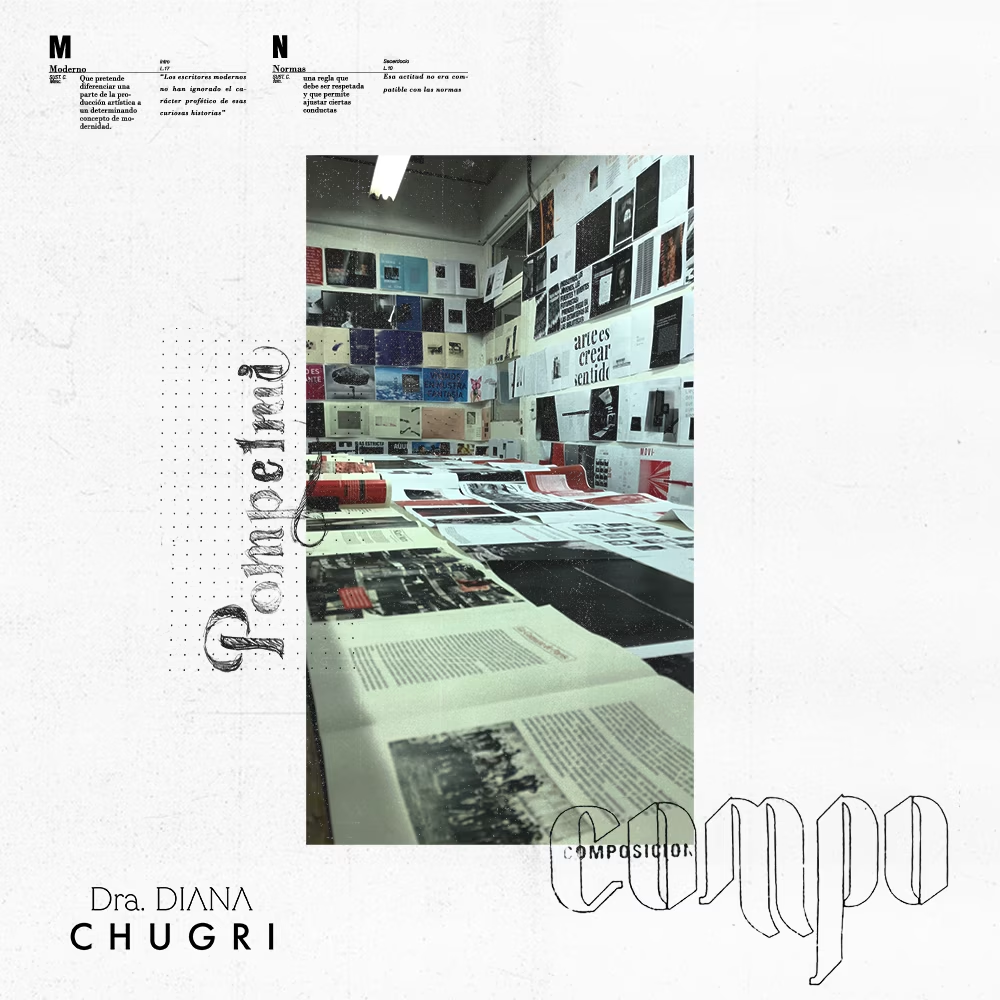
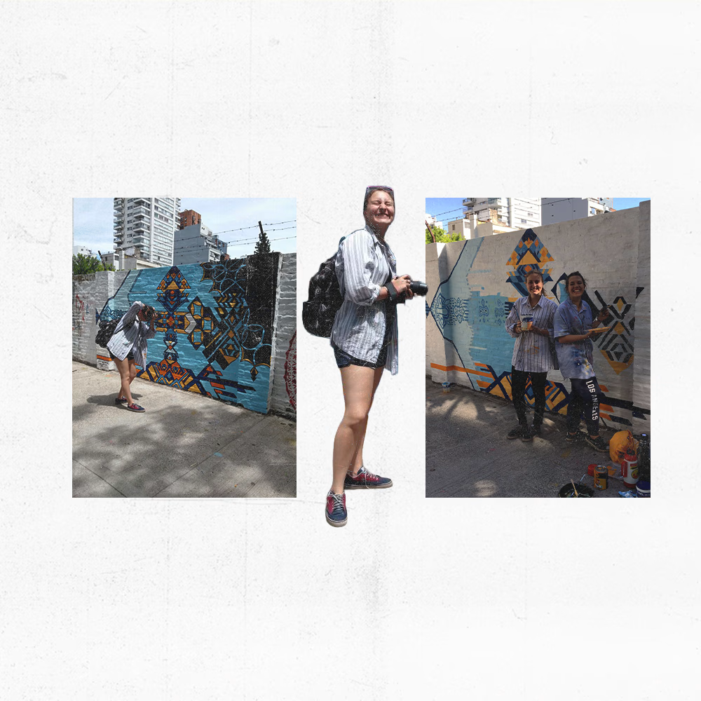
I turn 30 on the 25th this month, which puts me a decade out from the university where all of this actually started. 🤯
This collages keep alive that era exactly as I remember it: the all nighters that blurred into the next morning's class, the first typeface I picked apart just to understand why it worked, my first real typographic composition, the friends who shared this with me and the illustrations I was too nervous to show anyone at the time.
None of it was good yet. But every decision I make now traces back to those lovely moments which I now treasure 🥹
What's the first project that made you realize this was it for you?

For me it was an early identity project where I ended up hand drawing every icon because nothing off the shelf fit the brand. The set was rough, but watching someone navigate the work using marks I had invented was the first time design felt less like decoration and more like a...