The network for creativity
Join 1.25M professional creatives like you
Connect with clients, get discovered, and run your business 100% commission-free
Creatives on Contra have earned over $150M and we are just getting started
Back to feedPost
Taste Test
While working on a website, I explored two different approaches for the header design. Same brand, same content, just a different feel and interaction style.
Option 1 - Classic
Option 2 - Modern
Would love your honest UX/UI take, which direction feels cleaner, more functional, and better suited for the overall experience, and why?
7 voted
23%
23 voted
77%
30 votes
Closed

Modern for me. Feels cleaner and more immersive

modern is great one


option 2 feels easier to scan

thanks @Benjamin C 😊

Awesome work
thanks @Aal Khalid 🙌

Modern gives a really good feeling and make everything is clear
thanks for the feedback @Mohamed Sharaf 😊

i think modern works well to this type of site content


Voted Modern, but not on taste. Classic asks the visitor to read the photo and then go hunting for what to do; Modern puts the venue name and one yellow action inside the first screen, so on a phone the tappable thing is above the fold. For a music venue that header has one job...

Classic🔥

modern wins for me, clear visuals
You're welcome

This looks amazing!

Modern has my vote too. Highlighting "Birchmere" in yellow anchors the eye immediately, while the classic version lets the headline blend into the background photo a bit too much.

Yep modern is modern! 🔥

I would choose Option 2. There is a sense of urgency. Bold and there is quite a clear hierarchy. Well done!
The network for creativity
Join 1.25M professional creatives like you
Connect with clients, get discovered, and run your business 100% commission-free
Creatives on Contra have earned over $150M and we are just getting started











Related posts

I’ve been working on a bold, modern-retro logotype and can’t decide between these two options.
🆘 Which one feels more aesthetically pleasing to you?

11 voted
26%
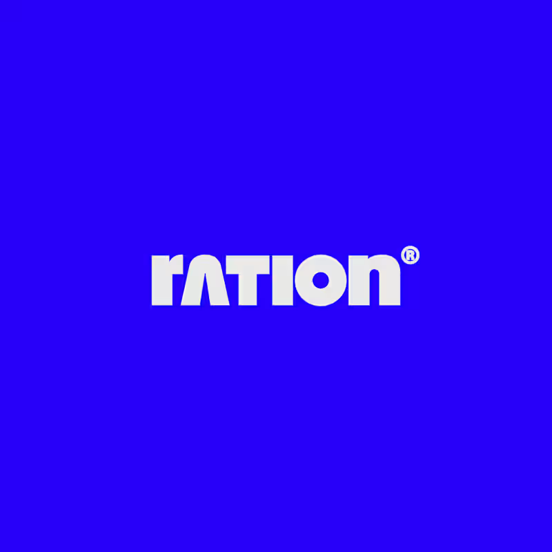
31 voted
74%
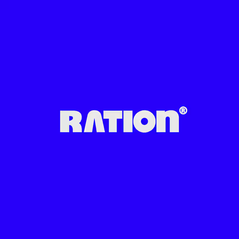
42 votes
Closed

CAPITAL is great but SMALL is unique great job Nawras 🔥🔥

AI can build the UI in minutes.
Bringing it up to a good standard, still needs a designer. Agree or disagree?
I see some of your work and honestly your work is really premium 🎉🎉
Great job Alex🎉🎉🔥🔥


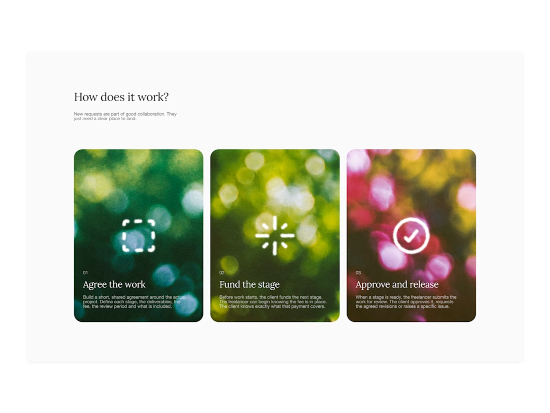

Your web sections always have such strong art direction. Great to see the brand carried right into the layout.