The network for creativity
Join 1.25M professional creatives like you
Connect with clients, get discovered, and run your business 100% commission-free
Creatives on Contra have earned over $150M and we are just getting started
Back to feedPost
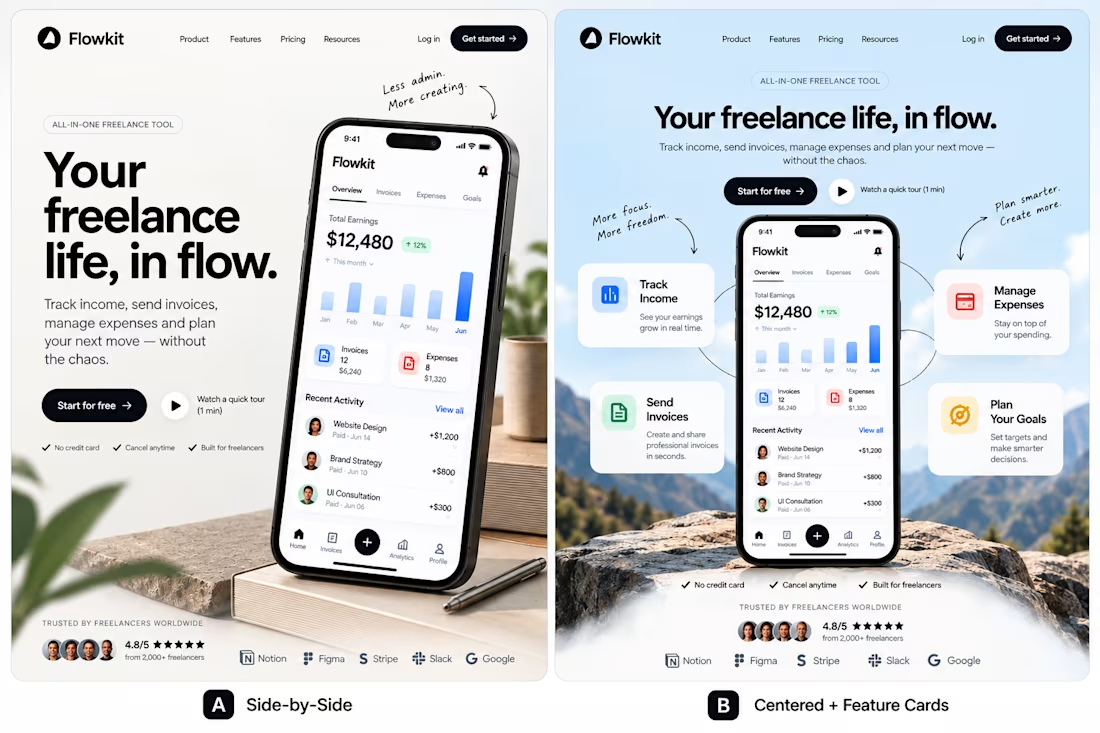
One product. Two directions. Which would you ship?
I explored two different approaches to the same landing page for Flowkit, a concept for freelancers who want to manage their finances without the extra complexity.
A — Side-by-Side: Clear hierarchy, direct messaging, and the product takes center stage.
B — Centered + Feature Cards: A more visual composition, with key features built around the product.
Both communicate the same value. The difference is how they guide attention.
My preference is A for its clarity, but B has a stronger visual presence.
Which direction would you choose, and what would make you change your mind?
I'm interested in the reasoning behind the choice, not just the vote.
If you're building a SaaS product and exploring how design can communicate value more effectively, I'd be happy to connect.
#ProductDesign #UIDesign #SaaSDesign #WebDesign #AI Agent



I’d choose A for its clarity and simplicity. For a finance product, making the value easy to understand at a glance is so important!

Absolutely agree. For a finance product, clarity should come before visual complexity. The interface should make key information easy to understand and act on without overwhelming the user.
The network for creativity
Join 1.25M professional creatives like you
Connect with clients, get discovered, and run your business 100% commission-free
Creatives on Contra have earned over $150M and we are just getting started










Related posts

Poster Club turns a simple event template into your own print. I built two working Flutter versions and recorded the same editing flow in each.
Print Room: calm, editorial, with a mounted canvas and bottom tools.
Cutout Playground: bold, playful, with loose prints and tools at the edge.
Which one would you rather use?
What made the difference?
Grab it for free:
https://contra.com/products/cUHBysMu-poster-club-free-flutter-ab-ui-kit


37 voted
60%
25 voted
40%
62 votes
Closed

Print Room looks great!!


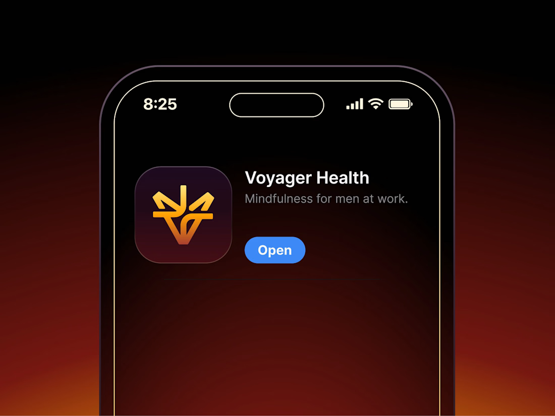

Aryna, that golden symbol pops so nicely against the plum background ✨

It’s been a minute since my last post here on Contra.
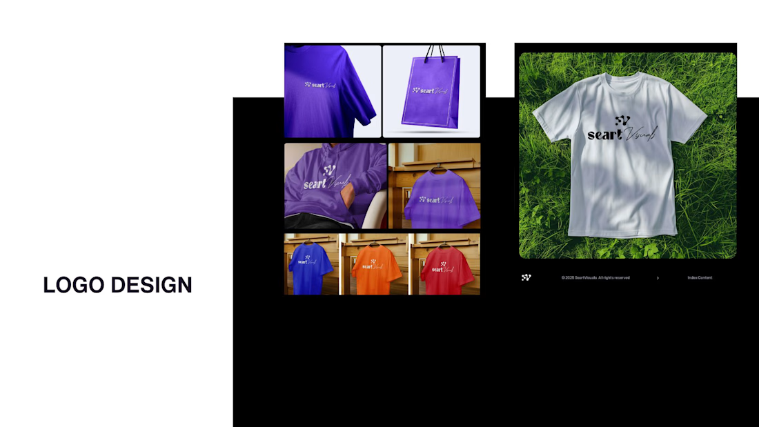
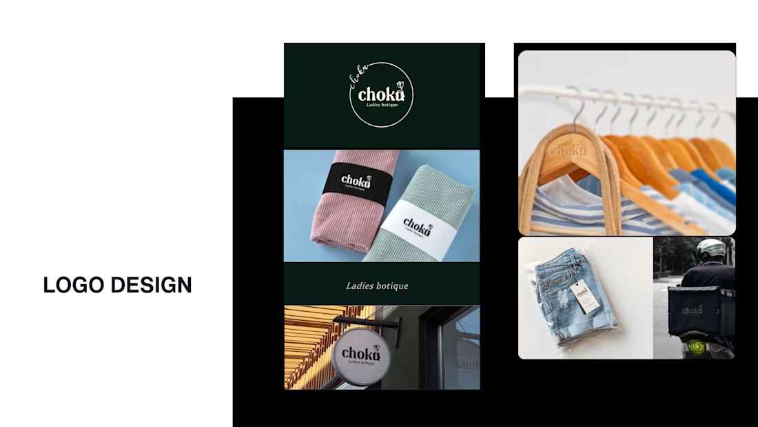
While my main focus usually lives in photo editing and digital design, I was digging through the archive recently and thought it’d be fun to share a couple of branding projects from the past:
Slide 1: Seart Visuals apparel & merchandise branding (1 year ago)
Slide 2: Choku Ladies Boutique identity and mockups (2 years ago)
Brand identity isn't my everyday lane, but tackling projects like these taught me a lot about visual consistency across different mediums. I’d love to hear your thoughts or see any feedback from fellow designers. Great to connect with the community again.



That's really great typography logo design❤️❤️