The network for creativity
Join 1.25M professional creatives like you
Connect with clients, get discovered, and run your business 100% commission-free
Creatives on Contra have earned over $150M and we are just getting started
Back to feedPost

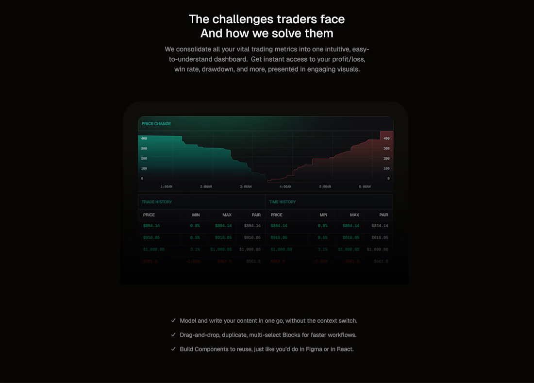
Data is only as useful as our ability to understand it.
Traders interact with enormous amounts of information, often across multiple platforms, charts, and transaction histories.
The challenge isn't necessarily the volume of information. It's the effort required to make sense of it.
When designing financial interfaces, I think about how different pieces of information relate to one another, how quickly users can recognize patterns, and how much cognitive effort is required to interpret what's happening.
In this exploration, I used data visualization, color, typography, and information hierarchy to bring trading activity into a more structured experience.
The goal is to make relationships between market movements and trading history easier to recognize without requiring users to interpret every individual data point.
Good data visualization doesn't just show you what happened. It helps you understand what you're looking at.
#ProductDesign #DataVisualization #Fintech #UIDesign #UXDesign
The network for creativity
Join 1.25M professional creatives like you
Connect with clients, get discovered, and run your business 100% commission-free
Creatives on Contra have earned over $150M and we are just getting started

Challenges
View all


Related posts

💳 Making Financial Products Feel Simple
I designed this finance website for Sendit, with one goal in mind: make everyday payments feel simple, trustworthy, and effortless.
The design focuses on:
Clear messaging and strong visual hierarchy
Trust-focused finance UI
Simple payment interactions
Clean, modern layouts
Conversion-focused sections
A responsive experience designed around the user
For fintech products, good design isn’t just about looking modern. It’s about making people feel confident when money is involved.
If you’re building a fintech, SaaS, payment platform, or financial product and need a website that communicates trust and clarity, I’d love to work with you.


Trust in fintech is won at the exact second money moves, so I like that the transfer screen leads with the amount and the timing. That is the moment hesitation creeps in, and clear numbers there do more for confidence than any hero headline.

Who said finance has to look boring?
Turning numbers, currencies and product information into something you actually want to watch.
A playful exploration of type, 3D, rhythm and motion.

Playful motion makes the financial story easier to watch.

Trading Tools — Trading Decision Platform
I built Trading Tools as a decision-support platform for traders, bringing practical calculators, risk tools, market data, and trading utilities into one place
It includes tools for PnL, position sizing, options, currency conversion, crypto market data, arbitrage, and strategy experimentation
The focus is helping traders evaluate and understand their decisions without executing trades


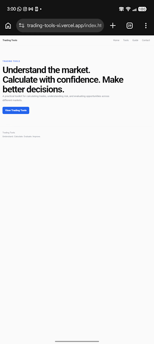
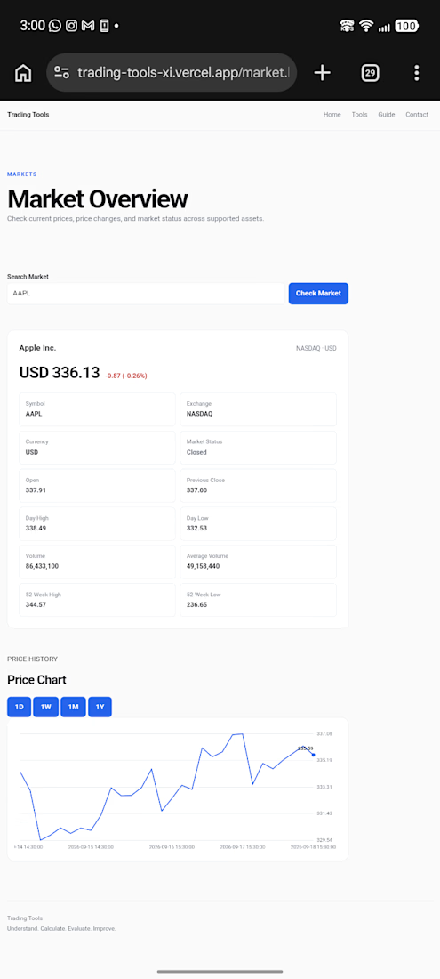
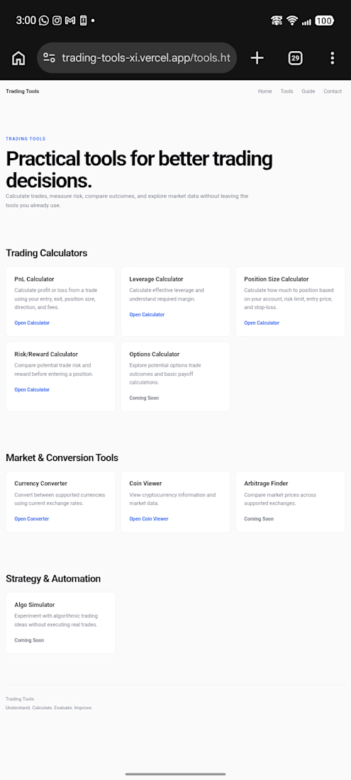
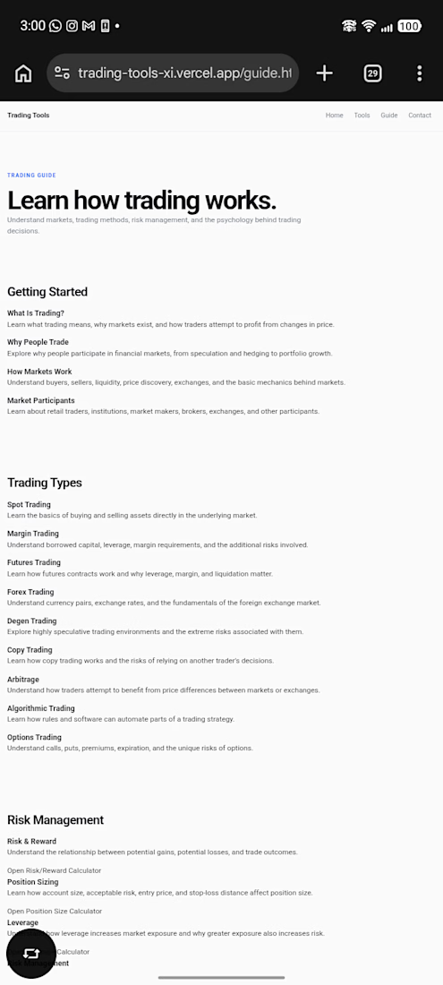

Grouping PnL, position sizing, and trading types in one view makes the decision layer easy to scan. Keeping it as a decision tool rather than an execution screen is a smart product boundary.