The network for creativity
Join 1.25M professional creatives like you
Connect with clients, get discovered, and run your business 100% commission-free
Creatives on Contra have earned over $150M and we are just getting started
Back to feedPost
Trading Tools — Trading Decision Platform
I built Trading Tools as a decision-support platform for traders, bringing practical calculators, risk tools, market data, and trading utilities into one place
It includes tools for PnL, position sizing, options, currency conversion, crypto market data, arbitrage, and strategy experimentation
The focus is helping traders evaluate and understand their decisions without executing trades


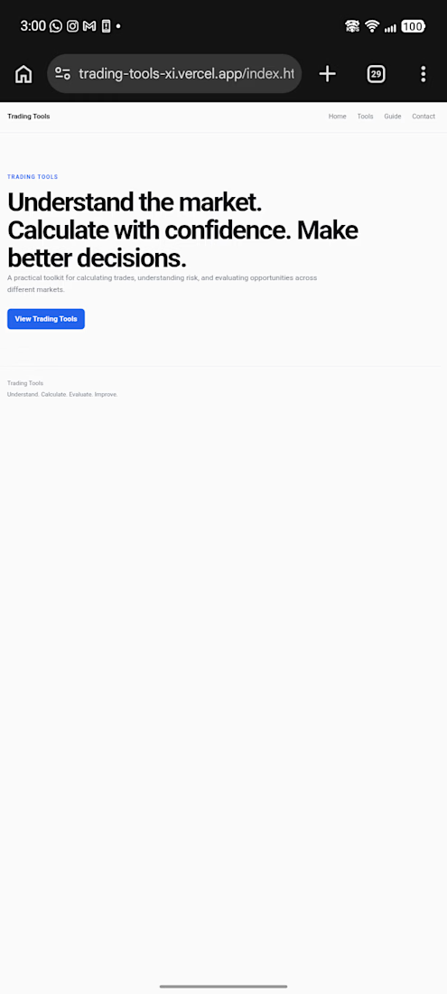
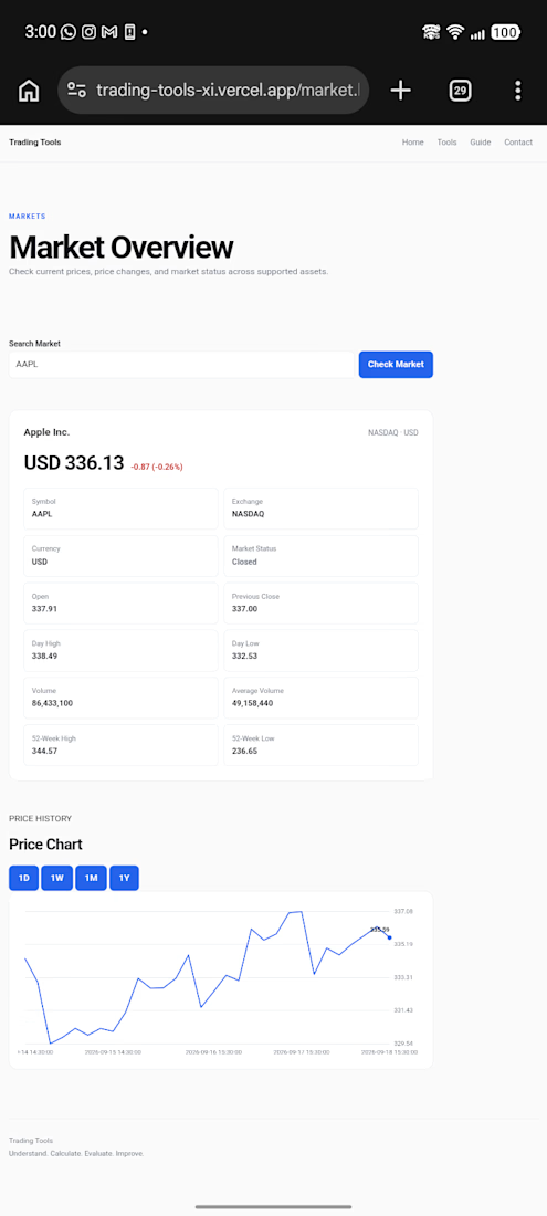
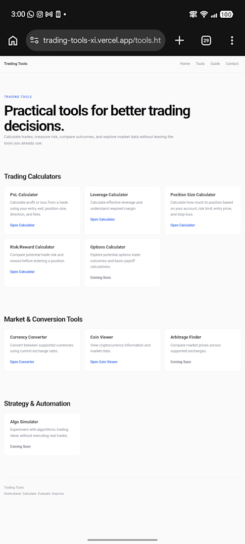
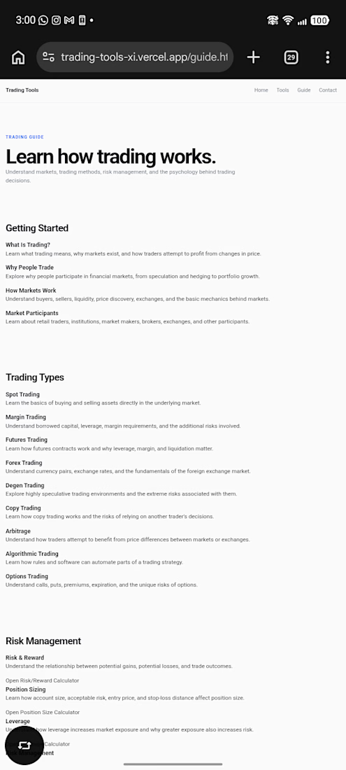

Grouping PnL, position sizing, and trading types in one view makes the decision layer easy to scan. Keeping it as a decision tool rather than an execution screen is a smart product boundary.

Appreciate that. Keeping the execution side out was deliberate. I wanted the tools to help with the decision before anything actually gets placed 🫠
The network for creativity
Join 1.25M professional creatives like you
Connect with clients, get discovered, and run your business 100% commission-free
Creatives on Contra have earned over $150M and we are just getting started
Challenges
View all


Related posts

Ledger — AI CFO Platform
Ledger is an AI platform that acts as an always-on Chief Financial Officer for founders — connecting to accounts, learning cash rhythm, and surfacing risks before they become real problems. I designed the full landing page.
My role: UI/UX Design
Scope: Landing page
Financial tools for founders usually feel either cold (dashboards) or intimidating (accounting software).
For Ledger, we borrowed from old-world institutional finance instead — serif type, oil-painting textures, classical architecture — so an AI CFO feels like real authority, not another app.


This color pallet works so well with data and makes everything look premium. love it!

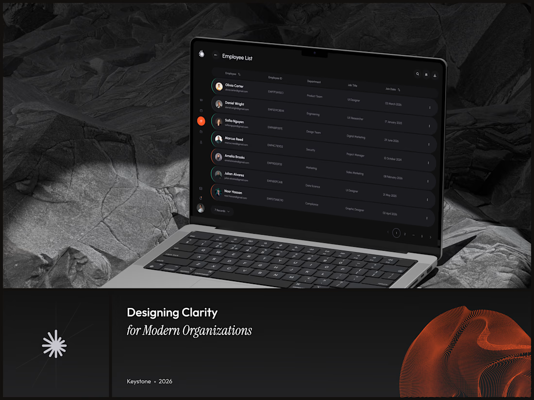
Keystone - HR Management Platform
Employee list screens are the homework assignment of SaaS design. A table is a table is a table. Nobody's winning an award for this view and that's exactly why it matters.
The restraint here is the point. No colored tags, no status badges fighting for attention, no dashboard widgets crammed into the sidebar. Just the data, breathing in a dark container with enough row spacing that your eyes don't blur at record five.
That split between a bold brand identity and a restrained product UI is one of the hardest things to get right in B2B SaaS.
#SaaS #DashboardDesign #DarkUI #B2BTech #ProductDesign


"A table is a table" is the harder argument to make internally than the design itself - most teams would've shipped colored status tags just to have something to show in a review.

Yesterday, I posted my first (one of my favorite complete case study on 0 → 1 product design (award winning app) on Contra.
I never been loud about my work 😂 but this time, I am finding my way around contra to improve my scores by showcasing some of my favourite work. Let me know if you like it 🙌
The walkthrough makes the 0→1 journey easy to follow—the tutorial overlay and scan flow explain the product without overloading the screen. The restrained purple framing also gives the case study a memorable visual identity.