
pro
Paul Elite
Product and Mobile App Designer for over half a decade
Profile in progress
Paul is building their profile!

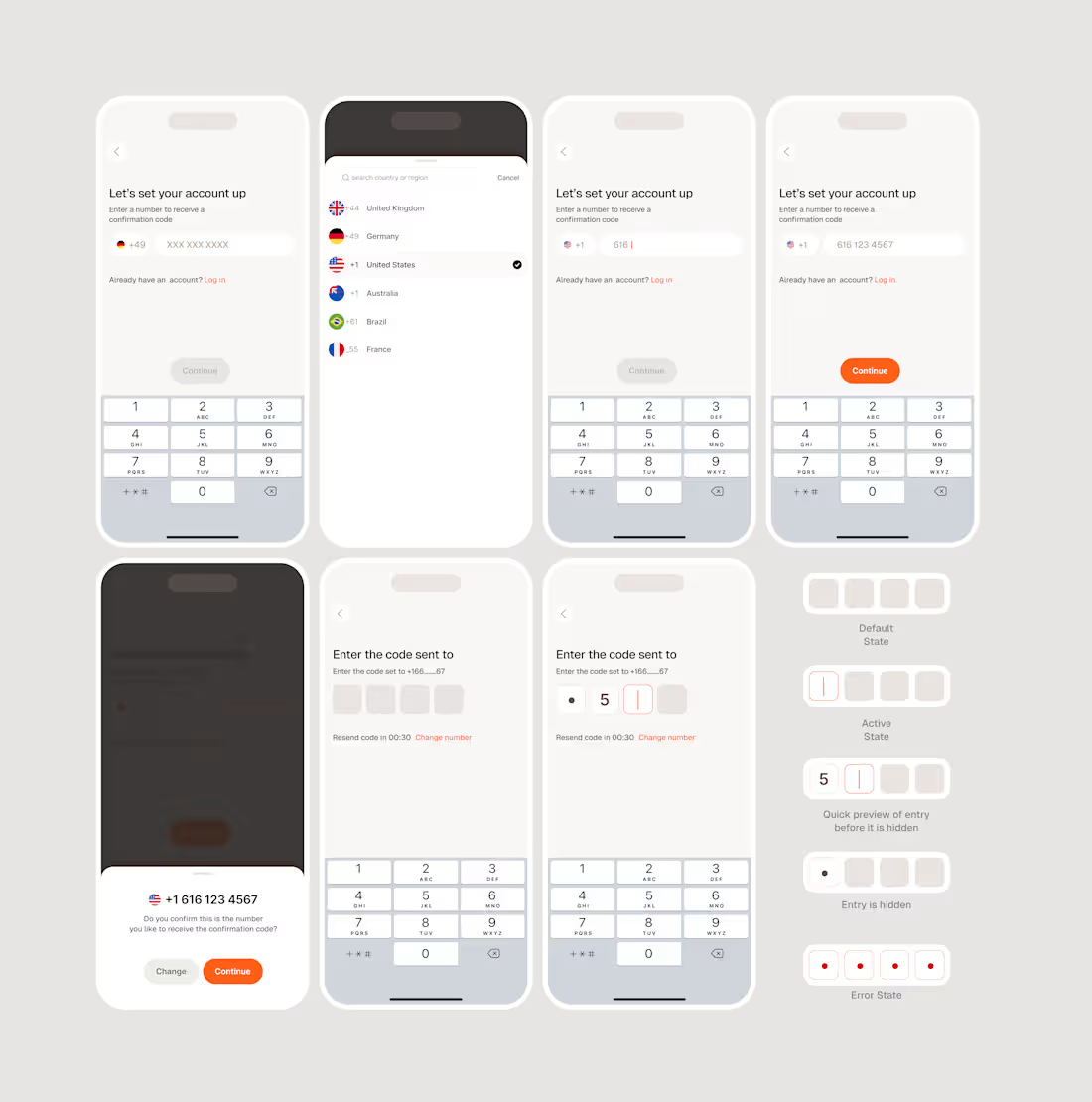
Designers should design for States, Not Just Screens.
A user interface is never truly static.
At any given moment, an element can be inactive, active, loading, completed, disabled, or in an error state. Each of these states represents a different point in the user's interaction with a product.
Yet, it's easy to design an interface around its ideal condition: when everything is working, the user knows exactly what to do, and nothing goes wrong.
But that's only one version of the experience.
A complete design accounts for what happens before, during, and after an interaction.
An input field, for example, isn't just a rectangle waiting for text. It needs to communicate when it's available, when it's receiving input, whether that input is valid, and what happens when something goes wrong.
These details establish a conversation between the user and the interface.
Without them, users are left to interpret what the system is doing. With them, the interface becomes more predictable, understandable, and responsive.
The goal isn't to design as many states as possible. It's to ensure that every meaningful change in the system is communicated appropriately.
Because good interaction design isn't just about what users see. It's about how the interface responds to what they do.
0
10
A good interface doesn't just tell users what to do. It helps them understand what will happen when they do it.
One of the interesting things about designing permissions is that we're often asking users to make decisions about experiences they haven't had yet.
Take notifications, for example.
An app asks you to enable notifications. But what exactly are you enabling? What will those notifications look like? When will they appear? And why should you care?
A simple toggle doesn't necessarily answer those questions.
In this interaction, I wanted to explore how a small animation could make the decision more understandable.
Rather than presenting notifications as an abstract setting, the interface demonstrates the experience. When the user enables the option, a notification preview appears on the device, showing the relationship between their action and its outcome.
The animation also provides immediate feedback: the toggle changes state, the preview appears, and the primary action becomes available.
Nothing particularly complicated is happening, but the sequence gives the interaction a sense of cause and effect.
This is something I find increasingly interesting about motion in interface design.
Motion shouldn't exist simply because an element can move. It should help communicate something that would otherwise require additional explanation.
Sometimes that's a change in state. Sometimes it's a relationship between elements. And sometimes, as in this case, it's a preview of an experience the user is being asked to enable.
The goal isn't to make every interaction animated.
It's to make the right interactions easier to understand.
hashtag#ProductDesign (https://www.linkedin.com/search/results/all/?keywords=%23productdesign&origin=HASH_TAG_FROM_FEED) hashtag#InteractionDesign (https://www.linkedin.com/search/results/all/?keywords=%23interactiondesign&origin=HASH_TAG_FROM_FEED) hashtag#UXDesign (https://www.linkedin.com/search/results/all/?keywords=%23uxdesign&origin=HASH_TAG_FROM_FEED) hashtag#MotionDesign (https://www.linkedin.com/search/results/all/?keywords=%23motiondesign&origin=HASH_TAG_FROM_FEED) hashtag#UIDesign (https://www.linkedin.com/search/results/all/?keywords=%23uidesign&origin=HASH_TAG_FROM_FEED)
3
1
47
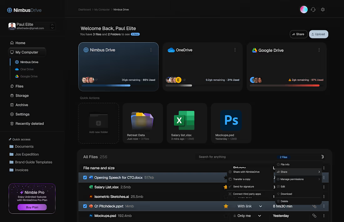
Nimble Drive Landing Page
0
2