The network for creativity
Join 1.25M professional creatives like you
Connect with clients, get discovered, and run your business 100% commission-free
Creatives on Contra have earned over $150M and we are just getting started
Back to feedPost

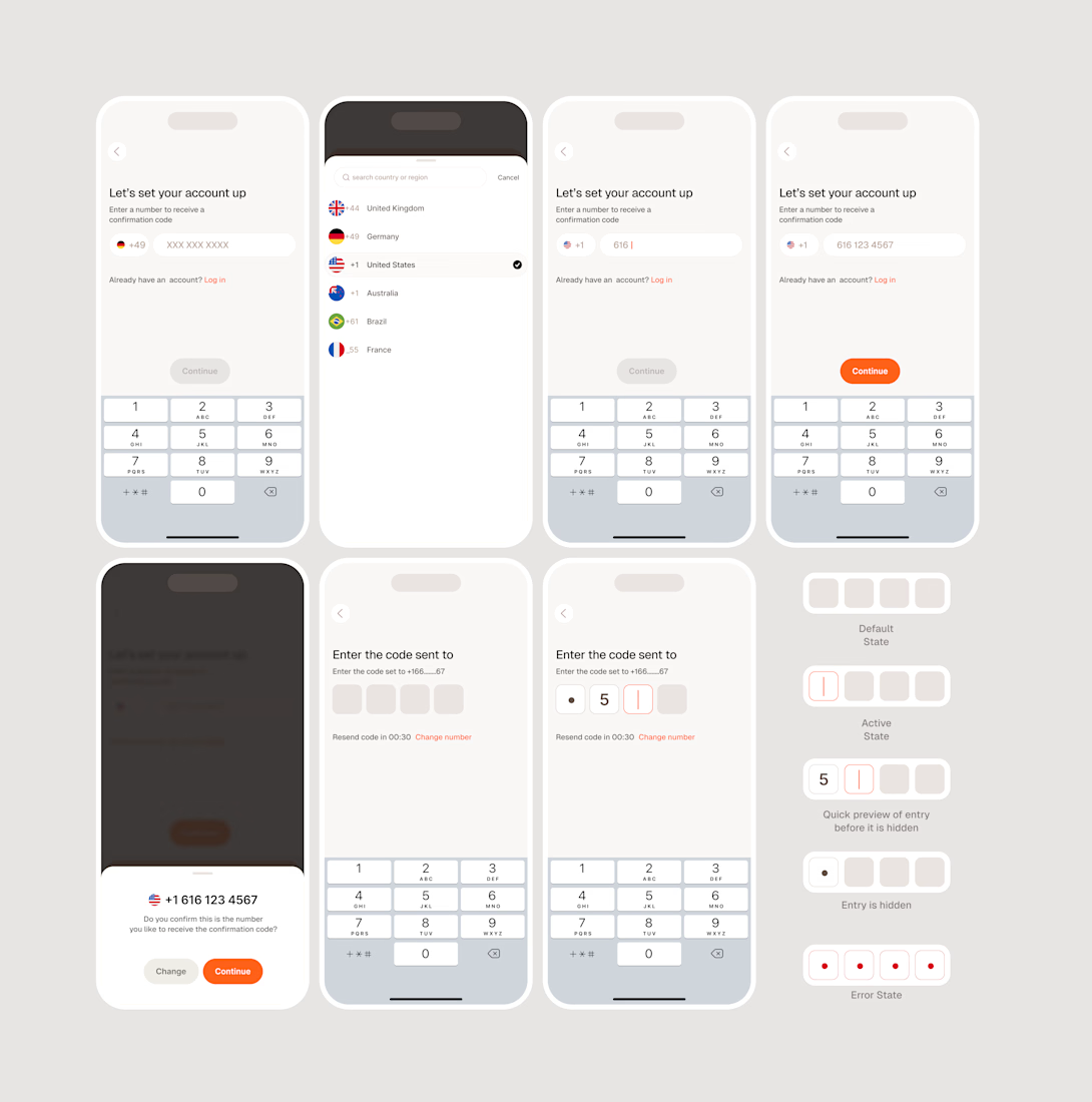
Designers should design for States, Not Just Screens.
A user interface is never truly static.
At any given moment, an element can be inactive, active, loading, completed, disabled, or in an error state. Each of these states represents a different point in the user's interaction with a product.
Yet, it's easy to design an interface around its ideal condition: when everything is working, the user knows exactly what to do, and nothing goes wrong.
But that's only one version of the experience.
A complete design accounts for what happens before, during, and after an interaction.
An input field, for example, isn't just a rectangle waiting for text. It needs to communicate when it's available, when it's receiving input, whether that input is valid, and what happens when something goes wrong.
These details establish a conversation between the user and the interface.
Without them, users are left to interpret what the system is doing. With them, the interface becomes more predictable, understandable, and responsive.
The goal isn't to design as many states as possible. It's to ensure that every meaningful change in the system is communicated appropriately.
Because good interaction design isn't just about what users see. It's about how the interface responds to what they do.

The network for creativity
Join 1.25M professional creatives like you
Connect with clients, get discovered, and run your business 100% commission-free
Creatives on Contra have earned over $150M and we are just getting started

Challenges
View all


Related posts

An experiment exploring how to visually communicate design impact through a draggable before/after slider. Built to test the interaction and motion feel of scrubbing between two states of a design, it uses a small format to show transformation at a glance 😊


The compact format is doing a lot of work—the draggable reveal makes the improvement immediately legible, while the consistent card rhythm keeps the comparison easy to scan.


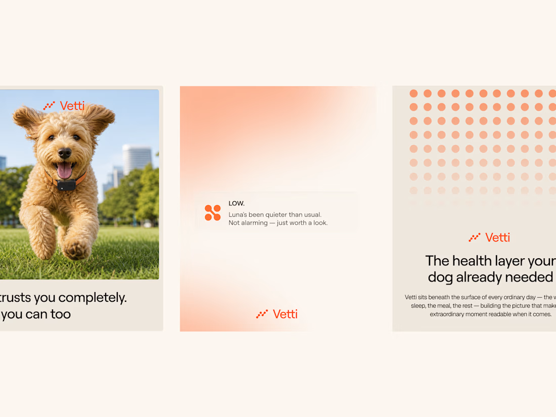
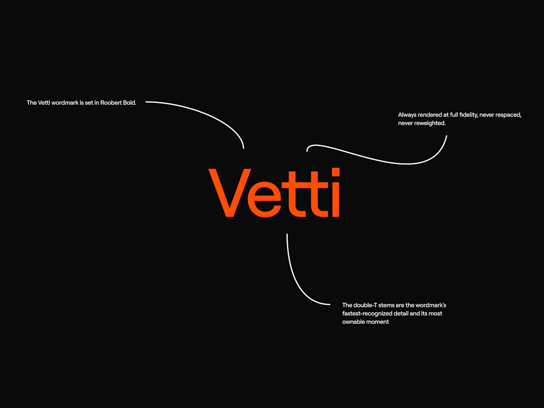
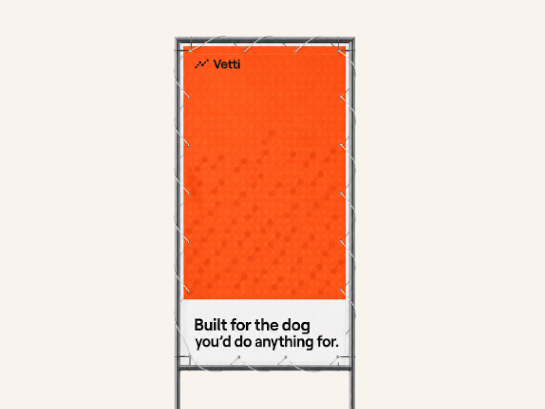
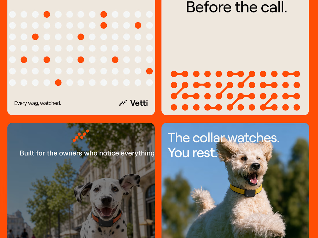
A fuller look at the brand identity work we for Vetti, a dog health monitoring brand.
The connected dots carry through the whole identity. They form the mark, expand into patterns and give the campaign a recognisable language of its own. Sometimes they fill the layout.
Paired with warm orange and cream the system has room for both the technology and the dogs it’s there for.

Looks very nice welldone


New Case 🙈
This time it’s BUDOVA — a next-gen real estate platform we designed from the product UX to the full brand identity and visual system.
Would love to hear what the Contra community thinks — what stands out to you most in this direction: Product Demo or Product Overview?

16 voted
41%
23 voted
59%
39 votes
Closed

PRO Design 😍