The network for creativity
Join 1.25M professional creatives like you
Connect with clients, get discovered, and run your business 100% commission-free
Creatives on Contra have earned over $150M and we are just getting started
Back to feedPost
Taste Test
New Case 🙈
This time it’s BUDOVA — a next-gen real estate platform we designed from the product UX to the full brand identity and visual system.
Would love to hear what the Contra community thinks — what stands out to you most in this direction: Product Demo or Product Overview?


16 voted
41%
23 voted
59%
39 votes
Closed

Love the Product Overview more!


We're on same vibe

PRO Design 😍
thank you!

This feels like a strong bridge between a real estate product and a broader visual system—the orange/peach palette gives the case study a memorable thread. I’d be curious to see how the Product Demo view handles the first-time user journey.

Overview and demo answer different questions - overview for someone still deciding the platform fits their portfolio, demo for someone who already believes it and wants to see the flow.
The strongest part is how the product UX and brand system are being developed as one experience—the orange-led direction gives the platform a clear point of view. I’d be curious to see which interaction details carry that same sense of place in the final flow.


Voted Product Demo, seeing the actual dashboard and map interaction tells me more about the UX decisions than the lifestyle collage does. That said the brand photography in the overview is doing a lot of work to make real estate feel less sterile.

Inlove with the product overview! 🚀

Good Approach

product overview.

I'm gonna be team product demo on this one.


demo is good but view impacts more

I voted Product Demo. When the brand is this polished, seeing it move and respond is what seals it for clients. The orange and the 3D map combo is already a strong first impression.

Both stand out, but really like the direction on the Product Overview.


I really love what you did with the product demo

Product overview!

The product overview experience feel so cohesive 🔥
Demo. On a real estate platform the live objection is "does this handle my listings" — an overview has to be believed, a demo gets checked.

Stunning!

Love how seamlessly the product UX and visual identity work together. Such a clean and modern direction! 👏🏻

Great work!

looks fantastic👍

Nice work
The network for creativity
Join 1.25M professional creatives like you
Connect with clients, get discovered, and run your business 100% commission-free
Creatives on Contra have earned over $150M and we are just getting started



Related posts

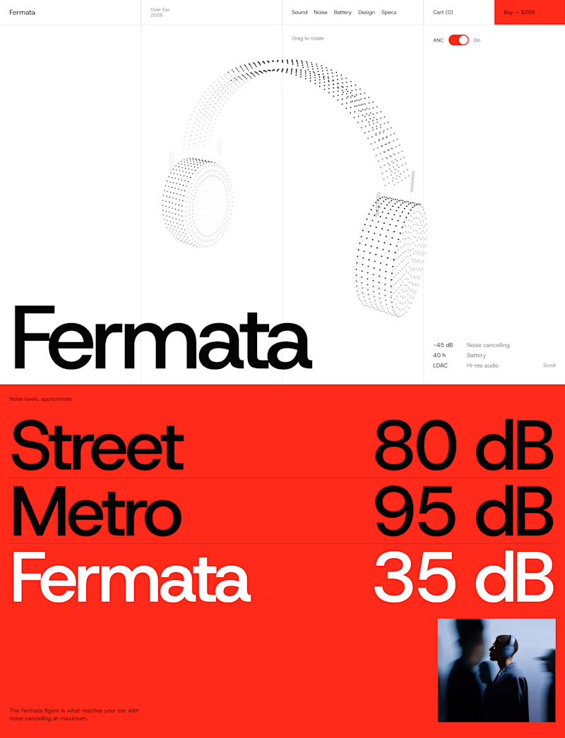
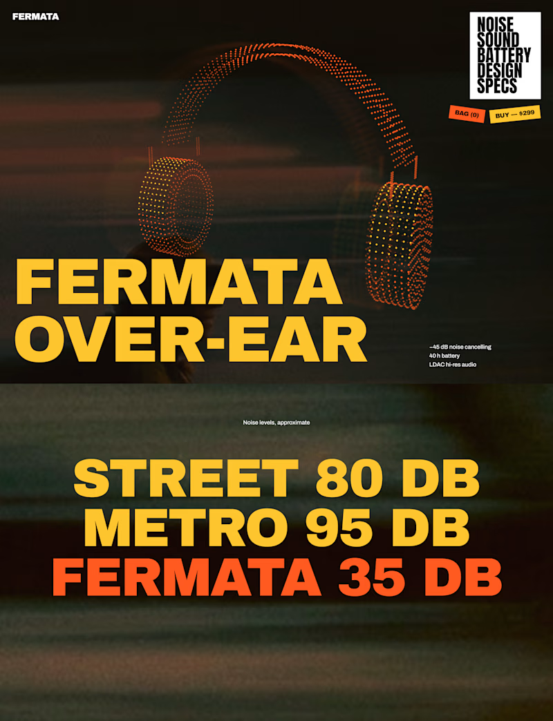
🎧 FERMATA — new over-ear headphones, coming soon.
A — Swiss poster: red, light blue, white and black. Clean grid, one grotesk typeface, product as a stipple 3D model.
B — Night edition: black, yellow and orange. Heavy condensed type, motion-blurred city photography, sticker details.
Both will have a scroll-driven 3D headphone (particles) as the hero.

56 voted
79%
15 voted
21%
71 votes
Closed


The Red Color Scheme looks nice


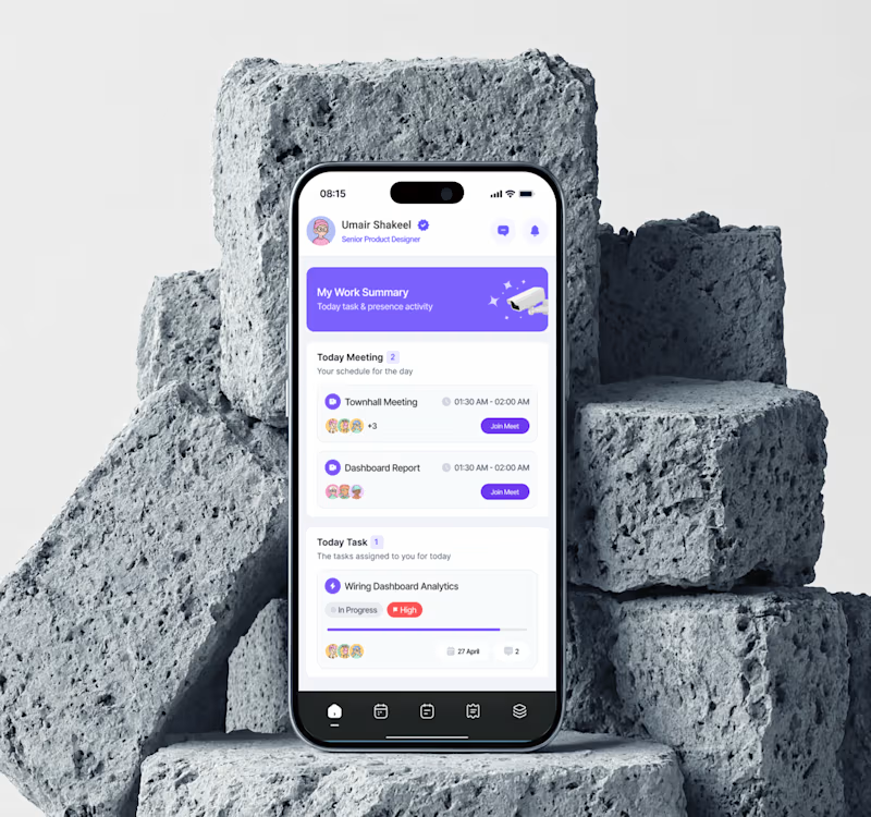
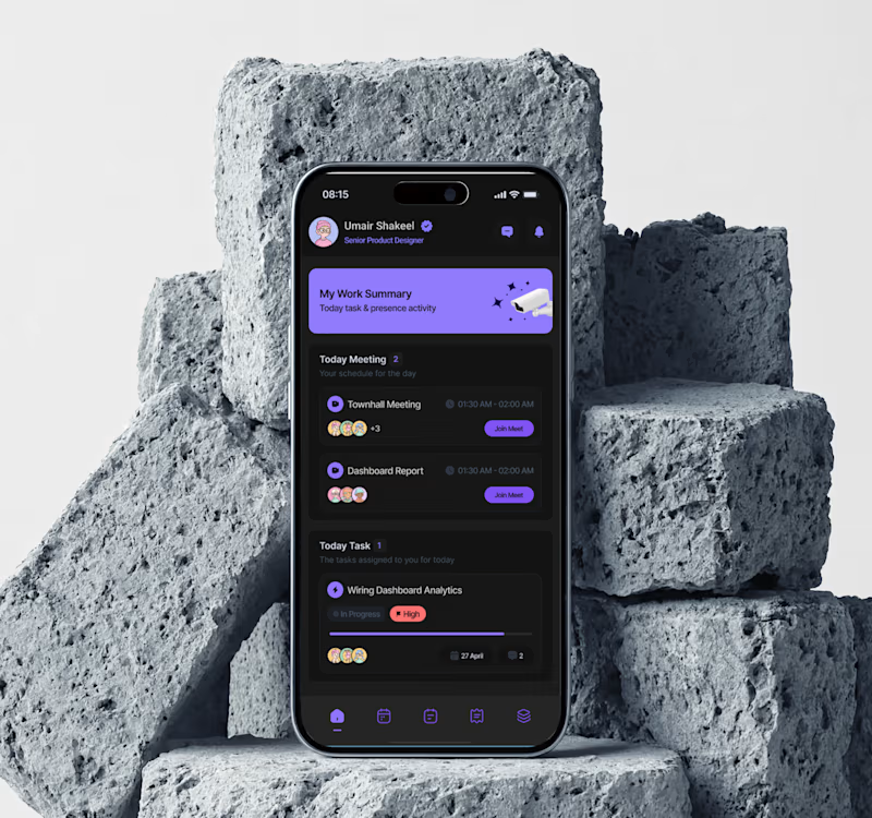

Dark mode for evenings, but light feels easier for daily use. Both look clean though!

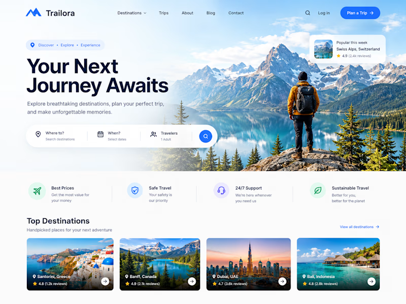
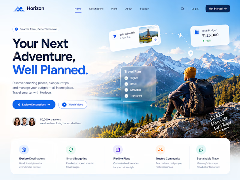
Two designs. One idea. Two different ways to experience travel. ✈️
What if planning your next trip felt less like managing a checklist and more like discovering a story waiting to unfold?
Trailora makes discovery feel effortless, while Horizon turns travel planning into a smarter, more structured experience.
Same industry. Different design directions.
Which direction would you choose: the freedom to explore or the confidence of a well-planned journey?
25 voted
71%
10 voted
29%
35 votes
Closed
Both are lovely! The second one feels more like an adventure, which fits travel well.