The network for creativity
Join 1.25M professional creatives like you
Connect with clients, get discovered, and run your business 100% commission-free
Creatives on Contra have earned over $150M and we are just getting started
Back to feedPost

Your supplement can be clinically strong and still lose on the shelf.
Because customers judge the packaging before they ever read the formula.
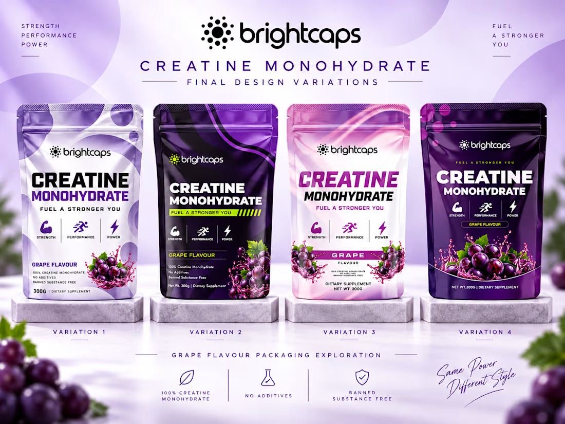
For Brightcaps Creatine Monohydrate, I explored four packaging directions built around one goal:
Make performance look premium, credible and impossible to ignore.
Each variation uses the same product, same positioning and same grape flavour, but changes the visual personality.
Clean + clinical
Dark + performance-driven
Fresh + lifestyle-focused
Bold + premium
The identity balances:
💪 Strength and performance cues
🍇 Strong flavour recognition
⚡ High shelf impact
🧪 Clear product information
🎯 Consistent Brightcaps branding
The interesting part?
There is no single “pretty” solution.
The strongest packaging is the one that matches the buyer, price point and sales channel.
So I want your vote:
Which variation would you trust most on a supplement shelf?
1, 2, 3 or 4?
Drop the number below.
And if you are building a supplement, wellness or sports nutrition brand and your product is stronger than your packaging looks, send me a message.
I design packaging that helps good products look ready to compete.
#PackagingDesign #SupplementBranding #Creatine #SportsNutrition #LabelDesign #BrandIdentity #CPGBranding #WellnessBranding #ProductPackaging #GraphicDesign


The network for creativity
Join 1.25M professional creatives like you
Connect with clients, get discovered, and run your business 100% commission-free
Creatives on Contra have earned over $150M and we are just getting started



Related posts


HealthSense Brand Identity
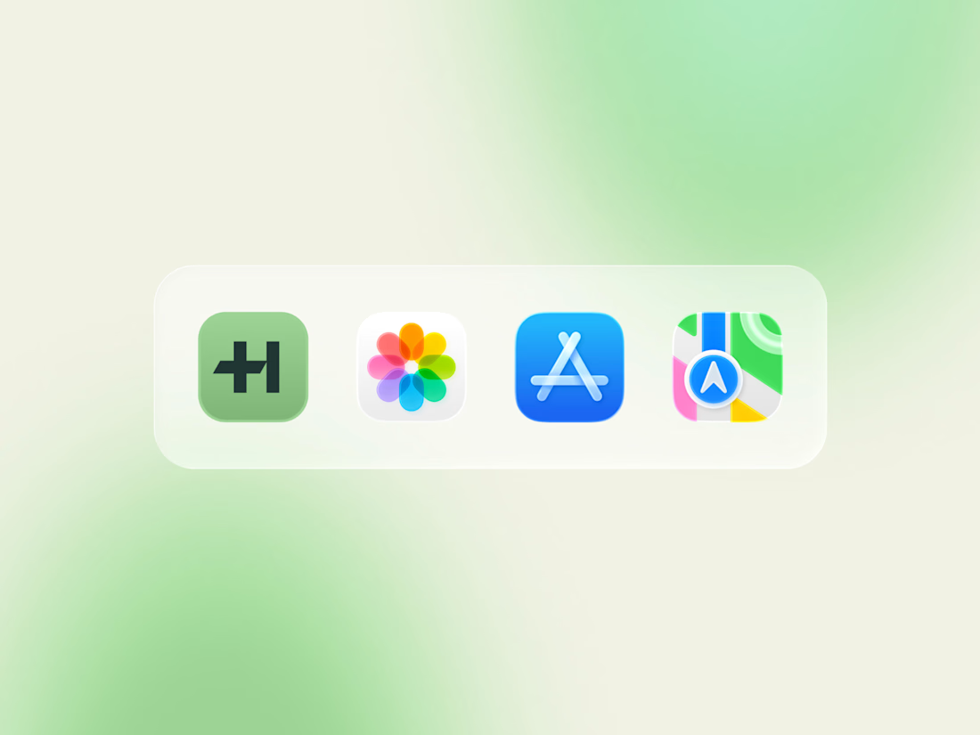
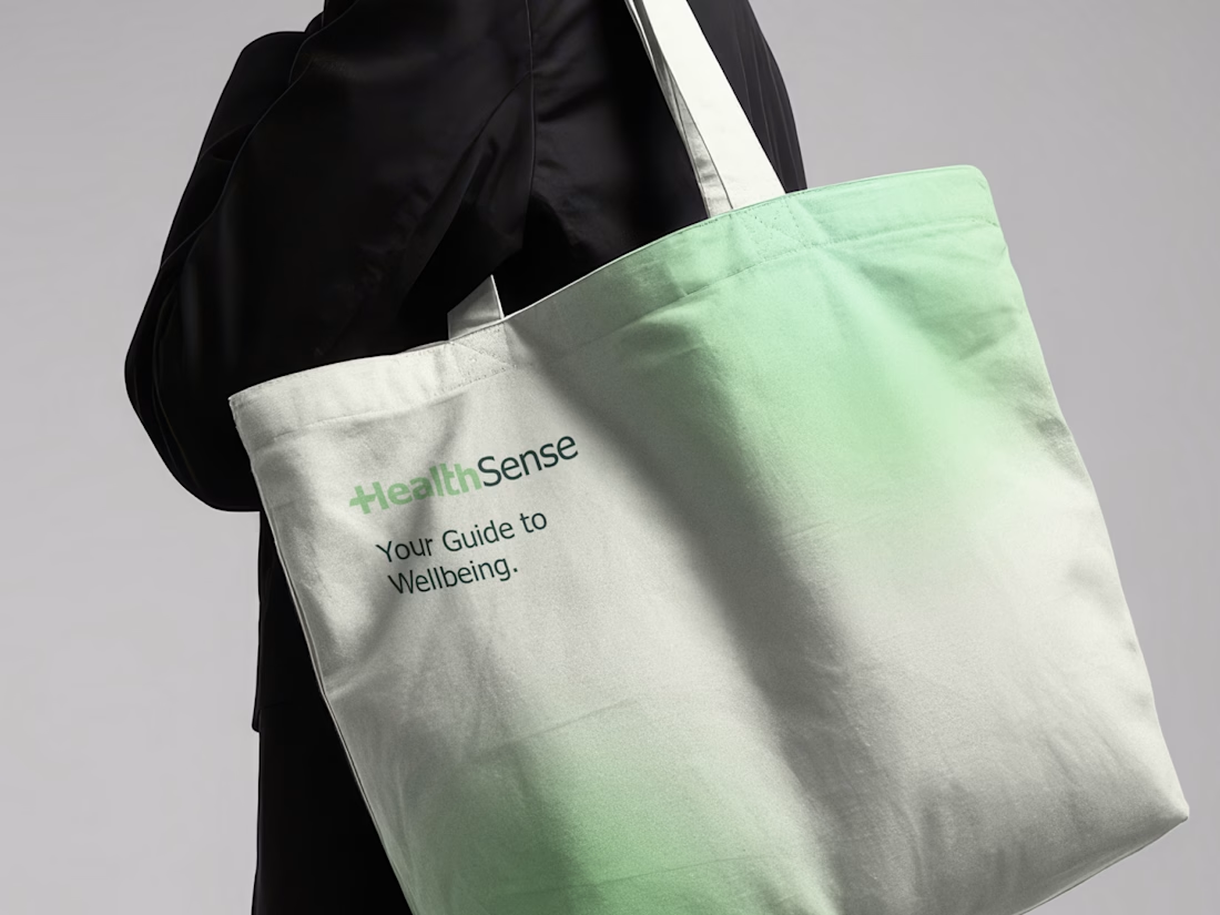
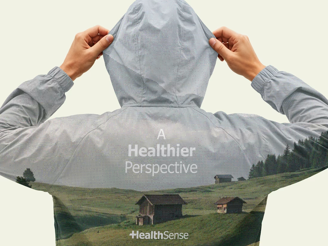
A brand identity project I worked on in March 2026 for HealthSense, a Singapore-based health and wellness information brand focused on making health knowledge clear, accessible, and easy to understand.
The client envisioned something simple, clean, and modern, but with meaning behind it. I explored a minimal wordmark with a medical cross integrated into the lettering, creating a direct connection to healthcare while keeping the identity clear, professional, and memorable.



Great brand identity 🎉🎉

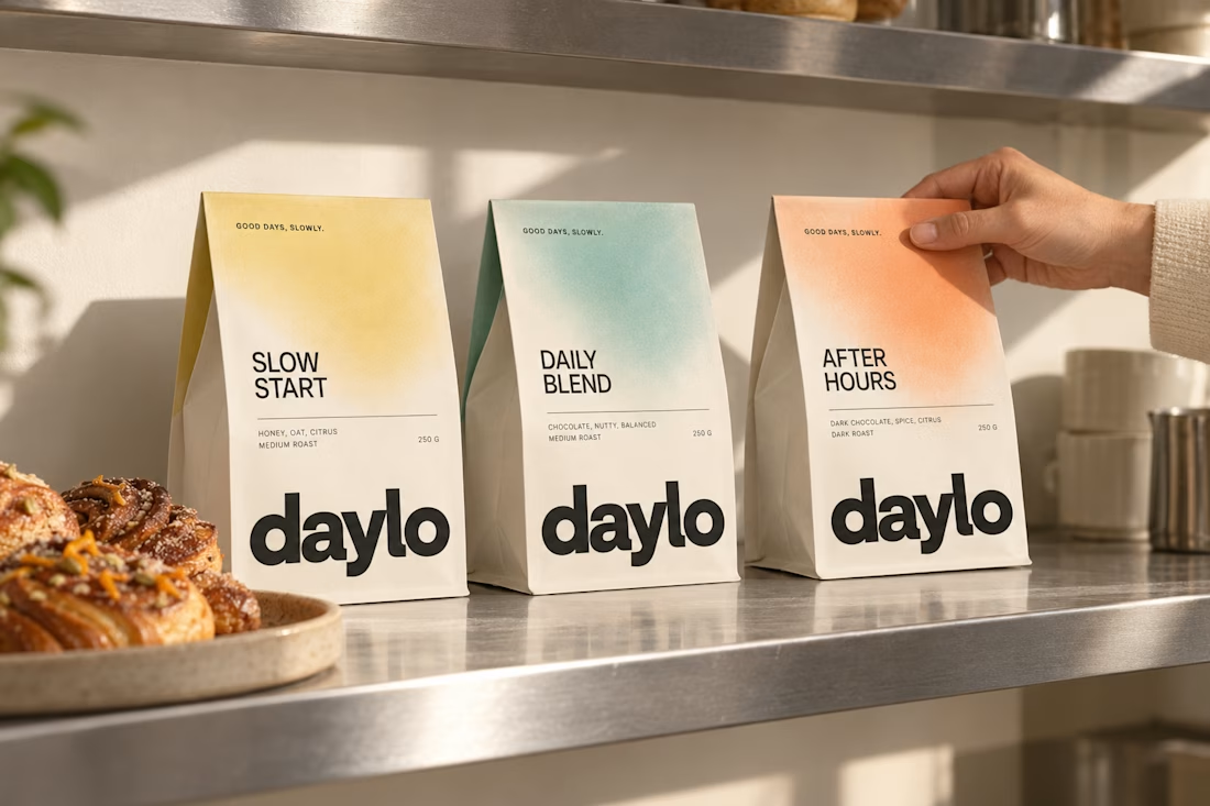
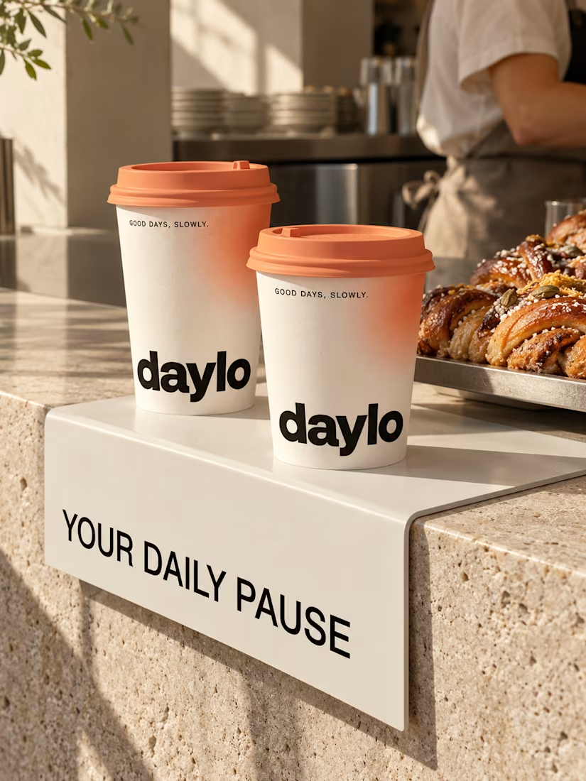
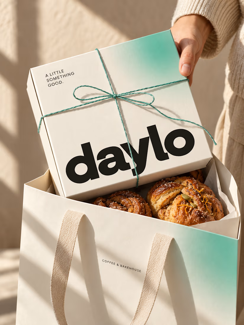
☕ Meet DAYLO - A minimalist coffee branding concept featuring bold typography, warm neutrals, and soft colors designed to make every cup feel a little more special. 🤎
Explore the full project on my Contra profile and let me know your thoughts!