The network for creativity
Join 1.25M professional creatives like you
Connect with clients, get discovered, and run your business 100% commission-free
Creatives on Contra have earned over $150M and we are just getting started
Back to feedPost
Taste Test

Which ORBIT pulls you in: the quiet one or the loud one? ✨
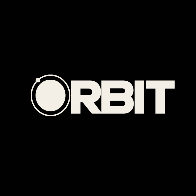
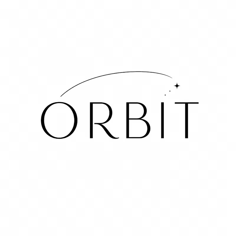
One name, two directions. Same idea, an object in motion around a center.
A → Heavy extended sans on black. The orbit is built into the O, a ring with a single satellite. Compact, graphic, impossible to ignore.
B → Light, high-contrast serif with a hairline arc and a tiny spark. The orbit is a gesture, a trail you almost miss. Elegant, airy, a little mysterious.
If you ask me, I'd pick A.

36 voted
80%
9 voted
20%
45 votes
Closed


A has such a strong sense of magic to it!

A is heavy great job Julia🎉🎉🔥🔥

I would choose B Julia, may be due to my personal choice to lean more towards the simple things😊

Both are good but A is the winner

A feels more distinctive to me: building the orbit into the O makes the idea part of the wordmark itself. I would be curious to see how the satellite detail holds up at favicon size.


B for me tbh. the hairline arc tells the orbit story on its own, A starts reading like a power icon once it gets small

A looks awesome!

The loud one for me. Building the orbit right into the O is such a smart move, it sticks instantly.

A gets my vote. Building the orbit into the O gives you a standalone mark for an avatar or favicon without losing the idea. I’d test it at 24px, though the satellite and gap between the rings might need optical adjustments. B has a lovely editorial feel, but A gives you more to build a visual system around.

Gorgeous work, Julia!

Very clean type on both options

TheA

B surely.

A'' for sure .. bcz black is my color🙌

I think A is better.

I like the loud one Julia. It is owneable & can extend into different applications very well!

Great Work!

I'd pick A too. The ring with the satellite inside the O does the job, and the heavy weight will hold up small.


awsome

love B, the aesthetics are perfect

Simplicity turned to luxury

A actually looks cool and professional

Both have their own charm! A is definitely bold and eye-catching, but I'm drawn to B. I love how the subtle orbital arc adds movement while keeping the whole design elegant and refined!


I love the clean execution of the O in the first design. The contrasting ring and the little dot really sell the "object in motion" idea. Both directions are really strong, though.
The network for creativity
Join 1.25M professional creatives like you
Connect with clients, get discovered, and run your business 100% commission-free
Creatives on Contra have earned over $150M and we are just getting started





Related posts

Lime Cream or Peach Fuzz? 🍋🟩🍑
Two animated isometric sets — same system, different mood. Cast your vote 👇
68 voted
78%
19 voted
22%
87 votes
Closed
Lime Cream. The dark linework pops more on it.


Should a personal brand hero lead with the name or the promise?
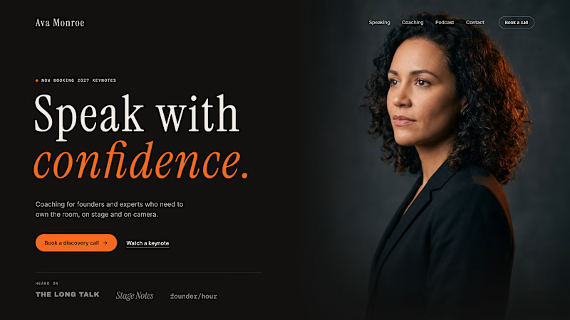
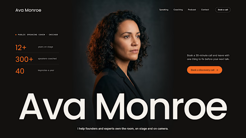
A client of ours is a speaking coach. People find her by name: podcasts, stages, word of mouth. Yet her first hero hid that name in the top-left corner.
We tested two directions:
The promise first. "Speak with confidence" in big type, the name small in the nav. Clear, but it could be any coach on the internet.
The name first. Her name at billboard scale, the promise in one line above it, her face right behind. Someone arriving from a podcast knows instantly they're in the right place.
When people search for you, your name is the headline.
Which one would you ship for a personal brand?
43 voted
51%
42 voted
49%
85 votes
Closed

Name first — podcast listeners arrive looking for her.

A system makes it work. A brand makes it matter.
Through Adora Garden, we explore how a structured visual system can evolve into a cohesive brand identity — bringing consistency, character, and a more meaningful visual experience to every touchpoint.
Because branding isn't just about how a brand looks. It's about how it feels, speaks, and connects.
6 voted
27%
16 voted
73%
22 votes
Closed

Identity 💯