The network for creativity
Join 1.25M professional creatives like you
Connect with clients, get discovered, and run your business 100% commission-free
Creatives on Contra have earned over $150M and we are just getting started
Back to feedPost

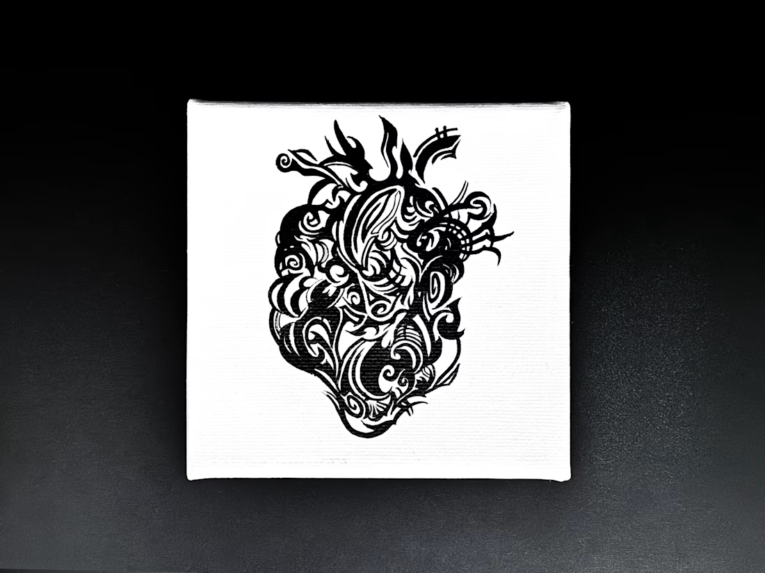
My brush has no undo button. It rarely listens, either.
This is Silent Anatomy, painted by hand with sumi ink.
AI is amazing too, but I love what happens when ink misbehaves.
Ever turned a mistake into your favorite detail?
The network for creativity
Join 1.25M professional creatives like you
Connect with clients, get discovered, and run your business 100% commission-free
Creatives on Contra have earned over $150M and we are just getting started








Related posts


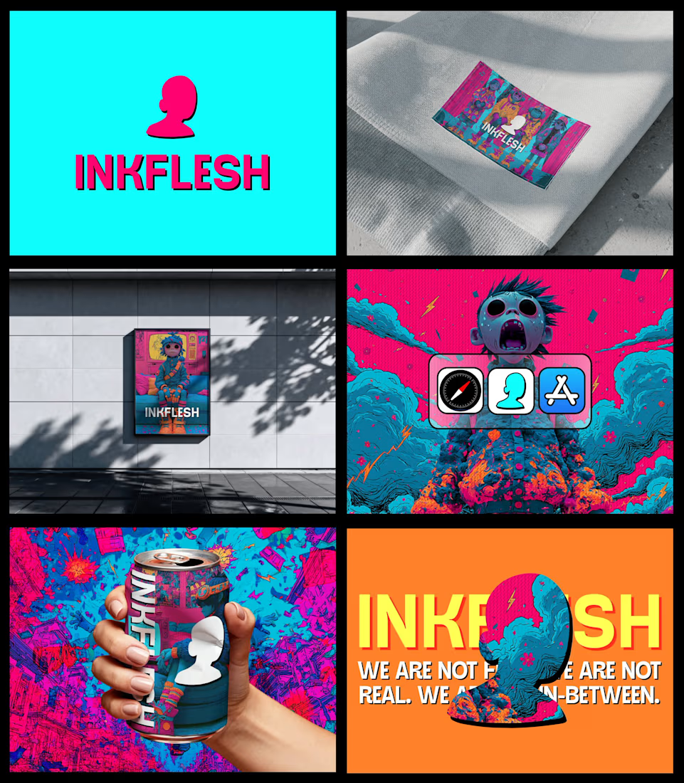
In my INKFLESH identity work, the wordmark runs off the can's curve and gets partly hidden behind artwork on posters. That crop asks the rest of the identity to carry more recognition. The mark has a job when the name is only partly there.


A near miss is a warning sign worth paying attention to. ⚠️
For NeuraSafe, we designed this social media post to highlight four common gaps in workplace safety: hesitation to report, delayed documentation, stalled corrective actions, and overlooked patterns.

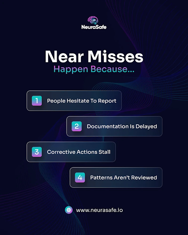

The offset cards turn a plain list into a sequence, which suits gaps that feed into each other. Did you try linking them with a connector line, or did the stagger alone carry the order well enough?

Something I've been thinking about lately is how much visual consistency matters in video editing.
I came across a podcast with a really nice visual identity in its thumbnails and got curious about how that same style could translate into the videos.
Ended up experimenting with one of its intros.
A little before & after :)
