The network for creativity
Join 1.25M professional creatives like you
Connect with clients, get discovered, and run your business 100% commission-free
Creatives on Contra have earned over $150M and we are just getting started
Back to feedPost
Taste Test
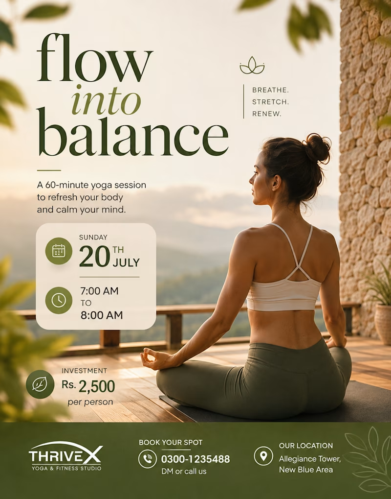
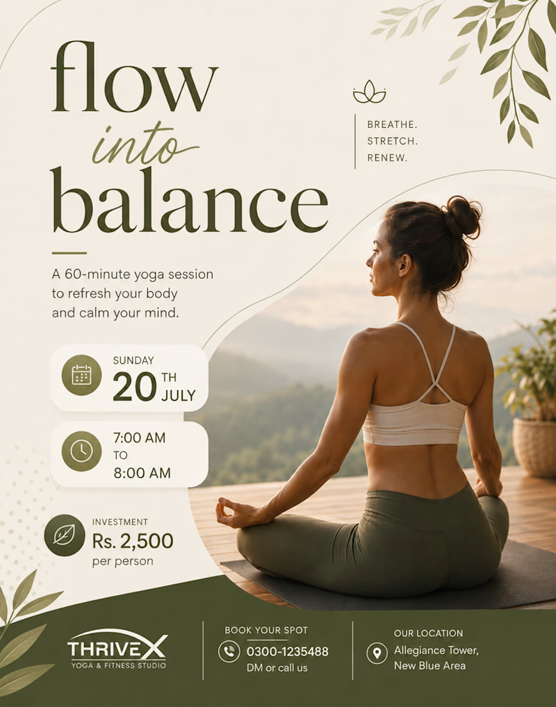
✨ Which design do you like the most?
We’ve created two versions of the same yoga post — now it’s your turn to choose! 🧘♀️🌿
01 or 02?
Drop your pick in the comments 👇


11 votes
Ends in 1d


1 for sure

I didn't vote, but if I had to choose, I'd go with Option 2 for the typography and overall design. I do, however, prefer the full-frame photograph in Option 1. The border around the photograph in Option 2 slightly compresses the model's gaze and makes the image feel a little more confined.

Thanks for the feedback! I’ll combine Option 2’s typography with Option 1’s full-frame photo.
The network for creativity
Join 1.25M professional creatives like you
Connect with clients, get discovered, and run your business 100% commission-free
Creatives on Contra have earned over $150M and we are just getting started
Trending
retrofuturism
Share your favorite designs from the past exploring the distant future. Or your own take on the aesthetic 🚀
halftone
Dots. Texture. Grain. Let's see your designs using the halftone technique.

Midjourney
Creatives are showing off what they're making with Midjourney.
colorgrade
Video editors sound off: How do you enhance the mood of your video in color grading?


Related posts


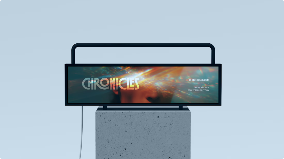
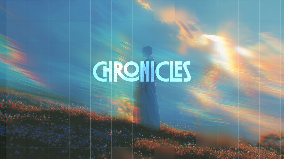
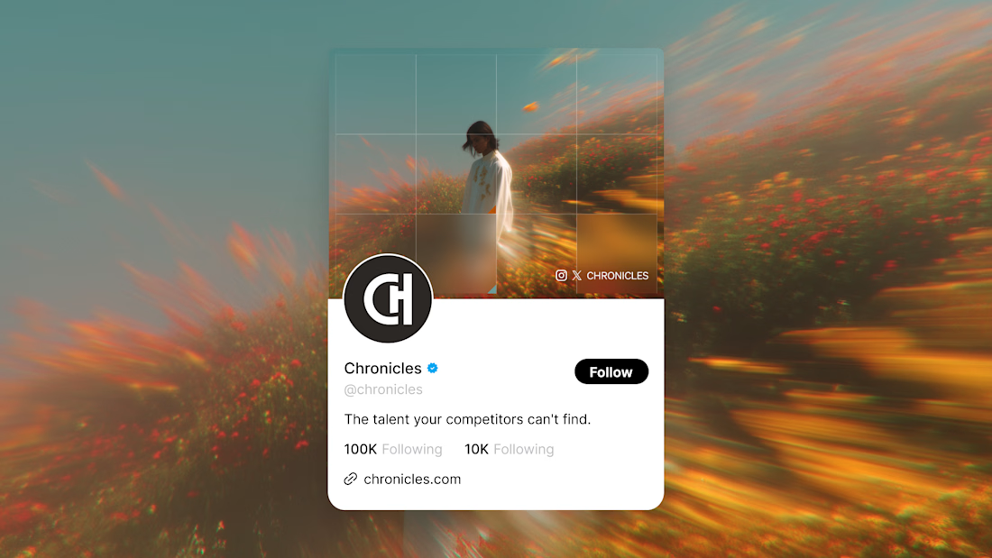
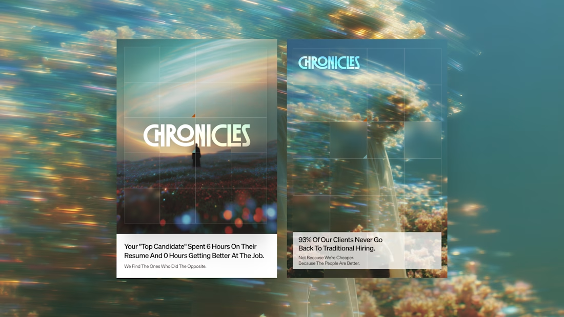
I needed to repost something about how the imagery and colors combine with the logo here. I really love this branding I created.

Really nice, @Daniel G Bright 👍

Breath sets the pace of every yoga practice, so I wanted this interaction to do the same. I wanted it to feel like taking a deep breath.
Instead of presenting everything at once, the component reveals one moment at a time, guiding visitors through what a retreat holds for them.
Animation isn’t there to impress. It’s there to set the rhythm.
Built for my Namaste Studios Framer template. 🌿


Love this

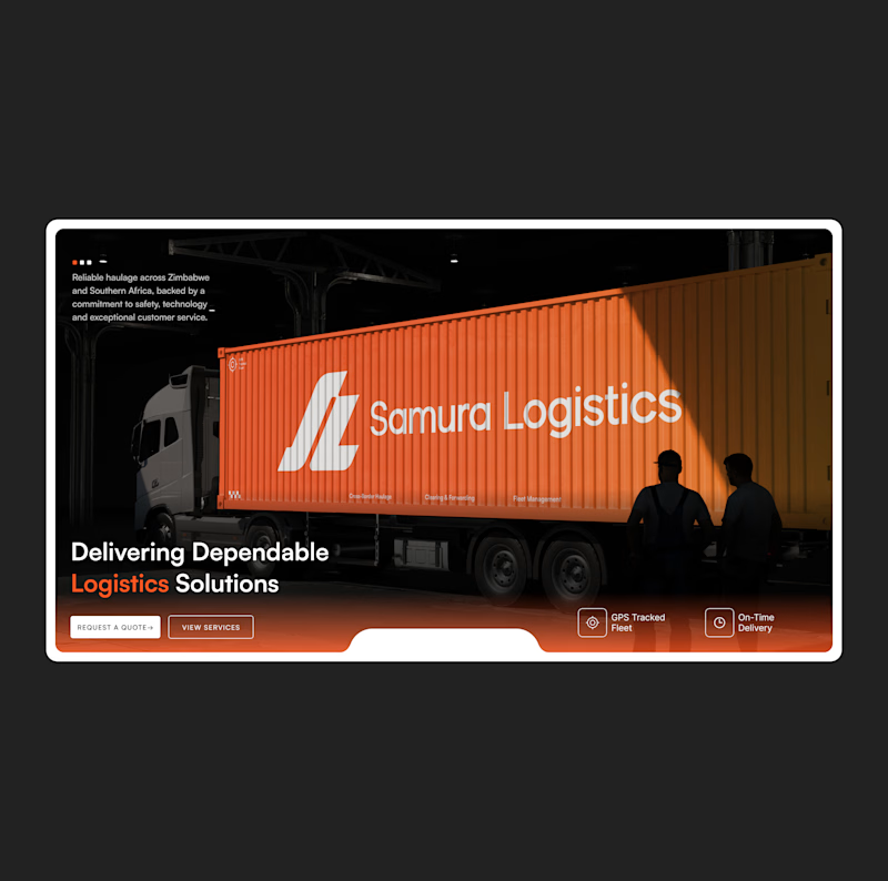


The two hero section designs are amazing but the option B looks better to me.