The network for creativity
Join 1.25M professional creatives like you
Connect with clients, get discovered, and run your business 100% commission-free
Creatives on Contra have earned over $150M and we are just getting started
Back to feedPost


Calling all web developers!
We're expanding our partnership rollout to more independents and small teams.
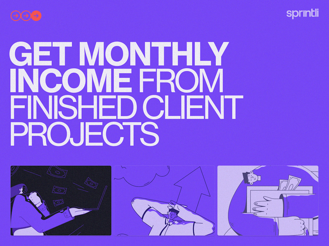
If you build websites for clients but don't have a pipeline for ongoing SEO, AEO, and/or CRO work; that's where we step in.
A strategic partnership that puts money in your hand and warm prospects in ours.
Here's how it works:
- You wrap up and ship the website to your client
- You introduce that client to us (we turn websites into acquisition tools)
- We pay you an upfront lump sum + monthly commission for every client
Their site grows in traffic and revenue, which makes your work look even better in your portfolio.
We're starting with 5 spots.
Example of the potential:
1. You refer a client to us
2. Client subscribes to a growth engagement plan at $3k/month
3. We pay you $500 that same day, plus $300/month
That's $4,100+ in your first year from a single referral. And it scales, if your client increases their budget, your monthly commission goes up too.
If you're interested, email us at partnerships@sprintli.com with:
- A brief intro (who you are, where you're based, what you do)
- Portfolio link
- How you currently handle SEO/CRO conversations with clients
- Your average project cost
- Any questions
Cheers!
Jadeon
COO at Sprintli


The network for creativity
Join 1.25M professional creatives like you
Connect with clients, get discovered, and run your business 100% commission-free
Creatives on Contra have earned over $150M and we are just getting started
Related posts

Design Agency Website
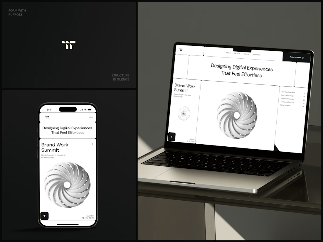
Only one cell on this homepage is black.
The rest of the page is a grid of rounded white cells: the headline, an event card, a white 3D spiral and a list of services. The black one, top right, holds the "Follow the future" button and stands out against all that white.
On the phone, the cells stack into a single column. The navigation folds into a menu icon, and the event card and spiral merge into one cell.
The headline reads "Designing Digital Experiences That Feel Effortless", so the grid has to look organized before anyone reads a word.
Designed by the Hue & Machine team.
#DesignAgency #WebDesign #AgencyWebsite #LandingPage #BentoGrid #MinimalDesign #UIDesign #ResponsiveDesign #MobileDesign #FigmaDesign


Looks cool


Here’s a little piece from my current project. As I watch the Swiss design concept become a part of my creative DNA, I find myself constantly gravitating towards this direction in web design.
What’s really interesting is that Volume 3 studio and I are experimenting here, mixing things that seem completely unmixable at first glance.
Since Volume 3 is a CGI and VFX studio, it was crucial to incorporate a 3D dimension into their brand communication. On top of that, a Terminal UI is exactly what keeps that technical vibe going.
So, the final mix is International (Swiss) style, a Terminal UI, and a 3D feel brought to life by neumorphism. Crazy, right???
It looks simple and clean, but behind the scenes, there’s a massive amount of work on the details. We focused on all those little things that push the UX/UI into the premium segment — the things you don't necessarily see right away, but you definitely feel when you're on the page.
The work is still ongoing, so I can't dive into reflecting on the whole process just yet, but I'm gonna keep revealing small parts here.


Swiss grids on the web never get old when they're this clean. What are you and Volume 3 mixing it with?

Hero section for a company that creates personalized supplementation plans. Which one fits better?
9 voted
43%
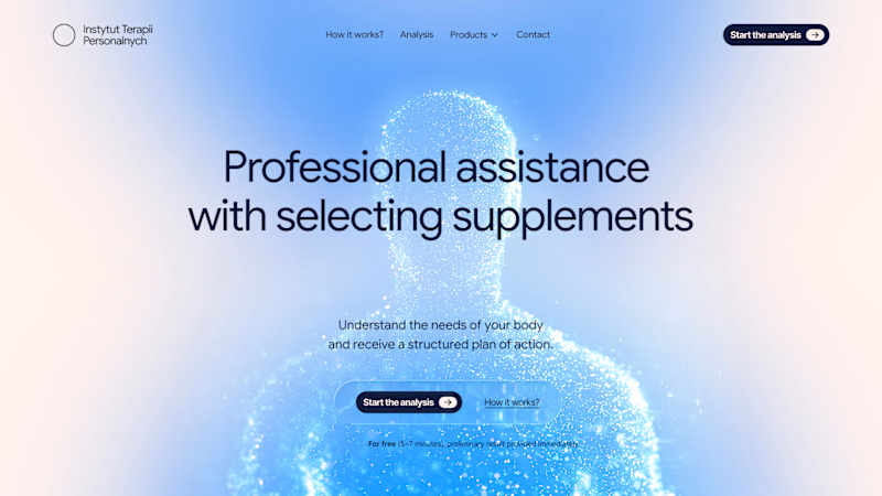
12 voted
57%
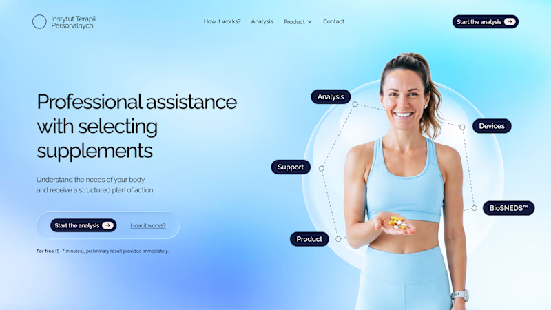
21 votes
Closed

V2 fits best and it looks more practical as compare to V1



