The network for creativity
Join 1.25M professional creatives like you
Connect with clients, get discovered, and run your business 100% commission-free
Creatives on Contra have earned over $150M and we are just getting started
Back to feedPost
Taste Test

Hero section for a company that creates personalized supplementation plans. Which one fits better?

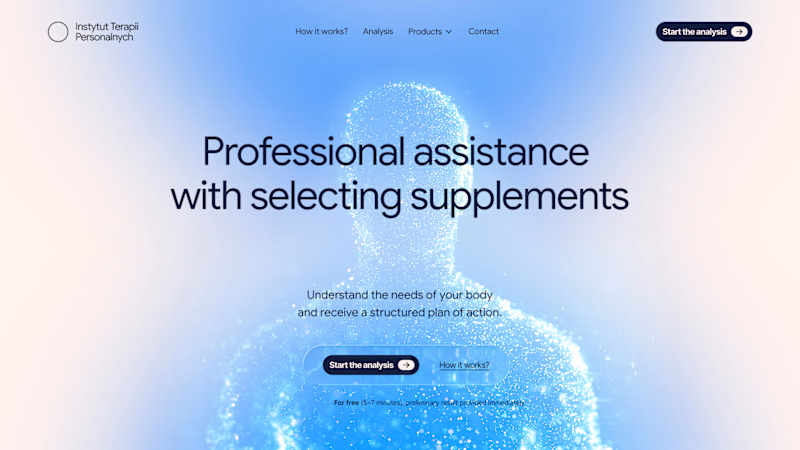
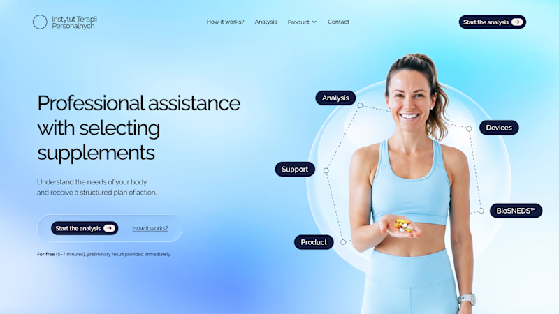
17 votes
Ends in 1d

Very tough call to make


Definitely V2. Showing an actual smiling person makes the brand feel friendly, real and safe to trust with your health. V1 looks like a futuristic sci-fi game or AI tool rather than a wellness service.

The network for creativity
Join 1.25M professional creatives like you
Connect with clients, get discovered, and run your business 100% commission-free
Creatives on Contra have earned over $150M and we are just getting started



Related posts


This Framer Page Load is made by me recently. 🚀
The page effect of Framer took shape in just 5 Steps!
i've tried to build this without any components, so I only set up the animations and loadings ⚡️
Check the replies for the rest of the tutorial.

Clean work, love it.

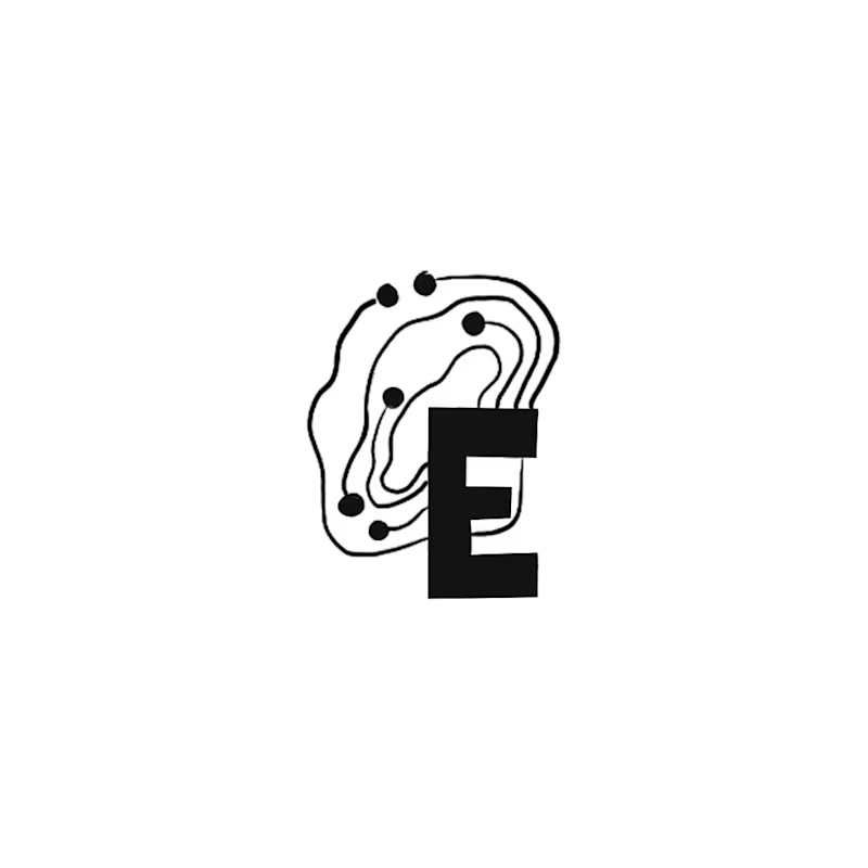
Happy Monday! Exploring early concept marks for a regional IT brand wanting to bridge modern IT services with Appalachian heritage.
Out of 10 sketches, my circle split right down the middle on these two:
A: The Ridge Monogram holds a bold silhouette where the "E" acts as the bedrock of the mountain ridge. It became a fast favorite with non-designer friends.
B: The Topo-Circuit idea plants a dynamic mark pairing circuit traces with elevation contours that can adapt to different locations as the business expands. (My personal pick!)
Which direction would you build out: A or B?
22 voted
73%

8 voted
27%
30 votes
Closed

I like the ridge monogram here!
because it is serving its purpose and it can be use in all applications.
The smallest ones as well.
Great work!🔥

Website & Branding for Blockchain Payments Consortium (Mysten Labs)

