The network for creativity
Join 1.25M professional creatives like you
Connect with clients, get discovered, and run your business 100% commission-free
Creatives on Contra have earned over $150M and we are just getting started
Back to feedPost


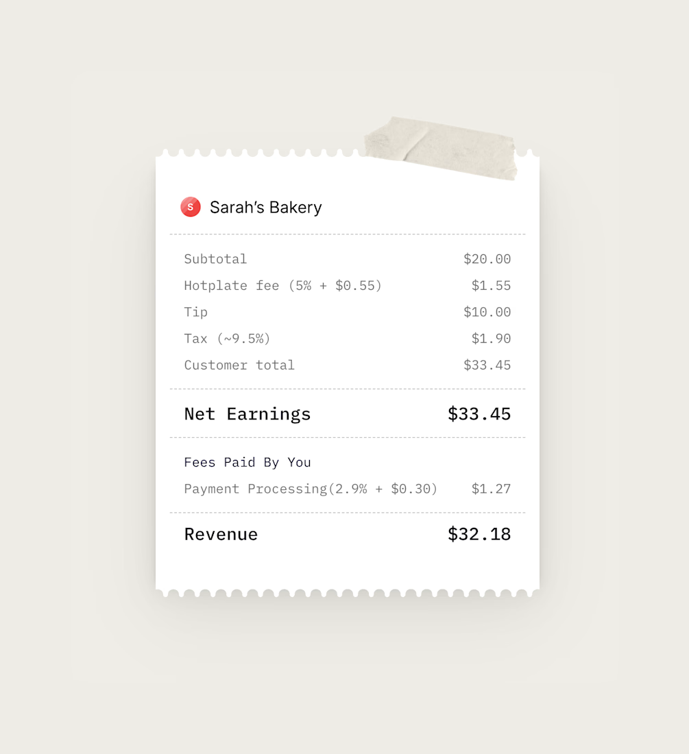
I love this piece of design for @Hotplate's new site that @Disha Shah and I are working on together. The whole site is all about making things feel organic and authentic, highlighting independent chefs, micro-bakers, hobbyist etc..
I love the receipt idea to demonstrate an example of what the pricing looks like and the masking tape adds that organic vibe to it.
Can't way to share the whole site!



That's awesome man!
Thanks brother!

clean
✨

The masking tape detail + the receipt UI is such a clever way to show the product experience! Hotplate is going to look so good in Framer 👏
I agree 💯 thank you!

It's the asset of a section on the pricing page

cool
Thanks Florencio!

Thank you!

Good Work!
Thanks Asif!

Awesome mate!
thanks man!

This is the height of clarity in design
Thanks Emmanuel!

Looks good 👍

This is dope

good work

Very cool 🙌


obsessed with this
Thank you Madison! 🙏

Great idea.

This looks nice
Thanks Breeje! 🫡


Such lovely design!
Appreciate it Marcus 🙏
The network for creativity
Join 1.25M professional creatives like you
Connect with clients, get discovered, and run your business 100% commission-free
Creatives on Contra have earned over $150M and we are just getting started




Related posts


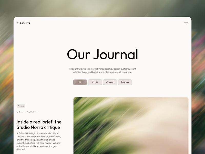
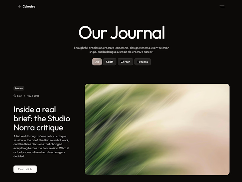
cohestra’s journal in light and dark. which would you keep?
26 voted
41%
37 voted
59%
63 votes
Closed


light: more clear for me 🎉


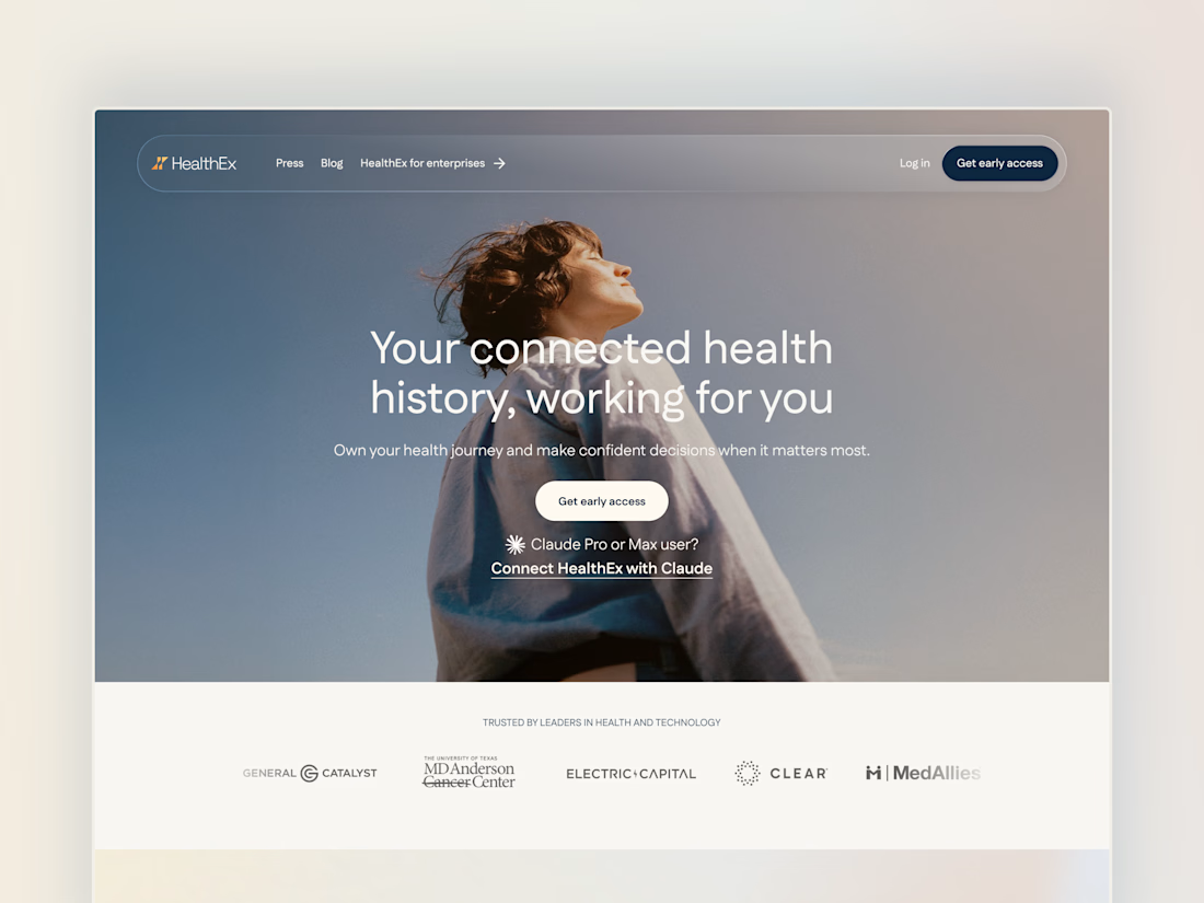
Project back from December 2025: Secret City designed the HealthEx website and hired me to build it in Framer.
P.S. they've gone through several site restructures since then (so it looks different from my snapshots), but it goes to show how easy Framer makes it for clients to manage and update their site independently.


Awesome😍


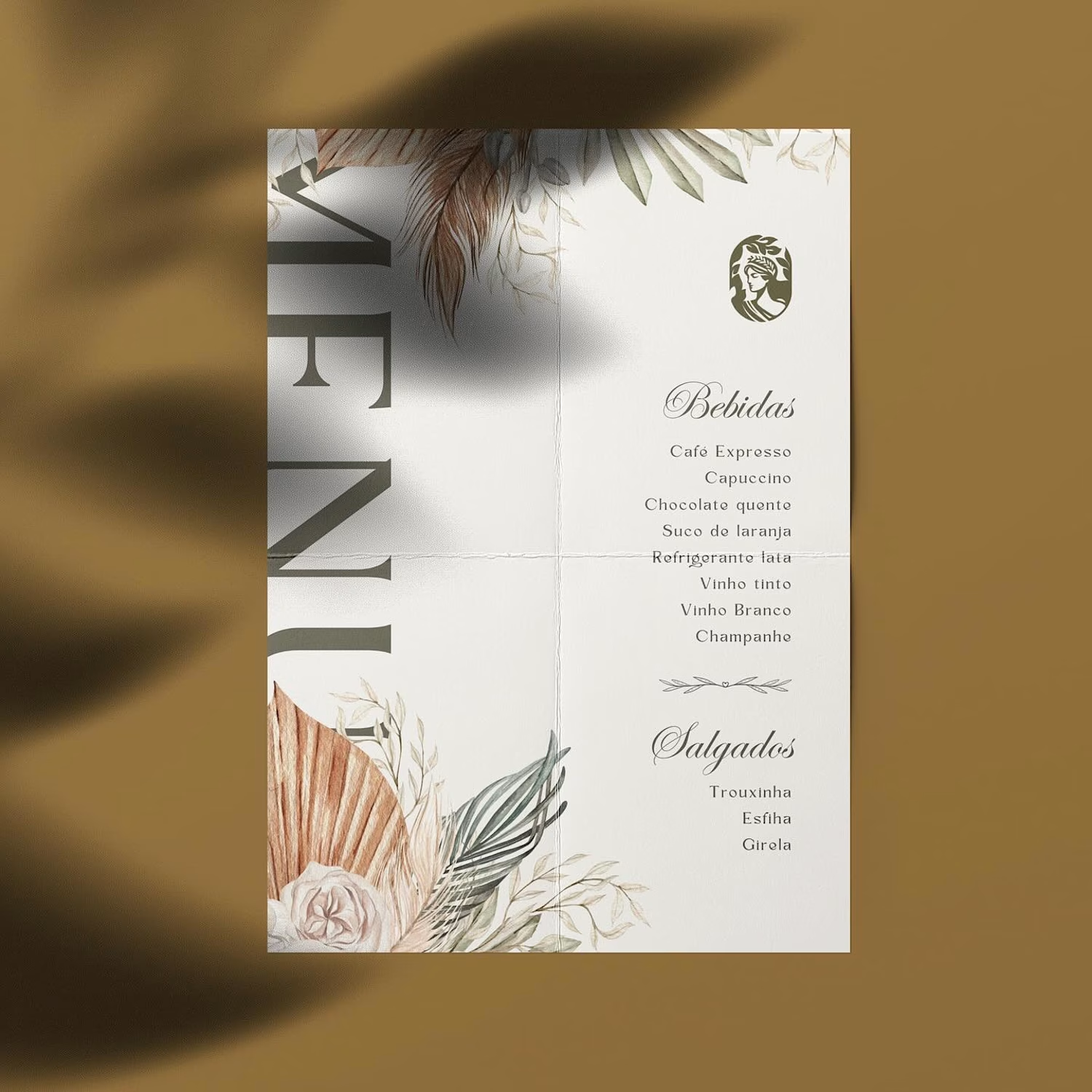
Hot take: aesthetics and clinical results should walk hand in hand.
Most brands in this space lean into cold, sterile whites or aggressive dark tones. It reads functional, but it also feels like something you'd hide in a medicine cabinet, not display on your vanity.
For this rebrand, we anchored the identity in classical beauty and organic sophistication. By combining warm earthy tones, botanical cues, and timeless iconography, we moved away from the "pharmacy product" feel into true high-end personal care.
It was a deliberate shift: positioning the brand not for someone who feels like they are treating a flaw, but for someone investing in a premium daily ritual.
Would a piece like this deserve a spot on your display shelf?




This is brilliant!