The network for creativity
Join 1.25M professional creatives like you
Connect with clients, get discovered, and run your business 100% commission-free
Creatives on Contra have earned over $150M and we are just getting started
Back to feedPost

The new @Figma Chrome Extension is insanely good for static websites.
Landing pages, blogs, marketing sites, documentation pages? Almost magical. It can pull layouts surprisingly well and save hours of manual recreation.
Where it still struggles is modern web apps. Complex React interfaces, dashboards, dynamic states, overlays, and highly interactive experiences can be hit-or-miss because there's much more happening beneath the surface than what appears on screen.
That said, I think some people are missing the point.
The value isn't copying pixels. It's starting from reality.
As designers, we're constantly working on products that already exist. A developer ships a feature, a competitor launches a flow, or a client wants to iterate on a live experience. Being able to bring that into Figma in seconds instead of rebuilding it from scratch is a huge productivity boost.
Even with its limitations, it's one of the biggest workflow improvements I've seen for designers this year.
I've shipped a few tools for designers and developers myself. If you're interested, feel free to check them out:
Chrome Extension: zipit extension
Web App: zipitweb
Would love to hear your thoughts and feedback.

The network for creativity
Join 1.25M professional creatives like you
Connect with clients, get discovered, and run your business 100% commission-free
Creatives on Contra have earned over $150M and we are just getting started








Related posts

Exploring hero sections for Nation e-commerce
Loving the direction

Solid layout, Miguel! The contrast between the clean typography and those interactive bento-style cards is crisp. Building this layout with smooth CSS grid transitions or GSAP pin scrolling would make the UX feel incredibly interactive.


what if your portfolio page was just all of it?
we put every project from our contra profile on one wall for the new apollo studio site.


Really great to see all of your work

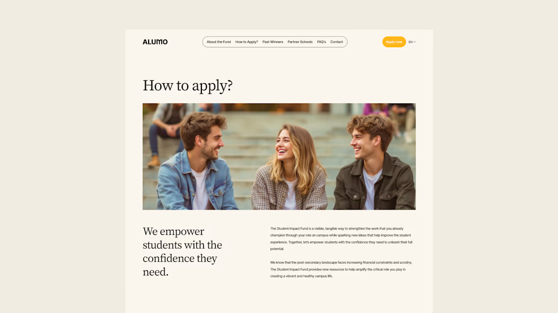
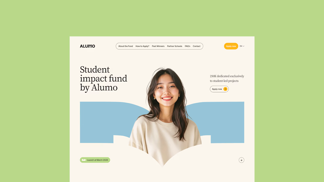
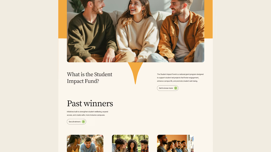
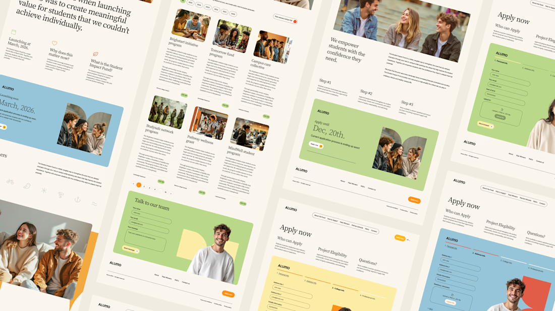
The Client: Alumo is a student impact fund that pools collective influence from influencers and partner schools to deliver a $250,000 annual grant program for student-led projects across Canada.
The Issue: The fund needed a website that could communicate trust and purpose to two very different audiences — students applying for grants and partner schools or influencers considering joining — while also showcasing past winners and guiding applicants through the process clearly.
The Solution: A multi-page website was designed with a warm, approachable visual identity using earthy tones, generous imagery, and clear information hierarchy. Each section — About, Past Winners, and How to Apply — was structured to reduce friction and build confidence, making it easy for students to understand eligibility and take action before the deadline.


Love how you're tackling trust + purpose for a $250K fund - that's a tough balance with two audiences. Communicating credibility for a student-led initiative across Canada is huge. Would love to see how you solved it!