The network for creativity
Join 1.25M professional creatives like you
Connect with clients, get discovered, and run your business 100% commission-free
Creatives on Contra have earned over $150M and we are just getting started
Back to feedPost
Taste Test
Which background makes the APEX logo look more luxurious and premium?
White or Black? Drop your choice + reason below 👇
2.


10 voted
22%
36 voted
78%

46 votes
Closed


Totally agree, Nirooz! The black background really gives it that exclusive, high-end vibe and makes the 3D metallic gold pop so much more.
Do you think the white version could still work better for clean print materials like business cards or stationery, or would you stick to black for everything?
Spot on! That’s exactly what I was thinking. Using white for stationery and print, while keeping black for digital & web branding creates a great balance.
Are you currently working on any branding or UI/UX projects yourself? Would love to check out your work

Appreciate the insight! I totally agree, the black background really pushes that luxury vibe.
Glad to help out! Always ready to support and collaborate.

Black for me too. the gold reads richer with more contrast, and that crown mark actually reads as a crown instead of getting lost in the lighter background. white version feels more like a spa brand than a luxury studio.
Thanks for the great feedback, MD Rafee! You nailed it — the high contrast against black really pops the gold details and holds that premium, luxury studio aesthetic. That spa comparison is a great callout!


Black gives it more depth and a stronger luxury feel.
100% agree with you, Kabir! The dark background really creates that contrast, making the gold pops and giving it a high-end luxury feel. Thanks for sharing your thought

Black is more preferable but here White is brighten.
Thanks for sharing your perspective, Alamgir! You're spot on—the white background really makes the overall composition brighter

Black makes it more visible and rich
Totally agree! The black background adds that high-end contrast to the logo. Thanks for dropping your thoughts — which element caught your attention first, the typography or the mark?

Negro
thank you
Huge thanks to everyone who voted and shared their thoughts! The Black concept clearly took the lead 🔥 Really appreciate the awesome support from this community! 🙏✨
The network for creativity
Join 1.25M professional creatives like you
Connect with clients, get discovered, and run your business 100% commission-free
Creatives on Contra have earned over $150M and we are just getting started





Related posts

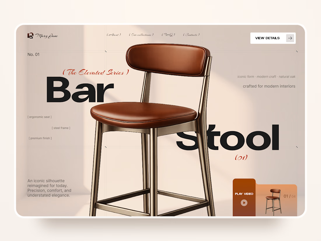
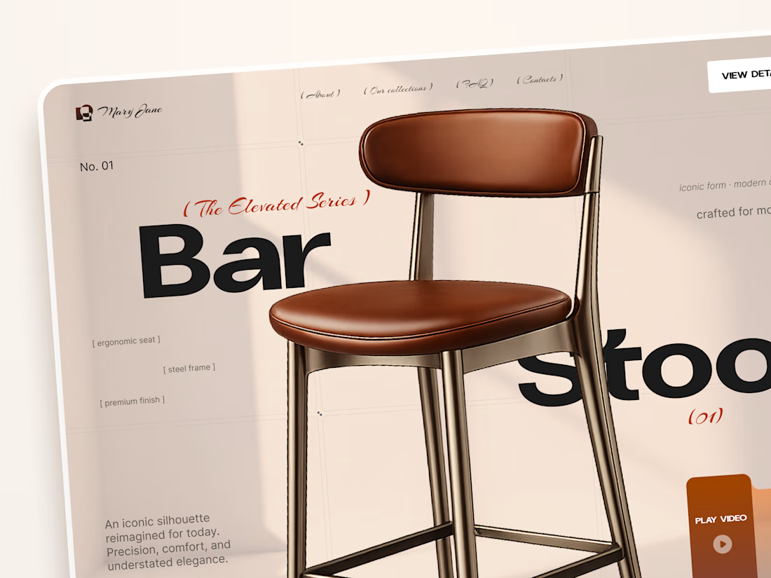
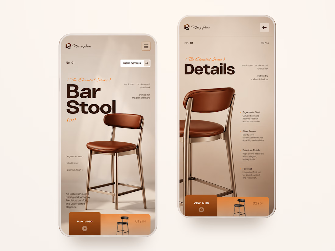
Mary Jane — Bar Stool Product Landing Page 🪑✨
A refined product landing page concept for a modern furniture brand, built around one statement piece
The design combines warm neutral tones, oversized typography, and editorial layouts to give the bar stool a premium, design-focused feel
Special attention was given to:
• Product-first composition
• Clean editorial typography
• Warm premium aesthetic
• Product details and features
• Video and 3D presentation
• Responsive mobile layout
The result is a simple, elegant experience that keeps the product at the center while giving the brand a distinctive visual character 🤎


Nice work

Luxury Gold Serum - Instagram Ad | 4:3 Premium Product Video
Premium Skincare Product Ad – 24k Gold Serum
I created this luxury Instagram ad (4:3 / 1080x1350) for a Korean skincare brand. Focused on clean, minimal & premium aesthetic.
Tools Used: CapCut, AI Enhancement, Lightroom
Features: White podium, soft studio lighting, bamboo elements for natural feel, gold serum highlight.
Designed to grab attention in 3 seconds and convert viewers into customers. Perfect for Instagram Feed & Stories.


good


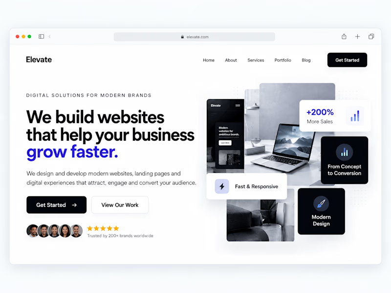
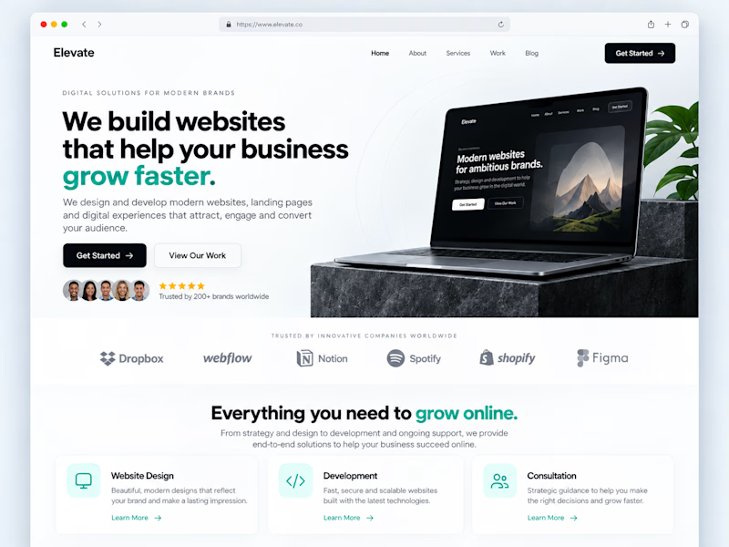
One of the easiest ways to make a website feel more professional:
Give your content more room to breathe.
Not every empty space needs another button, graphic, animation or paragraph.
Good spacing helps create:
• Better visual hierarchy
• Easier readability
• Clearer CTAs
• A more premium feel
Sometimes improving a website isn't about adding more.
It's about knowing what to remove.
Designers: do you prefer spacious layouts or more content-heavy websites?
#WebDesign #Webflow #UIDesign #Figma #WebsiteDesign
1 voted
33%
2 voted
67%
3 votes
Closed

The top one has more visible details I like it Victor ❤️❤️