
callum gardiner
Senior UX/UI Designer 🪐 Designer and #Figma nerd


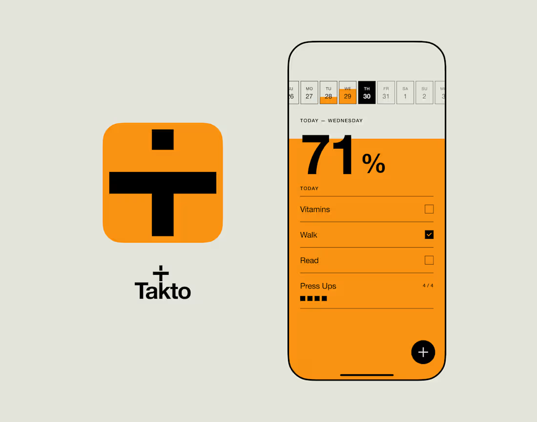
I made an app.
A slightly different project for me.
For years, I’ve tracked my daily habits using an orange Post-it note. Write down what I want to get done, tick it off, start again tomorrow.
I’d tried habit tracking apps, but always ended up back with the Post-it. I didn’t need dashboards, streaks, graphs or endless features. I just wanted something simple.
So I decided to build it myself.
Takto is my first iOS app — designed and built from scratch, taking it from an idea and some early Figma designs through to a real product on the App Store.
As a UX designer rather than a developer, a big part of the project was seeing how far I could push myself outside my usual role, using AI to help me actually build and ship the thing rather than stopping at a prototype.
The result is deliberately small. Add your habits. Do them. Tick them off. Your progress gradually fills the screen throughout the day.
No grand startup plan behind it. I wanted to make something I’d genuinely use, learn how to build a real product, and actually get it out into the world.
Quite nice seeing something that started as an orange Post-it sitting on my desk become an actual app.
https://apps.apple.com/us/app/takto/id6796480445
#UXDesign #ProductDesign #iOSDesign #AppDesign #IndieApp #BuildInPublic #AIDesign #Takto
6
7
614

Rocket Portfolio
Rocket Portfolio started as a simple question: why are so many creative portfolios either overcomplicated or forgettable?
I designed and built a premium portfolio template in Framer that helps creatives showcase their work with clarity and confidence. Every section was designed to keep the focus on the work itself, while giving users enough flexibility to make the site their own.
The template includes a CMS-powered project system, responsive layouts, subtle interactions, and reusable components that make it easy to launch a professional portfolio without starting from scratch.
From wireframes through to development in Framer, the goal was to create a template that balances strong visual design with usability and performance—something that works just as well for freelancers as it does for studios and product designers.
Deliverables
UX & UI Design
Framer Development
CMS Architecture
Responsive Design
Component System
Micro-interactions
SEO & Performance Optimisation
1
149
Overview
Self-initiated concept
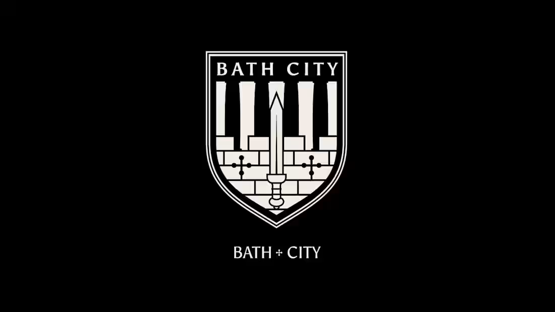
Bath City FC has adopted several different identities throughout its history, with each badge introducing new visual references while moving further away from a cohesive connection to the city itself. This concept explores how the club's identity could evolve by bringing together the strongest elements from its past into a single, modern crest rooted in Bath's history.
The Challenge
The club's identity has changed significantly over the decades, from the original civic crest to Roman-inspired shields and the current simplified badge. While each version introduced recognisable features, the relationship between the badge and the city's heritage had become less defined.
The challenge was to create an identity that felt unmistakably Bath while remaining practical across today's digital and physical touchpoints.
My Approach
I began by researching the evolution of Bath City FC's badges alongside the history of Bath itself.
Rather than creating an entirely new identity, the goal was to identify which elements carried genuine historical significance and reinterpret them for a contemporary audience.
This involved analysing:
Historic Bath City FC badges
The City of Bath coat of arms
Roman and medieval symbolism
Architectural references from the Roman Baths
Typography inspired by classical Roman inscriptions
The Solution
The redesigned crest combines references from multiple eras of the club's history into a single, cohesive identity.
Key design decisions included:
Restoring the detailed red city wall from earlier club identities.
Replacing the medieval sword with a Roman gladius to better reflect Bath's Roman heritage.
Redesigning the vertical linework as architectural columns inspired by the Roman Baths.
Introducing a refined shield structure for improved balance and scalability.
Developing typography influenced by classical Roman letterforms.
The result is a crest that feels more authentic to Bath while remaining flexible across kits, merchandise, social media and digital platforms.
Outcome
Although this is an independent concept rather than commissioned work, the project demonstrates how heritage research can inform modern identity design.
It explores how thoughtful design can strengthen the connection between a football club and the place it represents, while creating a visual identity that feels both timeless and practical.
Services
Brand Identity
Logo Design
Heritage Research
Visual Systems
Typography
Sports Branding
Tools
Figma
Adobe Illustrator
Adobe Photoshop
Project Type
Personal Concept (Self-initiated)
1
145

Overview
A personal branding concept exploring how the identity of my local football club could be reimagined through a modern crest, while respecting the history and heritage that supporters already identify with.
Project Type: Personal Concept
Role: Brand Identity, Logo Design, Visual Strategy
The Challenge
Football crests carry decades of history and emotional attachment. The challenge wasn't to replace that history, but to explore how a modern identity could retain the club's character while feeling more confident, scalable and consistent across today's digital and physical applications.
As a local supporter, I wanted to explore what that balance could look like.
The Approach
Rather than starting with trends, I began by understanding what made the existing identity recognisable.
The project focused on:
Preserving the iconic lion
Respecting Horsham's traditional green and yellow colours
Simplifying complex illustration into cleaner forms
Improving balance and legibility
Creating an identity that works from social media avatars through to embroidered kits
Throughout the process I referenced modern football identity systems that successfully evolved without losing their heritage.
Design Exploration
The project explored multiple directions before arriving at the final concept.
This included:
Lion illustration styles
Typography
Circular badge layouts
Colour refinement
Border treatments
Simplified heraldic detailing
Each iteration tested how far the badge could be simplified while remaining unmistakably Horsham.
The Outcome
The final concept presents a cleaner, more contemporary interpretation of the club's identity.
Rather than reinventing the badge, it focuses on refining its strongest assets into a mark that feels confident, recognisable and versatile across every touchpoint.
Applications
The concept was visualised across:
Match kits
Social media graphics
Digital assets
Merchandise
Brand presentation
This helped evaluate how the identity performs beyond the badge itself.
Disclaimer
This is an independent personal concept and is not affiliated with or endorsed by Horsham Football Club. It was created purely as a creative exploration.
1
1
158