The network for creativity
Join 1.25M professional creatives like you
Connect with clients, get discovered, and run your business 100% commission-free
Creatives on Contra have earned over $150M and we are just getting started
Back to feedPost

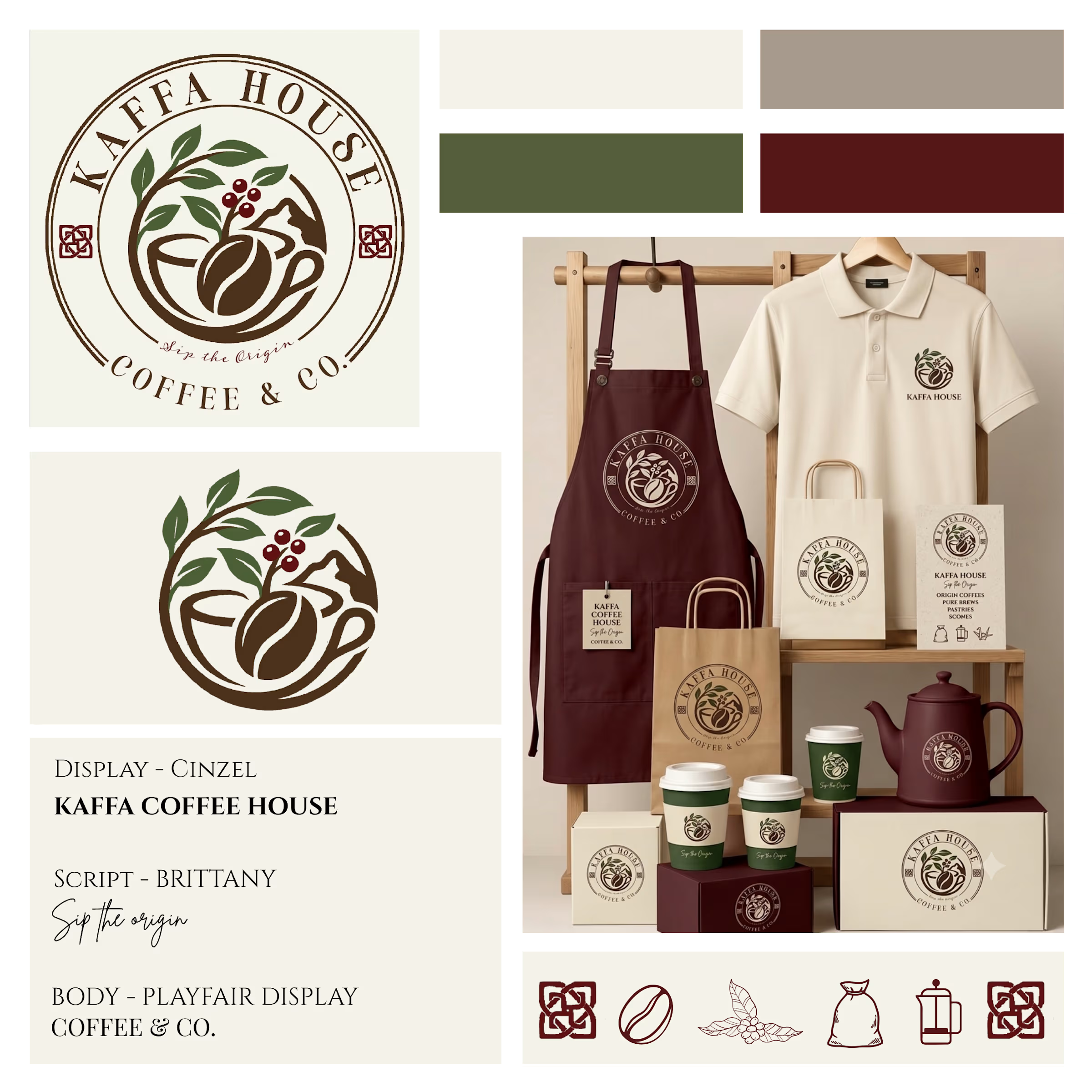
Kaffa House — Full Brand Identity System
A coffeehouse identity rooted in origin, ritual, and warmth.
Kaffa House needed a brand that felt as considered as the coffee itself — something that spoke to origin, craft, and the ritual of the pour, without leaning on café clichés. I developed a complete identity system: a primary emblem and standalone mark, a moss-and-merlot palette pulled from coffee cherries and highland greens, and a typography system (Cinzel for display, Brittany for script, Playfair Display for body) that balances heritage with warmth. The system was built to travel — from apron and uniform to packaging, cups, and stationery, while keeping "Sip the Origin" as a through line across every touchpoint.


The network for creativity
Join 1.25M professional creatives like you
Connect with clients, get discovered, and run your business 100% commission-free
Creatives on Contra have earned over $150M and we are just getting started






Related posts

New Day - New Case Study
Developed a visual identity for SuperMatics, a Berkeley-based technology company combining physics and AI to discover new superconducting materials.

Amazing work!!


It looks so good
Had some fun with this one.
Exploring how typography, colour, and a few unexpected details can give a brand its own personality.
Meet Flankman. Full case study is live! ↓






clean


