


Experimental Canva Poster Designs Across Diverse Visual Styles
0
0
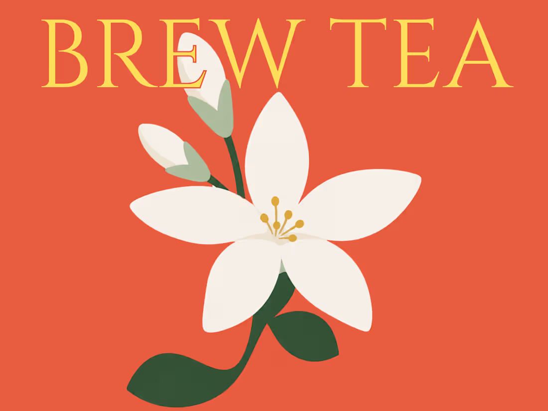
Brew Tea — Jasmine Tea Packaging & Brand Identity
A jasmine tea brand identity, from logo to a print-ready box.
Brew Tea is a full packaging and brand identity project for a jasmine tea label, built end to end - from logo and visual identity through to a manufacture-ready dieline.
The identity centers on a warm, botanical palette (Jade Ink, Sage Mist, Jasmine Gold, Marigold Coral) paired with Cinzel and Cormorant Garamond for a look that's elegant, earthy, and rooted in the plant itself. Illustrated jasmine motifs and a hand-drawn farmland landscape carry the packaging artwork, with copywriting for ingredients, steeping instructions, and brand messaging woven directly into the panel layout.
The project moves from concept to production: mood boarding and reference research, primary logo and typography system, full box artwork across all panels, a technical dieline with bleed/trim/crease specs and exact dimensions, and a 3D mockup to preview the folded, shelf-ready box.
0
83
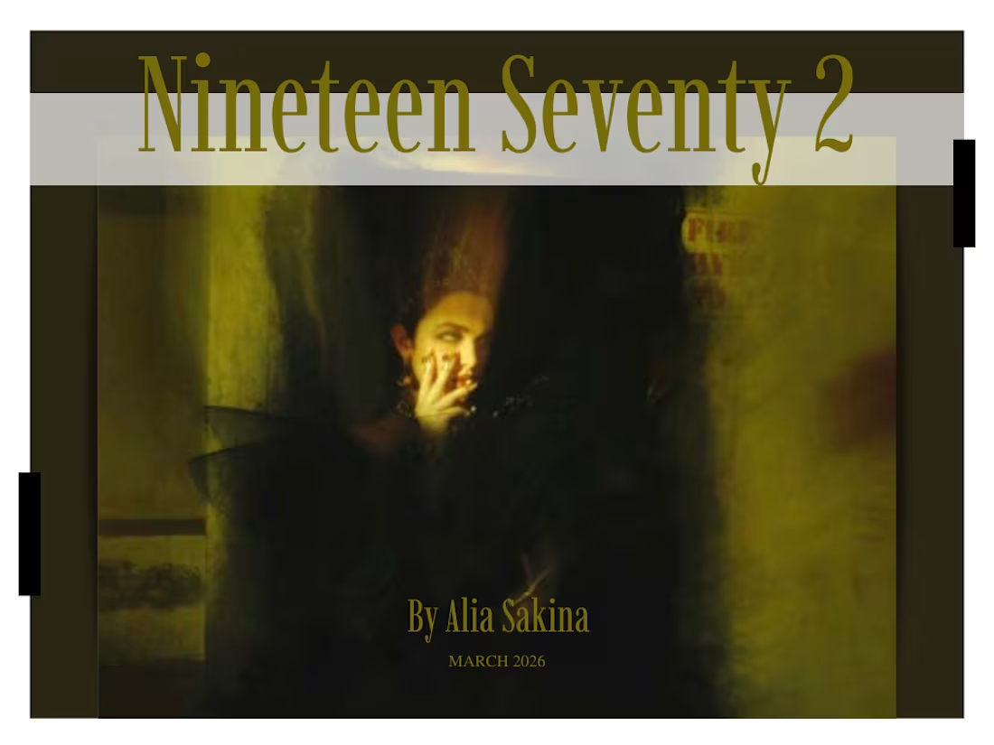
Nineteen Seventy 2 — Magazine Layout & Editorial Design
A print magazine spread blending Indian beauty heritage with high-fashion editorial styling.
A snippet from Nineteen Seventy 2, a print magazine I contributed to during my postgraduate studies, designed and art directed as part of a collaborative student publication for FAD Institute of Luxury Fashion and Style, Mumbai. This excerpt features the Beauty section, pairing editorial photography with feature writing on Indian skincare and haircare traditions from Ayurvedic formulations to the ritual of hair oiling - framed through a modern, high-fashion lens. The layout leans into clean grid structures, generous white space, and a considered typographic hierarchy to let the imagery and storytelling breathe.
1
2
152
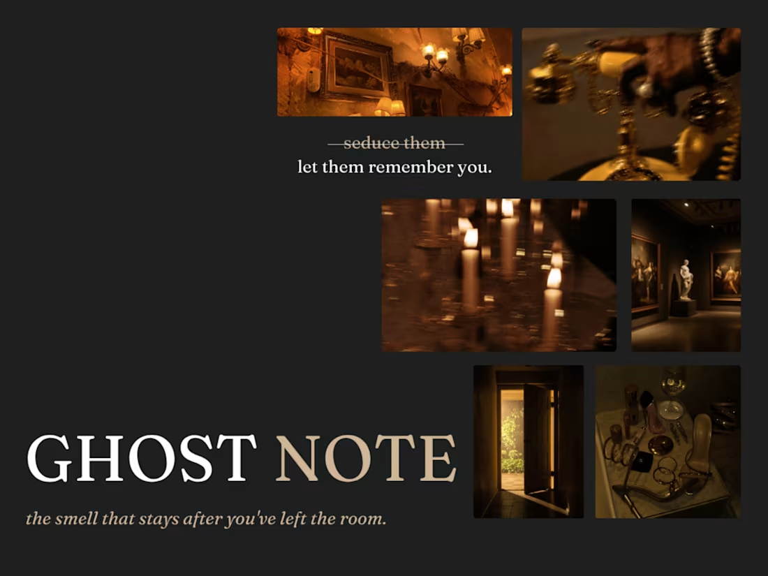
Ghost Note — Fragrance Brand Campaign (Full Branding, Spec Project)
A niche fragrance brand built around a single idea: the smell that stays after you've left the room.
Ghost Note is a self-initiated brand campaign for a niche, gender-fluid fragrance house — built to show full-funnel branding, from strategic positioning through to visual identity and copy voice.
The core idea: Most fragrance marketing sells presence in the room. Ghost Note sells the opposite — the residue left behind after someone's gone. Every deliverable, from the strikethrough copy device ("seduce them" → "let them remember you") to the four-scent range Almost Said It, Borrowed Sweater, Leftover Static and 3AM Unsent was built around that single emotional insight.
Scope included brand positioning, naming, tone-of-voice, a custom palette, typography system, art direction rules for photography, and packaging concepts — all designed to hold together as one coherent world, not just a mood-board.
0
150