
Alia Sakina
Content & Design for Creative Brands
New to Contra
Alia is ready for their next project!
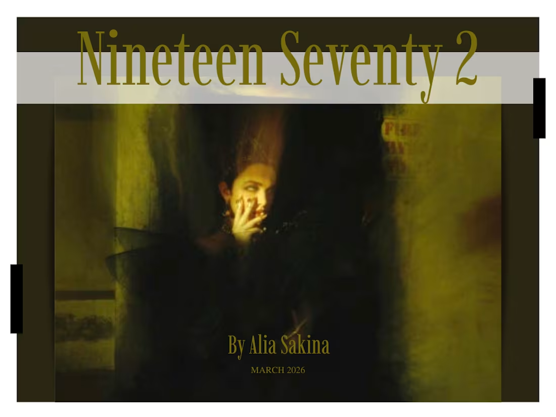
Nineteen Seventy 2 — Magazine Layout & Editorial Design
A print magazine spread blending Indian beauty heritage with high-fashion editorial styling.
A snippet from Nineteen Seventy 2, a print magazine I contributed to during my postgraduate studies, designed and art directed as part of a collaborative student publication for FAD Institute of Luxury Fashion and Style, Mumbai. This excerpt features the Beauty section, pairing editorial photography with feature writing on Indian skincare and haircare traditions from Ayurvedic formulations to the ritual of hair oiling - framed through a modern, high-fashion lens. The layout leans into clean grid structures, generous white space, and a considered typographic hierarchy to let the imagery and storytelling breathe.
1
2
44
Icons in Ink — A Portrait Series
Hand-drawn portraits of the faces that shaped music, film, and sport.
A self-directed series of hand-drawn stencil art portraits - rendered in marker, pen, and pencil — capturing musicians, actors, and athletes who've left a mark on culture. From Freddie Mercury and Jim Morrison to Kobe Bryant, Tupac, and Mohamed Salah, each piece balances bold linework with selective color and shading to bring out likeness and mood. The series doubles as a study in contrast — stark black-and-white forms next to bursts of color — and reflects an ongoing practice in observational portraiture and visual storytelling through the human face.
0
23
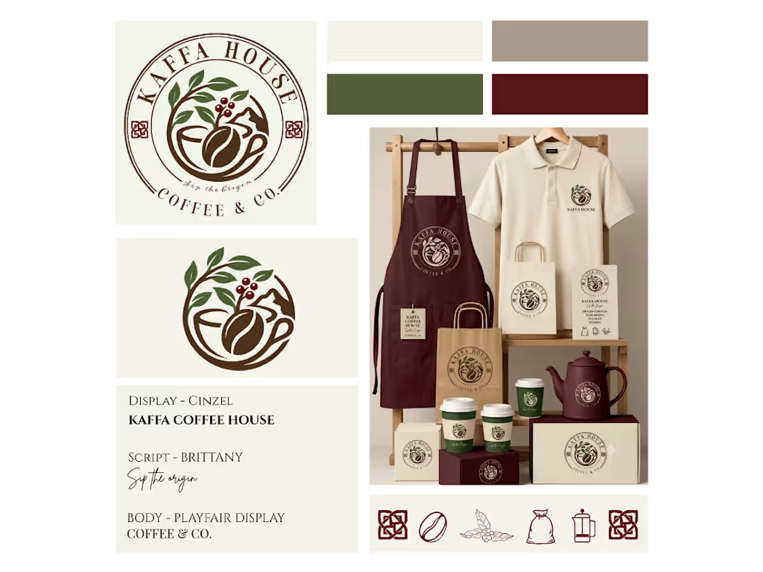
Kaffa House — Full Brand Identity System
A coffeehouse identity rooted in origin, ritual, and warmth.
Kaffa House needed a brand that felt as considered as the coffee itself — something that spoke to origin, craft, and the ritual of the pour, without leaning on café clichés. I developed a complete identity system: a primary emblem and standalone mark, a moss-and-merlot palette pulled from coffee cherries and highland greens, and a typography system (Cinzel for display, Brittany for script, Playfair Display for body) that balances heritage with warmth. The system was built to travel — from apron and uniform to packaging, cups, and stationery, while keeping "Sip the Origin" as a through line across every touchpoint.
2
41
Kaffa House — Brand Launch Carousel (Patna, Bihar)
Building a café's soul before it opened its doors.
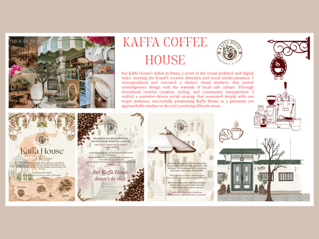
When my best friend was opening Kaffa House, her first coffee house in Patna, she came to me with a single feeling she wanted people to walk away with: that this wasn't just another café chasing a trend, but a small sanctuary built around one bean's long journey — from Ethiopia, through Greece, to the southern coast of India.
I took on the full creative direction for the brand's debut, working as both the visual architect and the writer behind its voice. Every slide in this launch carousel was built to do two things at once — look like a page out of an old travel journal, and read like a quiet invitation to slow down.
On the design side, I built a visual world around watercolour Santorini streets, pressed bougainvillea, hand-drawn coffee maps, and warm sepia tones — deliberately avoiding the loud, saturated aesthetic most new cafés lean on for launch content. On the writing side, I shaped a narrative voice for Kaffa House that's unapologetically poetic and a little confrontational — that coffee "was never meant to be sweet," that the café exists so people can stop performing and "return to themselves."
The result was a five-slide Instagram carousel that doubled as a manifesto: introducing the brand's origin story, its philosophy on bitterness versus comfort, its atmosphere, and even its resident Greek dog statues (a small, deliberate detail meant to make the sanctuary feel lived-in, not staged).
My role: Creative direction, visual design, brand copywriting, social content strategy
Tools: Canva
Deliverable: Instagram launch carousel (5 slides) establishing Kaffa House's brand voice and visual identity ahead of its Patna debut
0
56
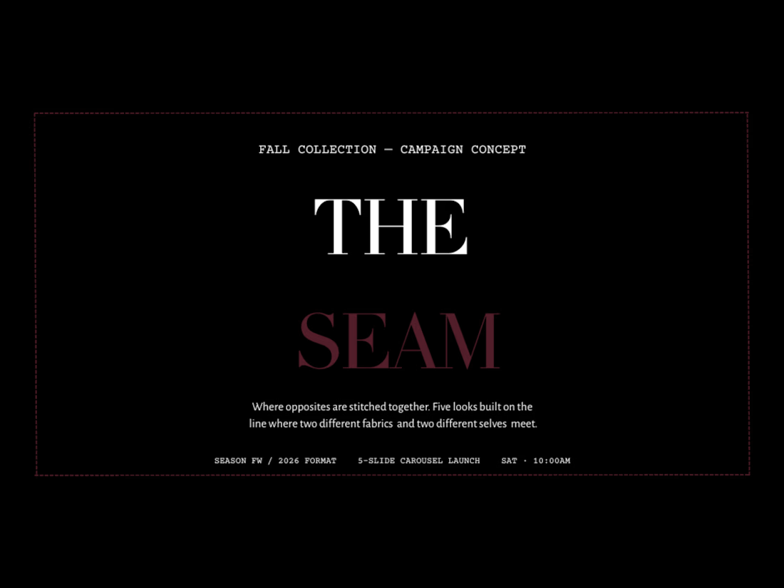
The Seam - Social Campaign Strategy & Copywriting
A mock 7 day social launch campaign for a fashion line — content calendar, caption copy, and campaign concept from strategy to execution.
The Seam is a mock fashion line I created to demonstrate how I approach social media strategy and copywriting for a product launch. This project covers the thinking behind a cohesive campaign — not just individual posts.
THE BRIEF (self-directed) : Design a 7 day social launch campaign for an elevated streetwear line, built to grow engagement and drive traffic ahead of a product drop.
WHAT I DELIVERED :
Content calendar: a full month mapped by content pillar (product, lifestyle, behind-the-scenes, UGC/community, promo), so every post has a job to do
Caption copywriting: on-brand voice across formats — hooks, product captions, and CTA-driven promo copy
A sample carousel mockup to show how the copy and visuals work together in-platform
MY APPROACH : I started with brand voice before writing a single caption — who is The Seam talking to, and what do they sound like when they talk? From there, the calendar was built around a rhythm real brands can actually sustain (not an unrealistic post-every-day fantasy), balancing product-forward content with posts that build community and trust.
This project reflects how I work with fashion and lifestyle brands: strategy first, copy second, visuals in support of both.
0
55
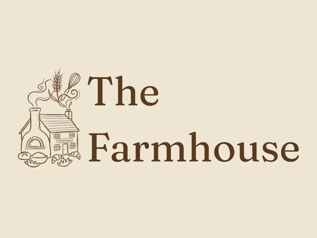
The Farmhouse — Café Rebrand (Whitefield, Bangalore)
The Brief (self-set) : The Farmhouse is a real all-day café in Whitefield, Bangalore. This was a spec rebrand — no client, no brief handed to me, just a café I thought was underserving its own story. It's not commissioned or affiliated work; it's a demonstration of how I'd approach a full identity system if I were briefed in.
The Idea : The existing identity leaned on a generic cottage illustration. I rebuilt the mark around a single wheat stalk — a signature element that works alone on a stamp, a bag seal, or a menu corner without needing the rest of the scene to explain it. The full house-and-oven illustration still exists as a primary lockup, but the wheat stalk is the piece built to travel.
0
61
Ghost Note — Fragrance Brand Campaign (Full Branding, Spec Project)
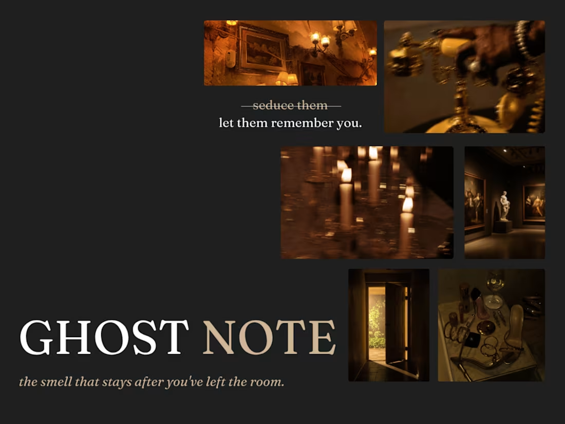
A niche fragrance brand built around a single idea: the smell that stays after you've left the room.
Ghost Note is a self-initiated brand campaign for a niche, gender-fluid fragrance house — built to show full-funnel branding, from strategic positioning through to visual identity and copy voice.
The core idea: Most fragrance marketing sells presence in the room. Ghost Note sells the opposite — the residue left behind after someone's gone. Every deliverable, from the strikethrough copy device ("seduce them" → "let them remember you") to the four-scent range Almost Said It, Borrowed Sweater, Leftover Static and 3AM Unsent was built around that single emotional insight.
Scope included brand positioning, naming, tone-of-voice, a custom palette, typography system, art direction rules for photography, and packaging concepts — all designed to hold together as one coherent world, not just a mood-board.
0
95