The network for creativity
Join 1.25M professional creatives like you
Connect with clients, get discovered, and run your business 100% commission-free
Creatives on Contra have earned over $150M and we are just getting started
Back to feedPost
Taste Test
Which one would you choose? 👇
Dark mode or light mode for an operational SaaS platform? ✨


16 voted
30%
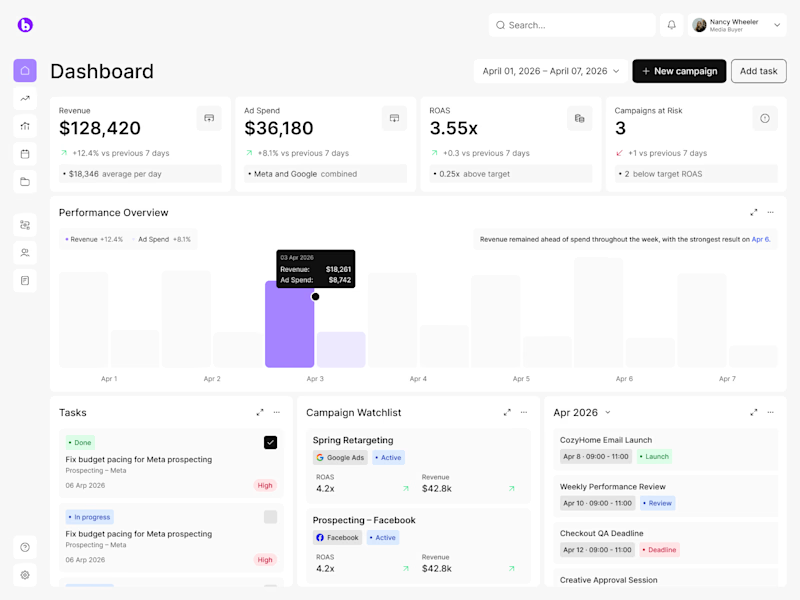
37 voted
70%
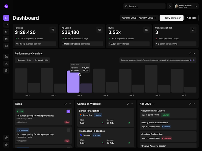
53 votes
Closed

I am so much in love with the Dark SaaS dashboard 😍

Your words sweet like honey 🍯😍
Thanks
dark version all the way, less pressure for eyes 😍
Thank you! We noticed you voted for the light version, appreciate it 🔥
both looks so clean 🚀 🔥
Indeed 💖💖

Wow, the visual balance in both layouts is incredible. But there’s just something about a premium dark mode for complex SaaS platforms that hits different. Absolutely gorgeous design work! 🔥
Yes, this is exactly what I thought at first too! There's something about this premium dark mode SaaS concept 😊

I like dark as a designer and light as a user

Exactly my mind haha
Haha, makes sense 🙌

Yeah, that's what I thought too

Awesome design, both versions are amazing! 😍 🔥
Thank you so much! 😍 🚀

Woow I really like light one 😍

as a dev or designer and dev DARK works well for me
Thanks for sharing 🙌

Light mode. In this case, the hierarchy feels clearer and the data is easier to process at a glance.
Thanks for sharing your opinion! :)

I prefer dark version❣️

Gotta choose both bro, but Contra doesn't allow it.

I usually go for light but here the dark mode is clearly better

might be one of the places where i choose a light theme

Strong UX thinking behind this.

what do you think has more real industrial use, light/ dark mode?

Dark SaaS Dashboard

I'd hoose the light one, cause the dark theme always make a pressure on my eyes.
Makes sense, Yurii! 🙌

Impressive design !


Definitely light mode🙌

I like always light mode more

My voice went to the Dark version ❤️

The Dark SaaS is cool
Thanks! 😎

I dont know why or is it my eyes...... dark mode always stand out than the light mode

Dark mode looks amazing here. If users are staring at these analytics dashboards for hours daily, the dark theme is much better for reducing eye strain. Super clean designs!
Your words mean a world to us! Thank you 💖

Light mode ftw

ummm, go for dark one.
Totally makes sense to add switcher :)
The network for creativity
Join 1.25M professional creatives like you
Connect with clients, get discovered, and run your business 100% commission-free
Creatives on Contra have earned over $150M and we are just getting started
Trending

Claude
Claude has entered the design space. How are you using Claude Design?

Contra University
Learn from expert creatives how to earn more using next-gen AI tools.
creativeaiflow
Creative AI workflows are evolving. What tools do you use, and what are their strengths and weaknesses?
freelancerlife
Freelancer life is wins, pivots, and everything in between. What’s yours right now?










Related posts
Check out the new weather app concept 🌧️ Would love to hear your feedback!



Hey!
I tried something similar , please check this out , will greatly appreciate your respose

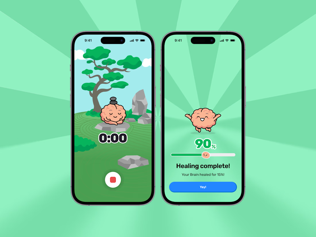
You can fix your brain in Brainrot! Turning on Focus mode lets you heal your brain and bring him back to top shape!

This looks cool.