The network for creativity
Join 1.25M professional creatives like you
Connect with clients, get discovered, and run your business 100% commission-free
Creatives on Contra have earned over $150M and we are just getting started
Back to feedPost
Taste Test
Which one would you choose? 👇
Dark mode or light mode for an operational SaaS platform? ✨


16 voted
30%
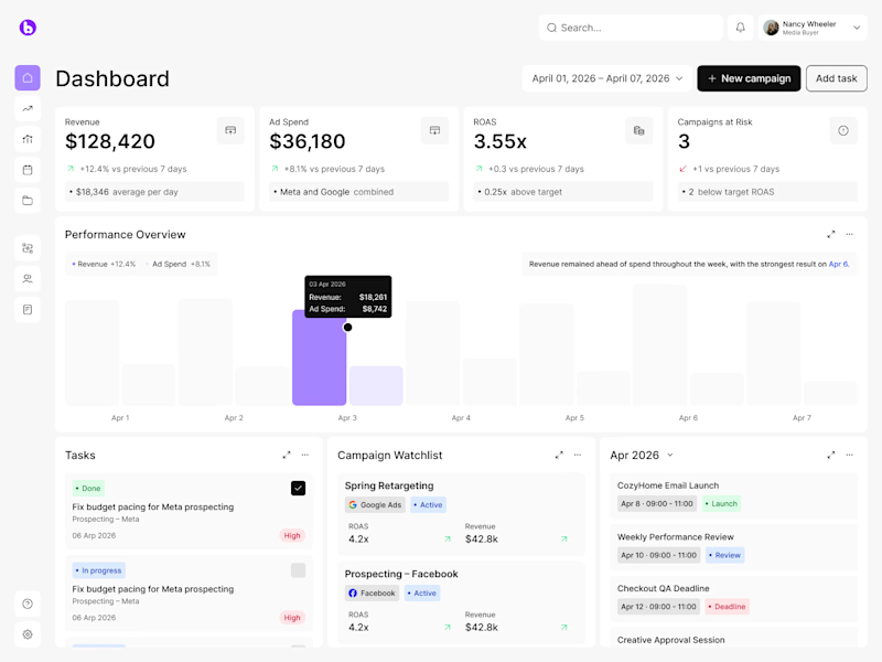
37 voted
70%
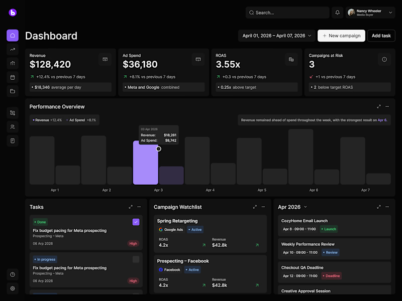
53 votes
Closed

dark version all the way, less pressure for eyes 😍


Thank you! We noticed you voted for the light version, appreciate it 🔥

both looks so clean 🚀 🔥
Indeed 💖💖

Wow, the visual balance in both layouts is incredible. But there’s just something about a premium dark mode for complex SaaS platforms that hits different. Absolutely gorgeous design work! 🔥
Yes, this is exactly what I thought at first too! There's something about this premium dark mode SaaS concept 😊

I like dark as a designer and light as a user

Exactly my mind haha
Haha, makes sense 🙌

Yeah, that's what I thought too

Awesome design, both versions are amazing! 😍 🔥
Thank you so much! 😍 🚀


Woow I really like light one 😍

as a dev or designer and dev DARK works well for me
Thanks for sharing 🙌

Light mode. In this case, the hierarchy feels clearer and the data is easier to process at a glance.
Thanks for sharing your opinion! :)

I prefer dark version❣️

Gotta choose both bro, but Contra doesn't allow it.

I usually go for light but here the dark mode is clearly better

might be one of the places where i choose a light theme

Strong UX thinking behind this.

I am so much in love with the Dark SaaS dashboard 😍
Your words sweet like honey 🍯😍
Thanks

what do you think has more real industrial use, light/ dark mode?

Dark SaaS Dashboard

I'd hoose the light one, cause the dark theme always make a pressure on my eyes.
Makes sense, Yurii! 🙌


Impressive design !


Definitely light mode🙌


I like always light mode more

My voice went to the Dark version ❤️

The Dark SaaS is cool
Thanks! 😎

Dark mode looks amazing here. If users are staring at these analytics dashboards for hours daily, the dark theme is much better for reducing eye strain. Super clean designs!
Your words mean a world to us! Thank you 💖

Light mode ftw

ummm, go for dark one.

Totally makes sense to add switcher :)
The network for creativity
Join 1.25M professional creatives like you
Connect with clients, get discovered, and run your business 100% commission-free
Creatives on Contra have earned over $150M and we are just getting started



Related posts

Dark Mode 🖤 or Light Mode 🤍?
Which one matches your vibe? 👀
15 voted
54%
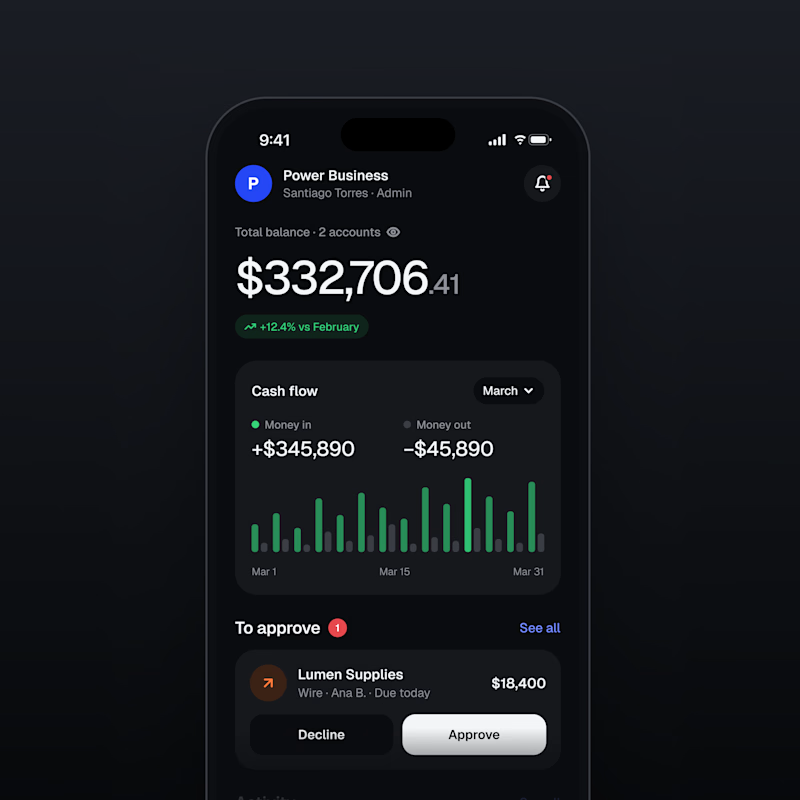
13 voted
46%
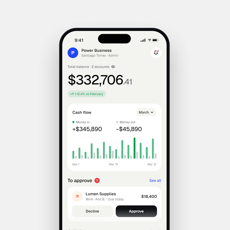
28 votes
Closed

Both are nice clean designs...for me,Dark mode!

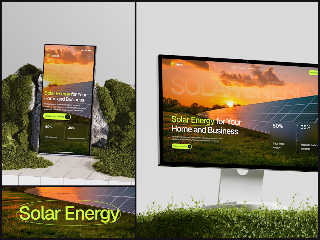
Solar Energy Website
A thin lime circle tells you which two words this page is about.
The headline sits over a sunset photo of a panel field. The "Get started" and "Explore innovations" buttons share the circle's lime, so the eye moves from the circled words straight to the next step.
Large faded capitals repeat those two words across the sky, faint enough to stay inside the photo. On mobile they break onto two lines, and the headline and button stack above two frosted cards.
Only two words of "Solar Energy for Your Home and Business" are lime, and the whole page follows them.
Designed by the Hue & Machine team.
#SolarEnergy #RenewableEnergy #CleanTech #WebDesign #LandingPage #HeroSection #UIDesign #ResponsiveDesign #MobileDesign #FigmaDesign



This is really cool, Nice job Dmytro
Which brand showreel preview design would you choose - Silver & Ropes or Purple Stones? ⚡
Lynksen is cooking something fire...
and we need your expert eyes on this one 🔥😎
Vote and tell why! 👇

12 voted
24%
37 voted
76%
49 votes
Closed

Going with Purple Stones. It feels more distinctive and memorable for a showreel, Silver & Ropes is clean but a bit safer.