The network for creativity
Join 1.25M professional creatives like you
Connect with clients, get discovered, and run your business 100% commission-free
Creatives on Contra have earned over $150M and we are just getting started
Back to feedPost


The network for creativity
Join 1.25M professional creatives like you
Connect with clients, get discovered, and run your business 100% commission-free
Creatives on Contra have earned over $150M and we are just getting started





Related posts

Built a custom @Rive component for the About section of my agency site.
The lanyard and badge are fully interactive. You can grab them, throw them around, and spin the badge 360° to see both sides.
It doesn’t necessarily need to do all of that, but that’s kind of the point.
Small interactive moments like this can turn a pretty standard section of a website into something people actually want to play with, remember, and come back to.


Wow Work bro.

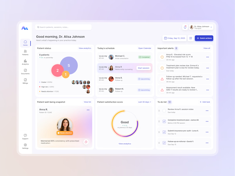
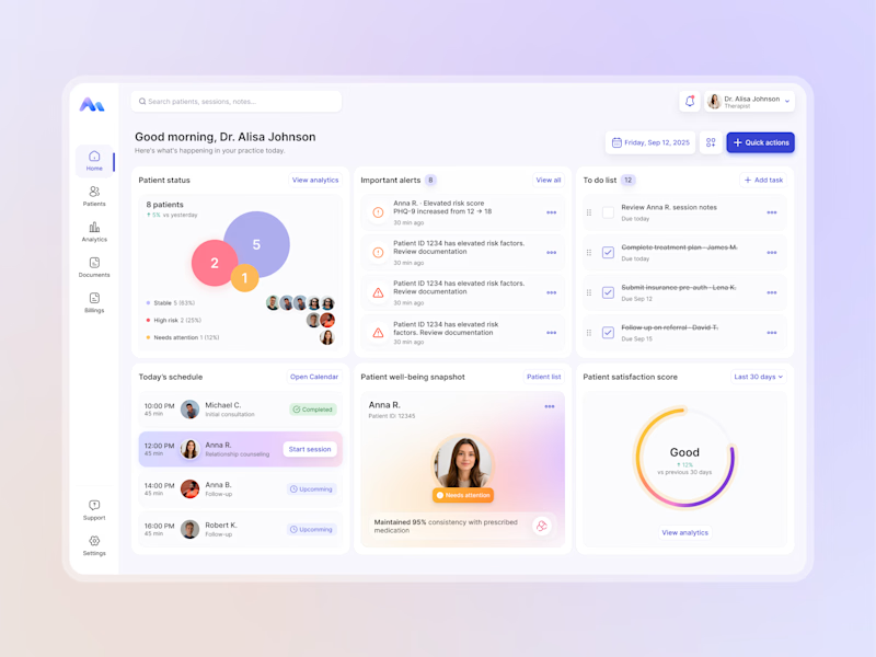
Designing for therapists means prioritizing what matters in the next few minutes, not just what looks good on a dashboard.
I explored two layout directions for a mental health practice management web app that helps psychologists manage sessions, patients, documentation, tasks, and follow-ups.
Both concepts use the same core widgets, but with different positioning and visual hierarchy. The goal was to make daily priorities easier to scan and act on.
Which option feels more intuitive - A or B? 🤔
17 voted
68%
8 voted
32%
25 votes
Closed


Hi Contra Community! I'm new here, what do you think about this design? I'll love to have your feedback.

Welcome to the Contra Community Juan!


