The network for creativity
Join 1.25M professional creatives like you
Connect with clients, get discovered, and run your business 100% commission-free
Creatives on Contra have earned over $150M and we are just getting started
Back to feedPost

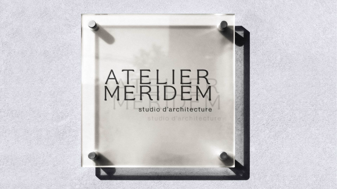
Atelier Meridem - Architecture Brand Identity
A refined identity system designed for a contemporary architecture studio seeking clarity, structure and spatial coherence.
Scope: Logo design, typographic system, visual language, stationery and brand guidelines.
The objective was to translate architectural rigor into a minimal, structured and timeless visual identity adaptable across print and digital environments.


The network for creativity
Join 1.25M professional creatives like you
Connect with clients, get discovered, and run your business 100% commission-free
Creatives on Contra have earned over $150M and we are just getting started





Related posts

Check it out, I just uploaded a case study on a brand project for Bluem, an activewear brand from Vancouver, CA.
Look through the case study to see some of my thoughts, and the project in full, worth the time!

Nice design language. Can you spare a minute giving me some advice for my logo design philosophy? Do I need some changes.
View Full Project
Brand Guidelines for Bluem.
Bluem is an activewear brand from Vancouver, they approached me for a rebrand earlier this year.
Take a look at the full project to learn more, and see the full guidelines!

The logo and visual direction work beautifully together!

Just shipped the BALEEN site — a marine salvage brand's home isn't a brochure, it's a registry.
A draggable archive of hyperrealistic specimen stamps as the hero. A live ledger of recovered objects. A vessel section with working depth and call sign.
Every object catalogued, never sold as treasure. 🐋⚓️

100% brochure, from layout, typography, sections, color palete and the description 100% AI generated. I use AI as well, but it seems like you did not put any human output anywhere.