The network for creativity
Join 1.25M professional creatives like you
Connect with clients, get discovered, and run your business 100% commission-free
Creatives on Contra have earned over $150M and we are just getting started
Back to feedPost
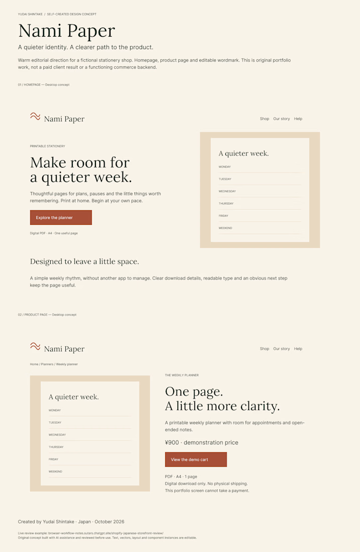
Nami Paper — Editable Storefront Design Concept
A self-initiated design for a fictional stationery brand. This is a portfolio example, not client work or a functioning online shop.
The homepage gives one printable planner a clear place in the story. The product page puts the format, page count and digital-delivery details beside the next action. A warm palette, serif headings and a simple wave mark carry the same identity across both pages.
The Figma file contains editable text, vector marks and component instances, so you can inspect the structure rather than judge only a screenshot. Conversion impact and production implementation have not been validated.
View the editable design:
https://www.figma.com/design/slq8fCdTAasxI7721c4nk7?node-id=2-2
For a small storefront design project, share the page you need, your existing brand assets and the intended handoff. We can agree on the design scope before work begins.
Created with AI assistance; design and wording reviewed before publication.


The design package is now available: $350 for two desktop pages in editable Figma. It starts with two rough homepage directions; we finish one selected homepage and one product-detail page, with one consolidated revision. Existing logo, images and approved copy are supplied by...
contra.com
Editable Storefront Design — Two Desktop Pages in Figma by Yudai Shintake
Read more about Editable Storefront Design — Two Desktop Pages in Figma by Yudai Shintake on Contra.
The network for creativity
Join 1.25M professional creatives like you
Connect with clients, get discovered, and run your business 100% commission-free
Creatives on Contra have earned over $150M and we are just getting started

Related posts



Amazing work!

Unpopular opinion: most redesigns don’t need a new look. They need less noise.
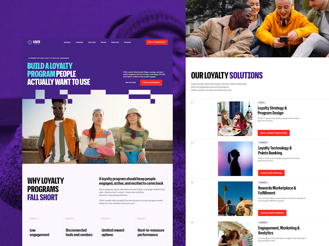
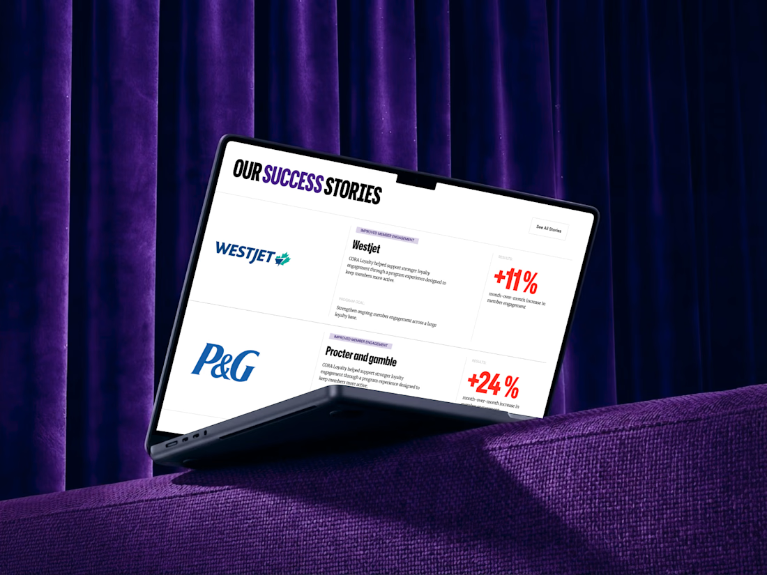
When CORA, a B2B loyalty and rewards platform, came in for a redesign, the easy move was to refresh everything. I did the opposite. I kept the brand’s colors, fonts, and rules, built a new UI system around them, and added the pages they were missing.
Wireframes first, then UI and animation. The biggest change came from what I took away: visual noise. A clear type hierarchy did the rest.
Before and after are in the case study on my profile.
So, designers: when a client asks for a “fresh look”, do you push for something new or protect what people already recognize? 👇
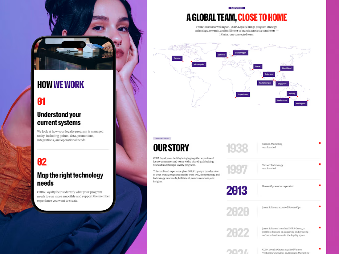

Love the after result and the comprehensive case study!

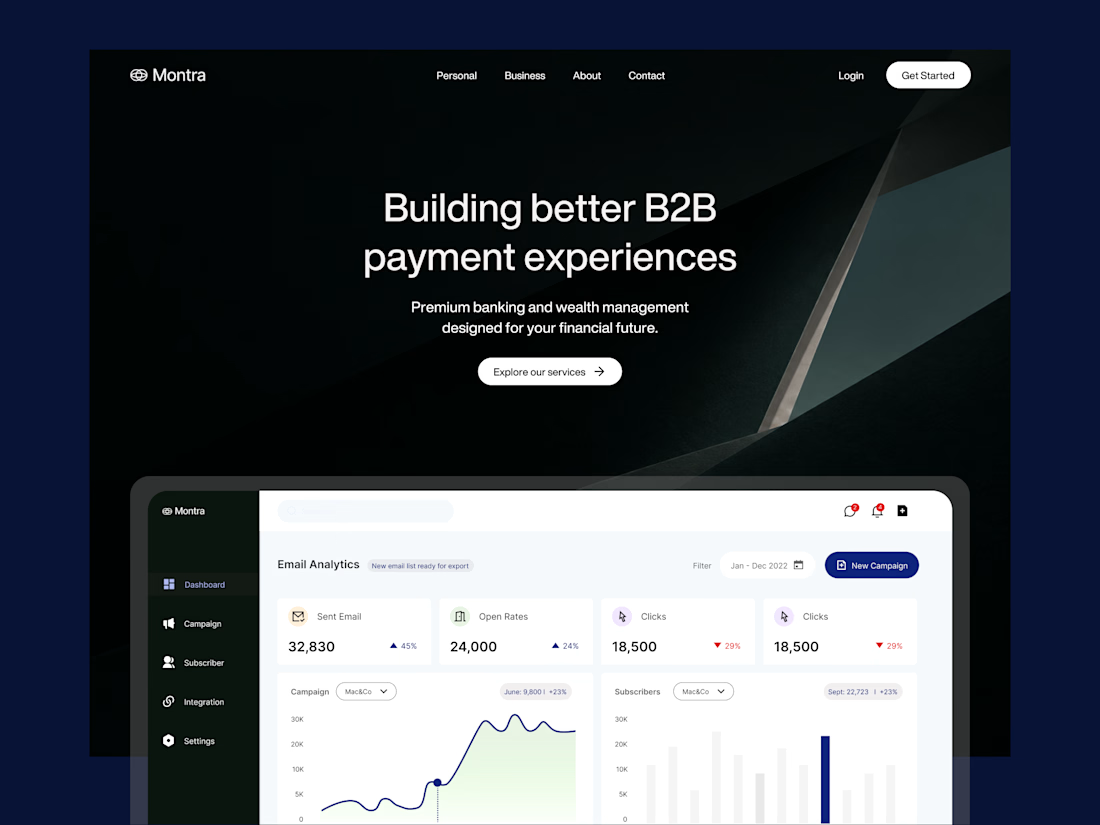
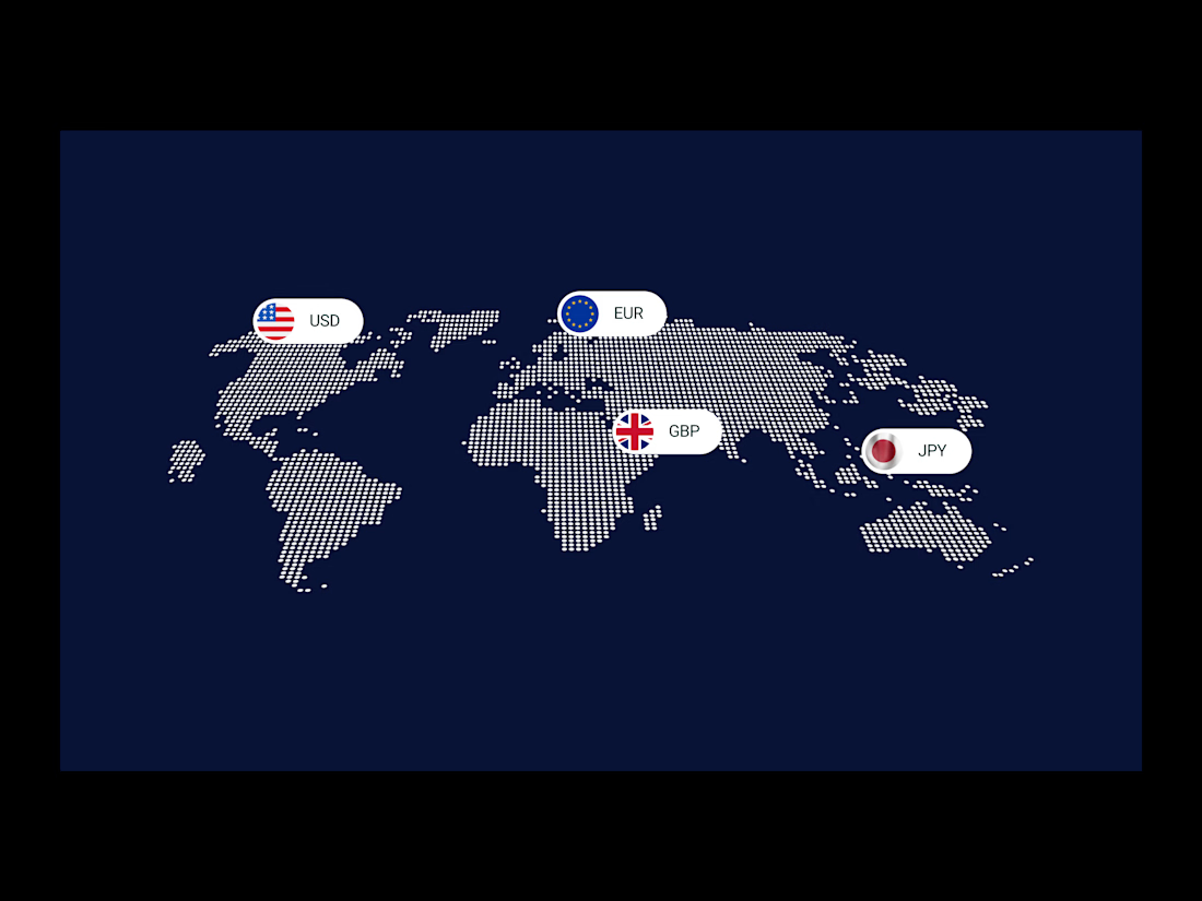
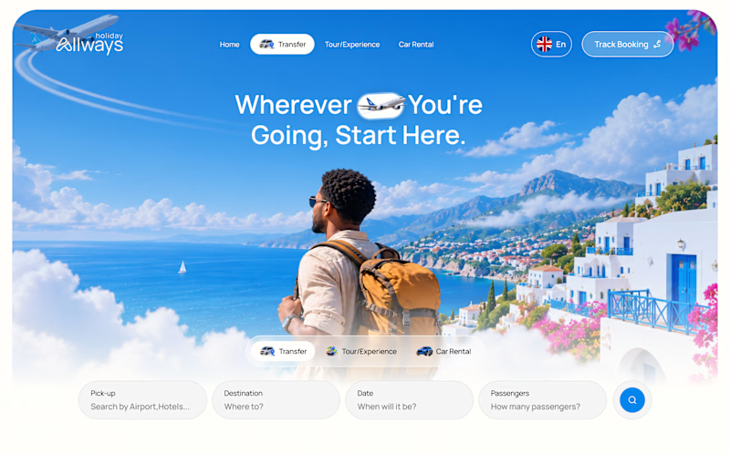
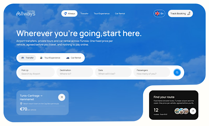
I missed an important detail in th first design direction, and the client rejected it.
After revisiting the feedback, I came up with another directiona nd it got approved
Both designs serve the same product, which one do you think got accepted for a web application?
Direction 1
Direction 2
9 voted
69%
4 voted
31%
13 votes
Closed

Dir 2 for sure!