The network for creativity
Join 1.25M professional creatives like you
Connect with clients, get discovered, and run your business 100% commission-free
Creatives on Contra have earned over $150M and we are just getting started
Back to feedPost
Day 4 - Permissionless design.
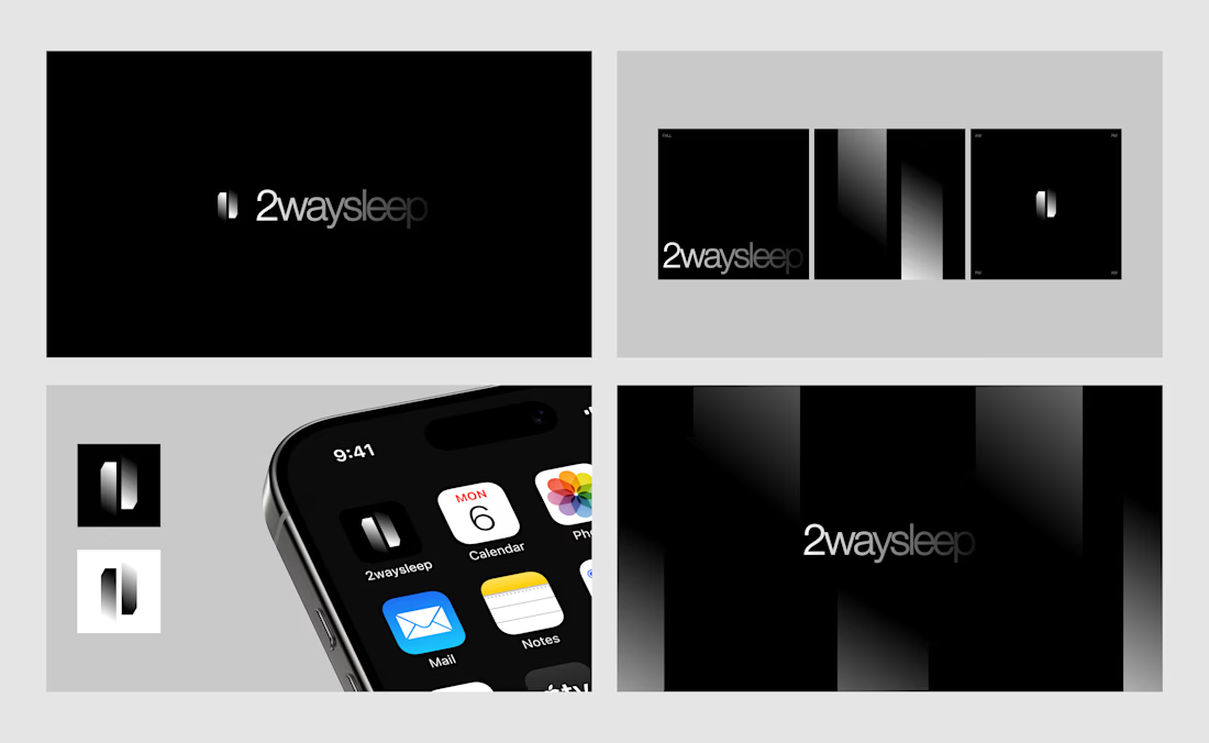
Logo concept for ...me lol, had this idea of an app that could help regarding sleep. I might build it one day!

nice

thanks
i am new on contra do you have a suggestion for me how to upscale on cntra
New here too, I recommend posting and engaging with the community

Great work
Thanks!

The dark, almost gradient-heavy palette really sells the sleep theme without being on the nose about it. If you do end up building this, would the branding stay this minimal or is this more of a placeholder direction for now?
It would stay this minimal, thanks!

Cool work
thank you!


build it fr
I might aha

Beautiful balance of simplicity and uniqueness.
Thanks!

Clean work brother!
Thanks a lot bro

Very tasteful work
Thank you, I appreciate it ;)

Great job. I like it.
Thanks

Keep up the great work! 🔥🔥
Thanks!

This is a really sleek concept! Curious about the functionality. Is this designed to be a sleep tracker, or does it actively lower the screen colors/blue light to induce sleep? Would love to know how it works!

Love the presentation of this!
thanks!
The network for creativity
Join 1.25M professional creatives like you
Connect with clients, get discovered, and run your business 100% commission-free
Creatives on Contra have earned over $150M and we are just getting started











Related posts

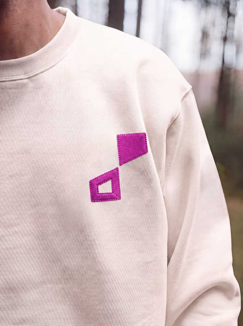
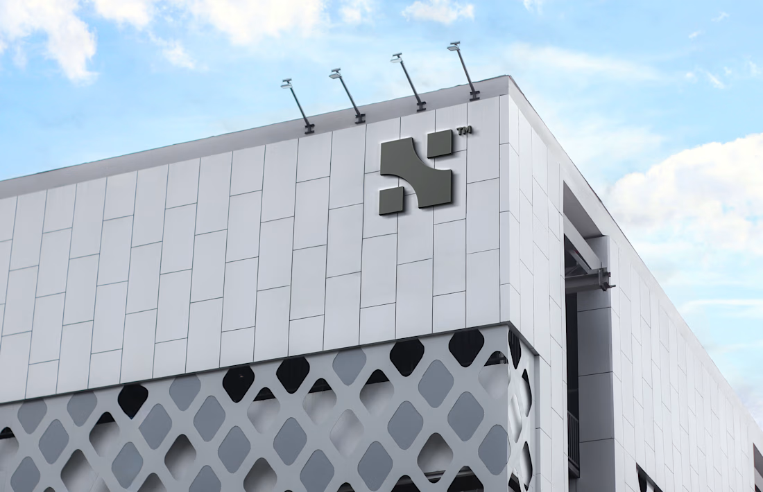
Logos from my archive.
A good logo doesn't really have to tell what you do; it's meant to tell a story. Here are some with their unique stories.
¹ Unik Mindz — inspired by Michelangelo’s 'Creation of Adam'; human creativity sparked by a higher source.
² Nutrift — reflecting the idea of weekly cycles and continuous meaningful progress.
³ Nestform — built to reflect furniture that adapts and transforms to different living spaces.
⁴ Ember & Oak — built around the truth that coffee is defined by its transformation, with the mark capturing the entire roasting journey.
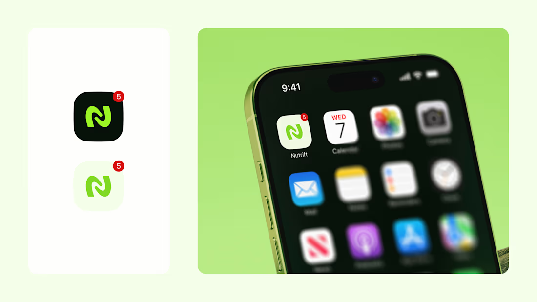
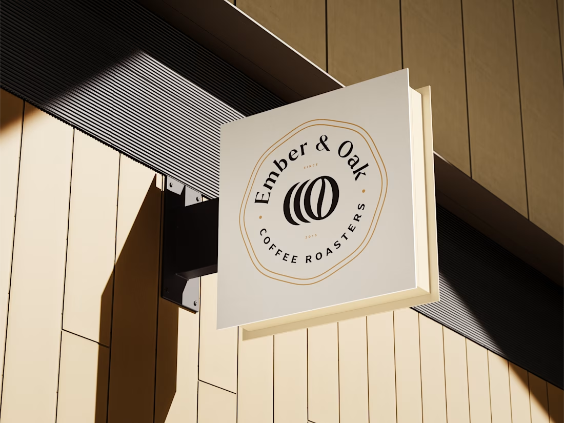

Do you usually find the story first and draw toward it, or does the story get written once the mark takes shape? The weekly-cycle idea behind Nutrift reads like it could have gone either way.


Approved logo for a mental health and daily habit app built for seafarers and offshore workers.
Can't wait to share more.

Which mockup platforms are you sourcing your mockups from ?
These are my favorite ones ✨
Share yours below.

This is very useful, and of course very beautiful