The network for creativity
Join 1.25M professional creatives like you
Connect with clients, get discovered, and run your business 100% commission-free
Creatives on Contra have earned over $150M and we are just getting started
Back to feedPost
Taste Test

Which version feels more premium to you? 👀
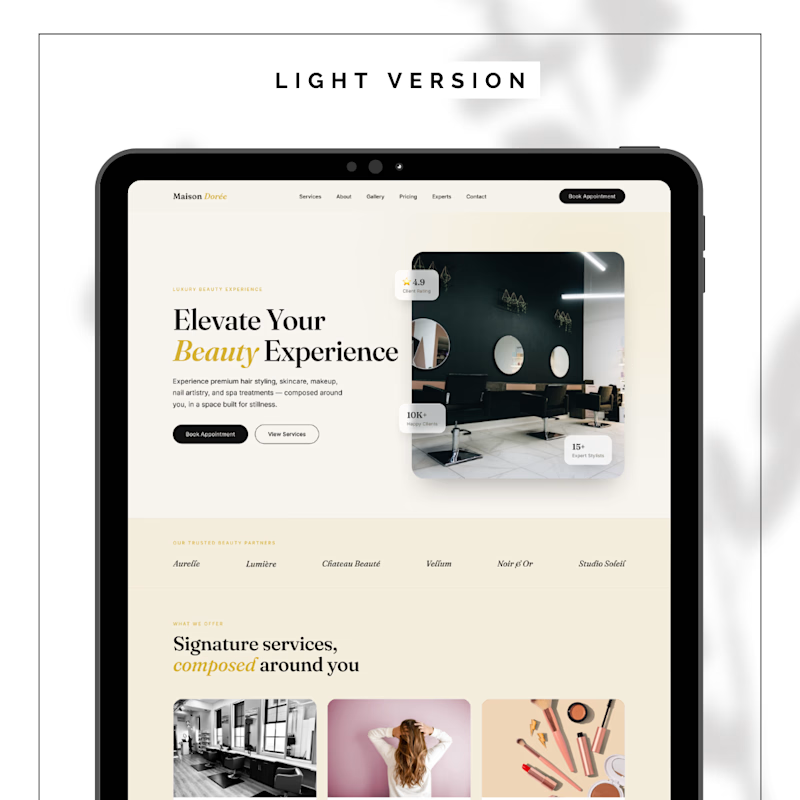
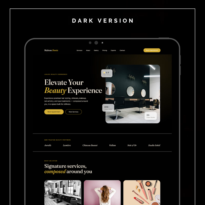
I’m designing a beauty studio website and exploring two directions:
A — Dark (bold, luxury feel)
B — Light (clean, elegant feel)
Both aim to attract, engage, and convert — but I want your honest take.
👉 Which one would you trust more for a high-end brand?
Drop A or B in the comments 👇
Your feedback actually shapes the final design.
#websitedesign #uiux #branding #freelance #designfeedback #contra


9 votes
Ends in 39m


I’d go with A. The light direction feels more clean, elegant, and premium to me. It feels like a better fit for a high-end beauty brand.

Light version, for me - the cream/gold combo already feels premium without needing black to say "luxury." Dark can work for beauty too, but it usually reads more editorial/high-fashion, while light+warm tones feel more like "come relax and be pampered," which fits a beauty...
The network for creativity
Join 1.25M professional creatives like you
Connect with clients, get discovered, and run your business 100% commission-free
Creatives on Contra have earned over $150M and we are just getting started
Trending
retrofuturism
Share your favorite designs from the past exploring the distant future. Or your own take on the aesthetic 🚀
halftone
Dots. Texture. Grain. Let's see your designs using the halftone technique.

Midjourney
Creatives are showing off what they're making with Midjourney.
colorgrade
Video editors sound off: How do you enhance the mood of your video in color grading?


Related posts

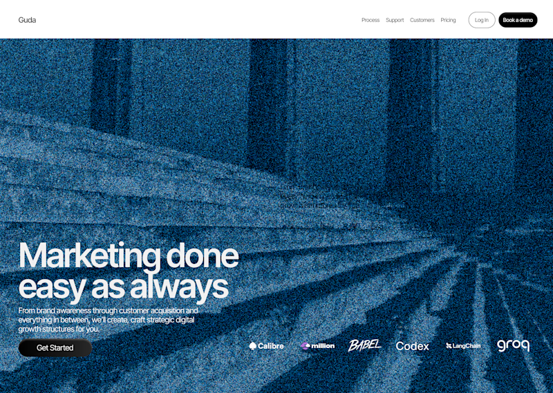
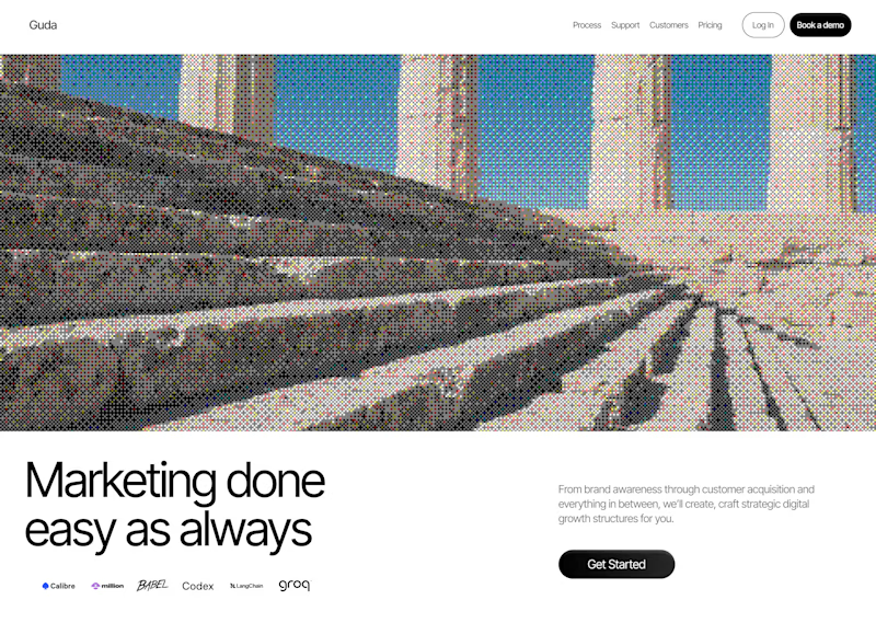
Played around with Dithering for websites last week and came up with these hero section design concepts. The goal as always is to design things that stand out. Are unique and communicate brand values.
Which one should i discard ? #freelancelife
16 voted
59%
11 voted
41%
27 votes
Closed

Both are actually great. You can use the full width for the Homepage, and the other for another page on the website


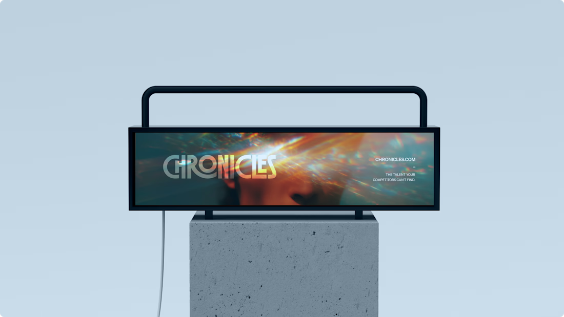
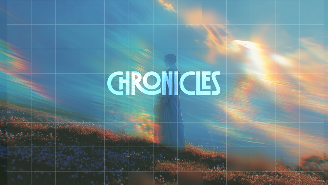
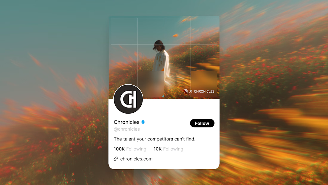
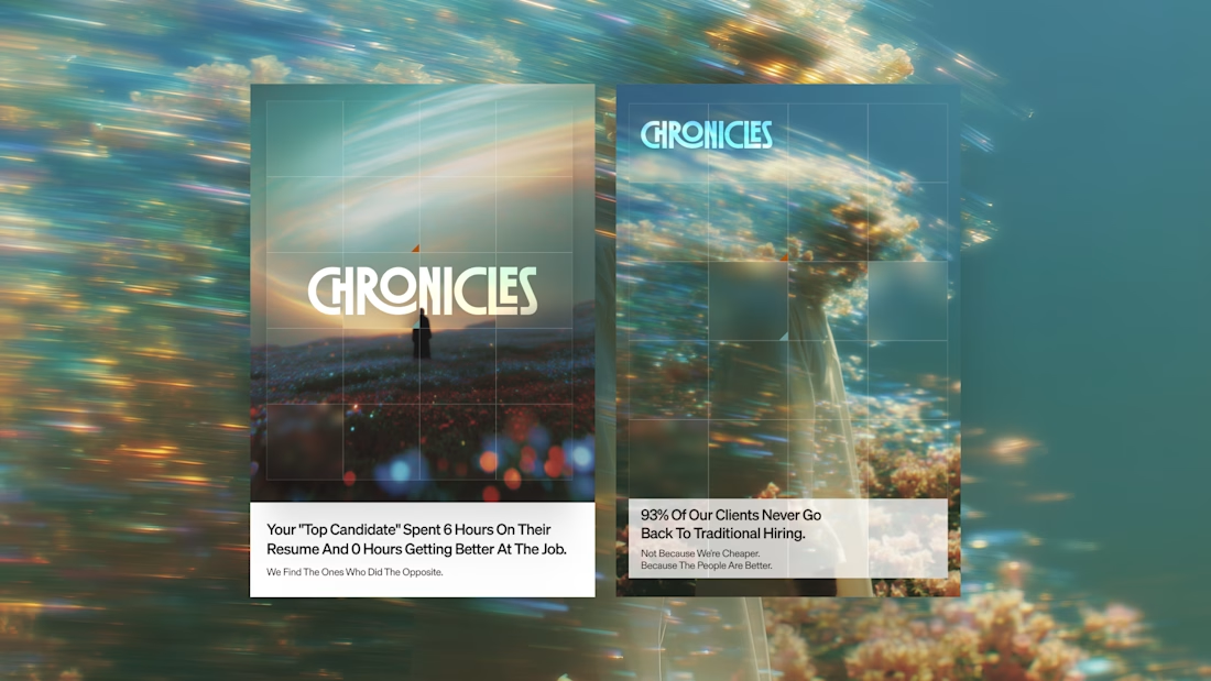
I needed to repost something about how the imagery and colors combine with the logo here. I really love this branding I created.

Really nice, @Daniel G Bright 👍


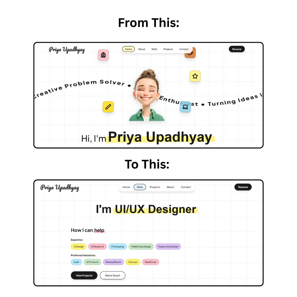

I really like how clean and thoughtful these designs feel. I agree that good design should go beyond looking beautiful, it should solve a problem and create a clear experience. Great work. 👏