The network for creativity
Join 1.25M professional creatives like you
Connect with clients, get discovered, and run your business 100% commission-free
Creatives on Contra have earned over $150M and we are just getting started
Back to feedPost

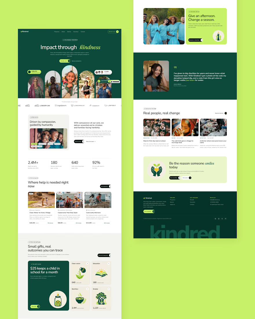
Kindred is a website design for nonprofits, built around one idea: donors give when they can see real people and real impact.
The brief
Most charity sites feel the same. Stock photos, a wall of text and a donate button that feels like a guilt trip. I wanted something calmer, warmer and more honest.
Design direction
→ Warm editorial look: forest green, fresh lime and soft cream
→ Nunito Sans for clarity, Fraunces Italic for the emotional moments
→ Centered hero with arch-framed photos, so faces lead the story
→ Custom paper-cut illustrations for each cause: water, education, food, shelter. They add warmth without leaning on sad imagery
→ Impact numbers placed up front, with a bento grid showing where every gift goes
Built in Framer
→ 10 responsive pages for desktop, tablet and phone
→ CMS for programs and stories, so the team can update it without a designer
→ Donate tiers, volunteer and contact forms
→ Subtle motion: word-by-word hero reveal, scroll fade-ups, floating illustrations
Released as a free template so smaller nonprofits can launch a site that looks like they have a big budget.
Want something like this for your organisation or brand? Let's talk.
The network for creativity
Join 1.25M professional creatives like you
Connect with clients, get discovered, and run your business 100% commission-free
Creatives on Contra have earned over $150M and we are just getting started



Related posts

One skincare brand. Two different hero experiences.
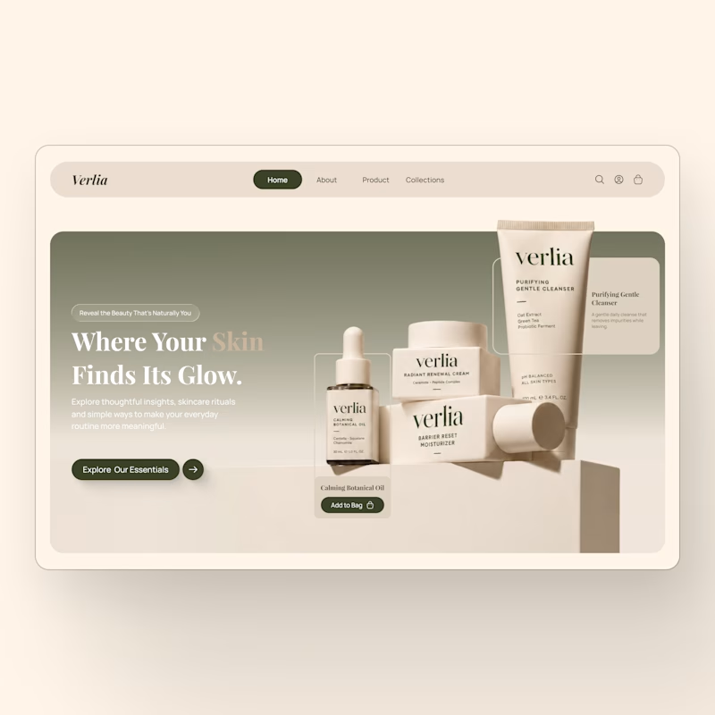
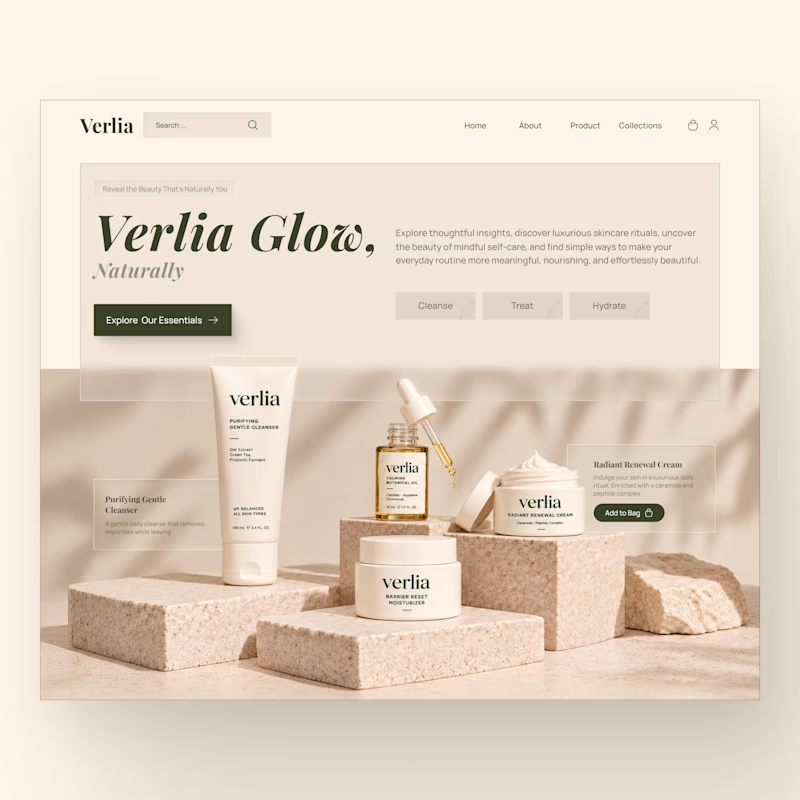
I designed two homepage hero concepts for **Verlia**, a premium skincare brand, exploring how visual storytelling can shape a brand's first impression.
Both concepts use a warm, neutral palette and minimal luxury aesthetic, but each has its own personality.
Option 1 — Minimal & Product-Focused. A clean, framed layout that puts the products and shopping experience in the spotlight.
Option 2 — Editorial & Immersive. A bold brand introduction paired with rich product photography and a more expressive visual composition.
Which hero design would you choose for a luxury skincare website?
Vote for Opt. 1 or Opt. 2, and share what made you choose it in the comments.


7 votes
Ends in 13h


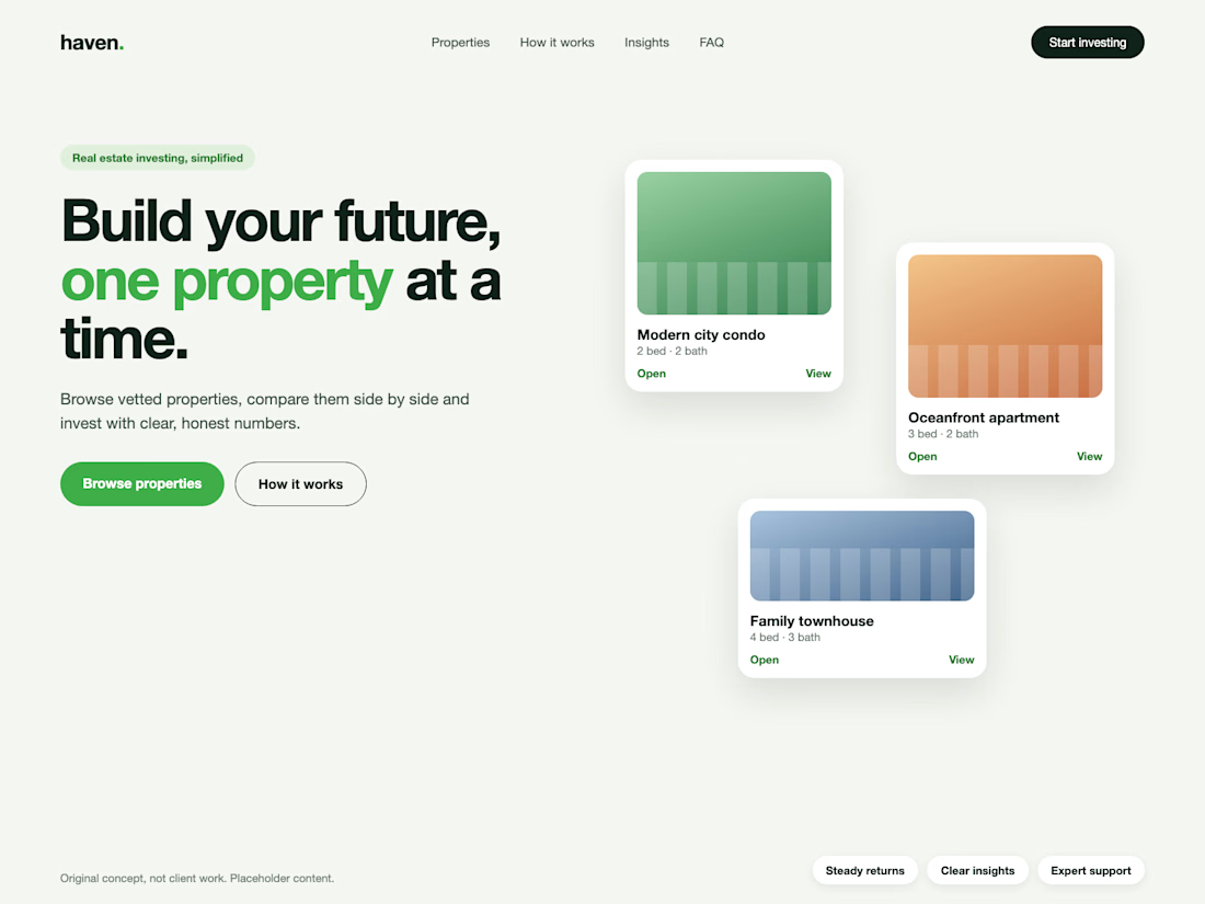
Real estate investing, simplified. Concept hero section.
I design professional hero sections: one clear message, one accent colour.


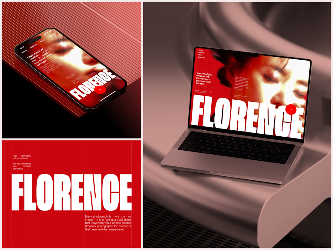
Photographer Portfolio Website
"Capturing light, emotion, and the moments you never want to forget." That line set the tone, and the layout follows it.
The hero is one motion-blurred portrait washed in red. The photographer's name runs across the bottom in a condensed white face, so large the screen cuts it off. The photo keeps its soft focus, and the name still reads first.
Thin grid lines split the page into narrow columns, and the small copy sits justified inside them. The loose photo gets a strict structure to lean on.
A single round red button with an arrow sits right on the letters and marks where to go next.
Designed by the Hue & Machine team.
#WebDesign #Photography #PortfolioWebsite #EditorialDesign #Typography #UIDesign #ProductDesign #CreativeDirection #ResponsiveDesign #FigmaDesign



The heavy condensed white FLORENCE over the red portrait is bold, and keeping the same red across phone, laptop and type tile makes the case study read as one system. Did the red come from the photographer's own work, or was it your call?