The network for creativity
Join 1.25M professional creatives like you
Connect with clients, get discovered, and run your business 100% commission-free
Creatives on Contra have earned over $150M and we are just getting started
Back to feedPost

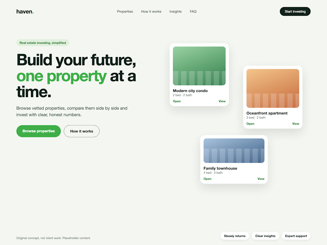
Real estate investing, simplified. Concept hero section.
I design professional hero sections: one clear message, one accent colour.


Thanks
The network for creativity
Join 1.25M professional creatives like you
Connect with clients, get discovered, and run your business 100% commission-free
Creatives on Contra have earned over $150M and we are just getting started



Related posts

Features section from Byline, a concept PR agency site. Off-black and white base, one red-orange accent for a breaking news feel, and a hover state that fills the active card. Built in Framer.

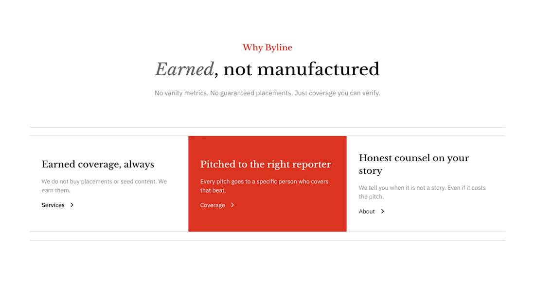

The italic Earned in that heading is a nice touch.

Updated the Dreamy effect for Framer, now it’s faster, smoother and more flexible
Grab it here
Really like what I get. If you are web designer, or brand designer would love to hear your feedback

Nice update, Denis. Making it faster and smoother is what matters most when an effect like this ends up on real client sites.


The little green dot moving through the grid is so satisfying