The network for creativity
Join 1.25M professional creatives like you
Connect with clients, get discovered, and run your business 100% commission-free
Creatives on Contra have earned over $150M and we are just getting started
Back to feedPost
Taste Test
which one sharp vs smooth
65 voted
43%
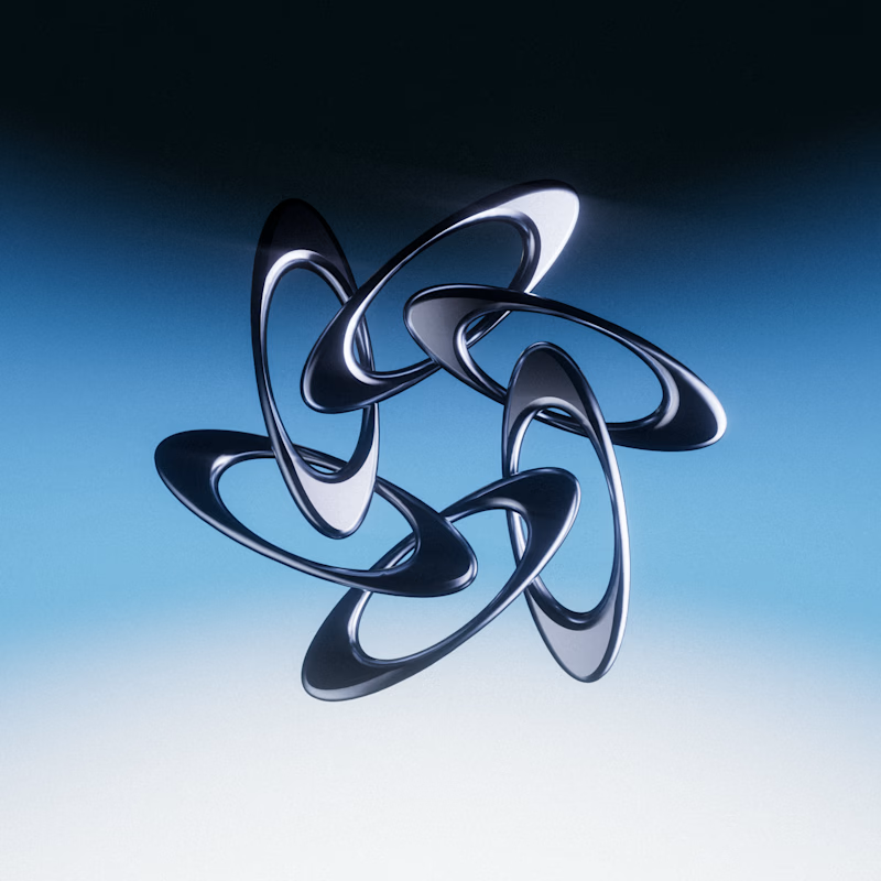
85 voted
57%
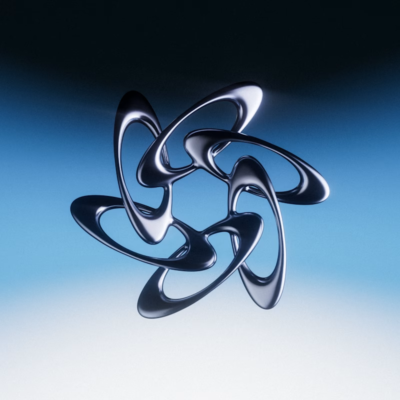
150 votes
Closed


Cinema4D

Sharp

Sharp looks cleaner.

Nice creation

I had to look at it for 6 seconds to spot the difference lol, I would choose smooth

Is it me or something? But I see no difference.

I love sharp one

I love sharp

Going with smooth on this one — the flowing curves feel more dynamic and organic, like the form has its own momentum. The sharp version is clean and precise but loses a bit of that energy. Both are gorgeous though!
thank you! I think smooth also feels more unique

Very professional and creative work.
thank you!

Sharp one

It's smooth for me ❄️

I got another idea. What if they're all entangled?

nice work

Cool😍

i love both but i go with smooth

Awesome Work

The smooth one for sure!
The network for creativity
Join 1.25M professional creatives like you
Connect with clients, get discovered, and run your business 100% commission-free
Creatives on Contra have earned over $150M and we are just getting started





Related posts

Which one would you go for and why? 🚀
Rate this hero section? 👇
5 voted
83%

1 voted
17%

6 votes
Closed

Light mood is working better here than the dark one


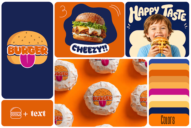
Which One Brand Identity Is looing good? A or B..
7 voted
50%
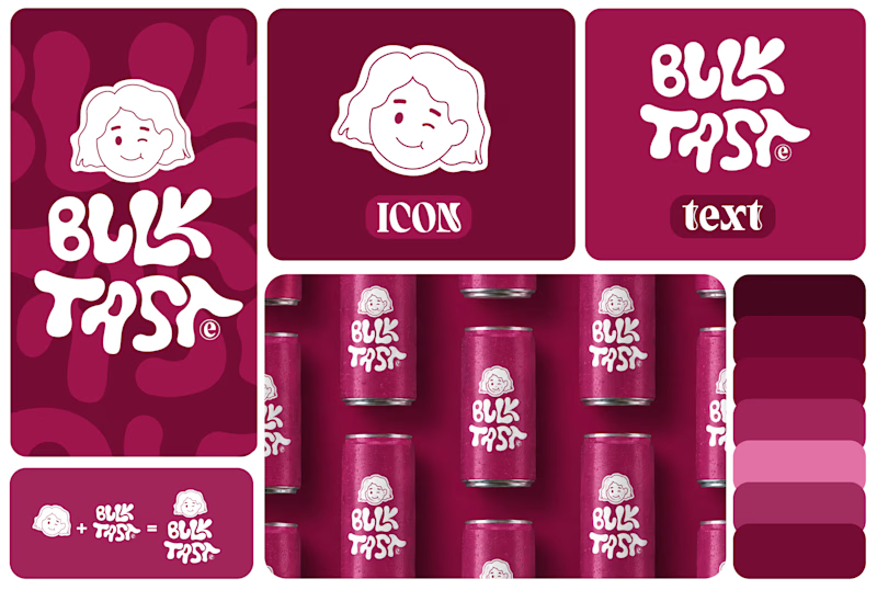
7 voted
50%
14 votes
Closed

Both look good, but I’d go with B. The colors and playful visuals feel more energetic. 🔥


Both of them are great but the bottom one is better because it's visibility great job 🎉🎉🔥🔥