The network for creativity
Join 1.25M professional creatives like you
Connect with clients, get discovered, and run your business 100% commission-free
Creatives on Contra have earned over $150M and we are just getting started
Back to feedPost
Taste Test

Design Direction Poll
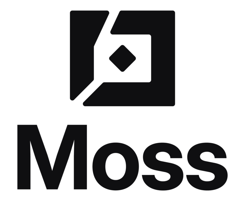
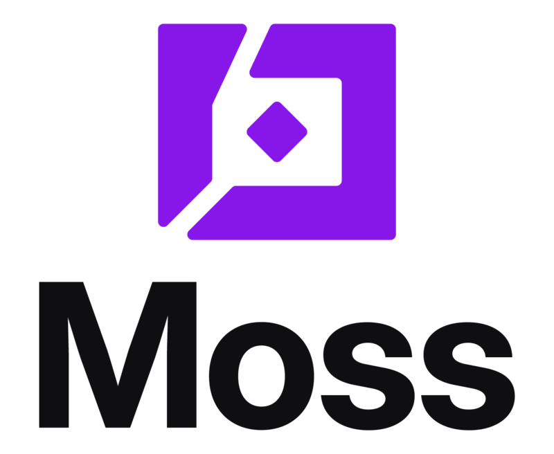
Two color treatments for the Moss logo same geometric icon, same bold wordmark, same stacked lockup. One decision changes the entire brand temperature.
🖤 Version 01
All black. The icon and wordmark read as one unified mark no hierarchy between symbol and type. It's serious, versatile, and disappears into any context. Works on light backgrounds, merch, docs, favicons. This version says infrastructure the kind of brand that doesn't need color to be recognized.
🟣 Version 02
Purple icon, black wordmark. The color separates the symbol from the type the icon becomes a standalone asset with its own identity. It's more ownable, more digital-native, and more memorable at a glance. This version says product the kind of brand that wants to be spotted in a feed.

9 voted
56%
7 voted
44%
16 votes
Closed


Purple is so much more dynamic and alive IMO! 🚀

Since it's the same structure, the industry will be the determinant

Purple without any second guess!! 🙌

MONO black got my upgoat

I'm going to go with the black. I just love the simplicity of it. Great work altogether!

Neither, Try different.

Version 01 reads more confident to me, the mono black feels like it trusts the mark enough to not need color to carry it. Am I wrong that the purple version dilutes the geometry a bit?

Voted Purple Mark. Mono black is the safer, more versatile choice, but purple gives Moss something to own visually once it's sitting next to a dozen other logos in a feed.

Wonderful
The network for creativity
Join 1.25M professional creatives like you
Connect with clients, get discovered, and run your business 100% commission-free
Creatives on Contra have earned over $150M and we are just getting started











Related posts

Two camera distances for the same Movable Ink cut. One leans in, one shows the whole layout. 1 or 2.
10 voted
50%
10 voted
50%
20 votes
Closed

2 is more stunning the animations feels unique and that's unbelievable 🎉🎉🔥🔥
great job Blahomyr❤️❤️

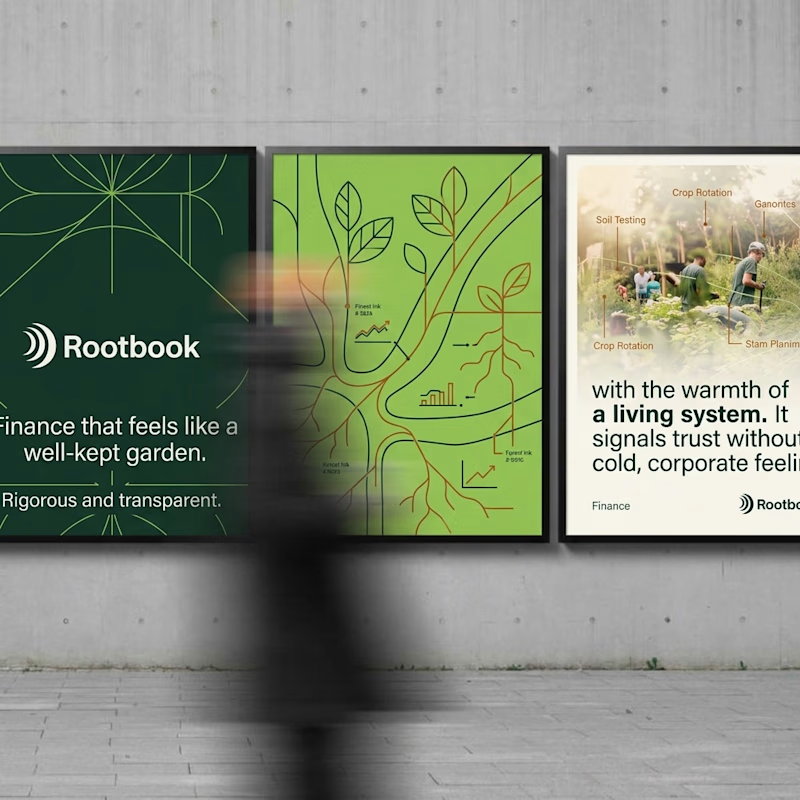
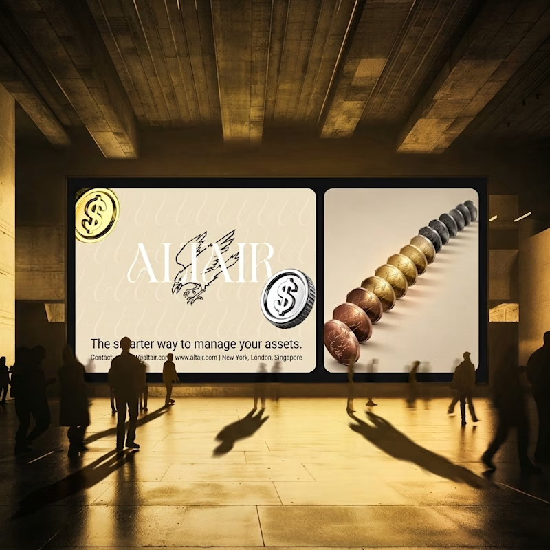
What does trustworthy finance look like to you?
A) Rootbook: Finance that feels like a well-kept garden.
B) Altair: The smarter way to manage your assets.
Two finance brands I’m designing, two completely opposite worlds. Which one gets your money?
28 voted
61%
18 voted
39%
46 votes
Closed

Rootbook wins for me. A finance brand that feels like a well kept garden is such a refreshing idea.

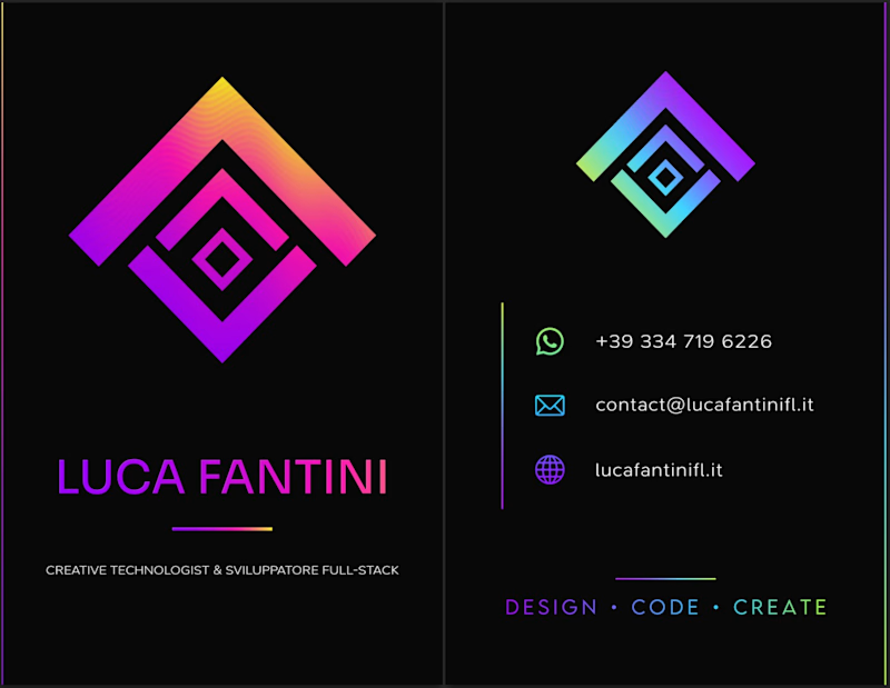
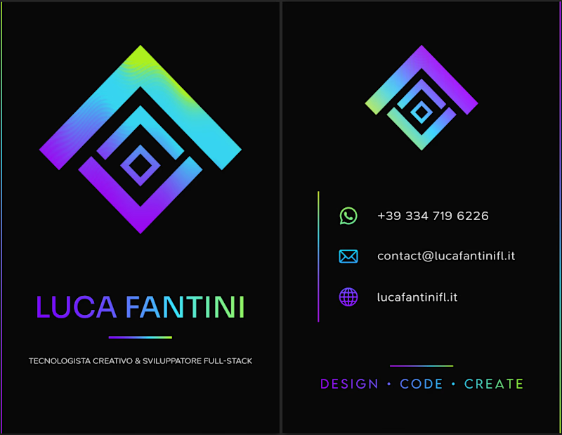
i've been making my business card today, which version do you prefer? what do you think about it?
2 voted
18%
9 voted
82%
11 votes
Closed

I'd lean toward the single palette. The cooler gradient keeps the contact icons readable, while the magenta in the second one starts competing with the logo mark. Worth proofing the neon on paper too, since it can shift a lot in CMYK.