The network for creativity
Join 1.25M professional creatives like you
Connect with clients, get discovered, and run your business 100% commission-free
Creatives on Contra have earned over $150M and we are just getting started
Back to feedPost
Taste Test
i've been making my business card today, which version do you prefer? what do you think about it?
2 voted
18%
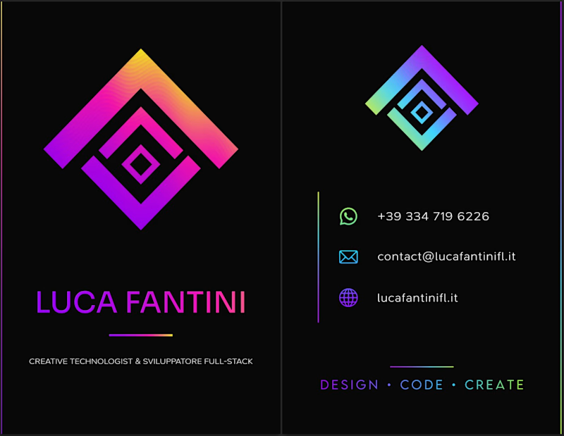
9 voted
82%
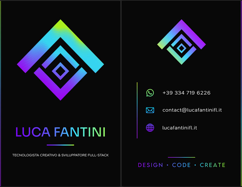
11 votes
Closed

Single palette hits to me but both of them are great 🎉🎉🎉
Great job Luca🔥🔥🔥

I'd lean toward the single palette. The cooler gradient keeps the contact icons readable, while the magenta in the second one starts competing with the logo mark. Worth proofing the neon on paper too, since it can shift a lot in CMYK.

thank you for your feedback, I fighted with CMYK for a good hour yesterday, a little hue shift on the gradients and some polishing for the new color space i think were enough
this is how it came out the soft proof for printing
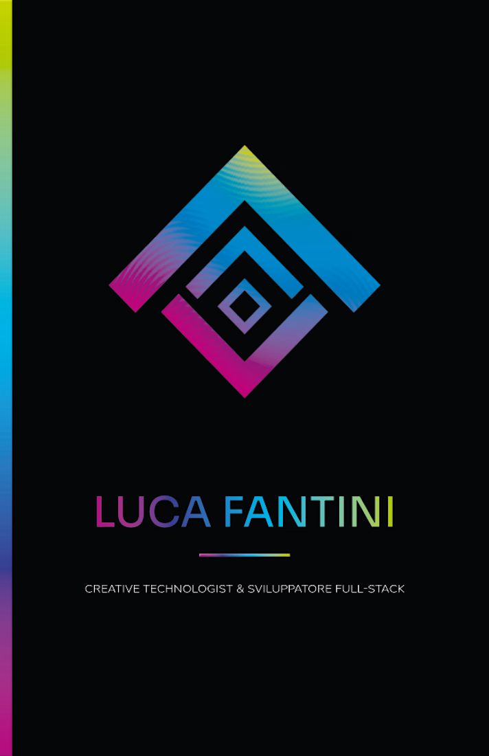
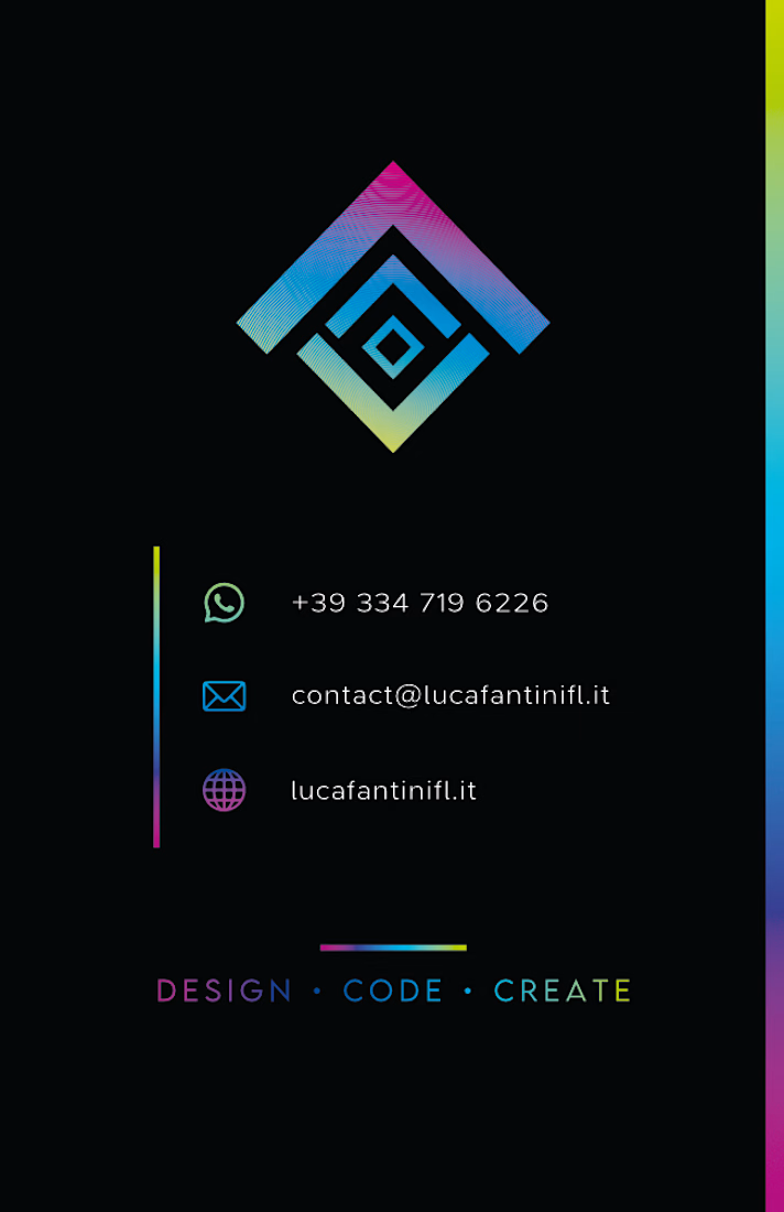

Single gradient, but I'd remove the right logomark, you already have it above your name.


Single palette for sure. Is this foldable?

Single palette for me too, Luca. The one-gradient approach feels calmer next to the logo and keeps the contact details readable. Nice mark, by the way.
The network for creativity
Join 1.25M professional creatives like you
Connect with clients, get discovered, and run your business 100% commission-free
Creatives on Contra have earned over $150M and we are just getting started



Related posts

Which homepage would you trust more to download 3D products from?
2 voted
33%
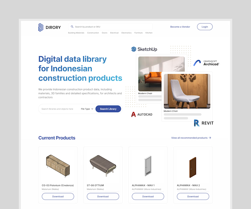
4 voted
67%
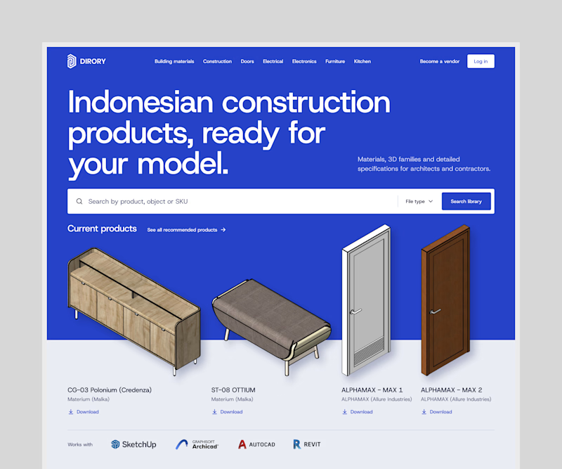
6 votes
Closed


An AI agent that asks before everything is a to-do list with extra steps. One that never asks is an apology email waiting to happen.
Built both for a concept invoice agent. Same 4 late clients, same $3,860. Which one gets to email your clients, A or B?
2 voted
67%
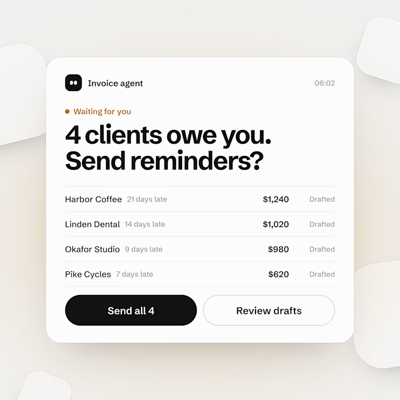
1 voted
33%
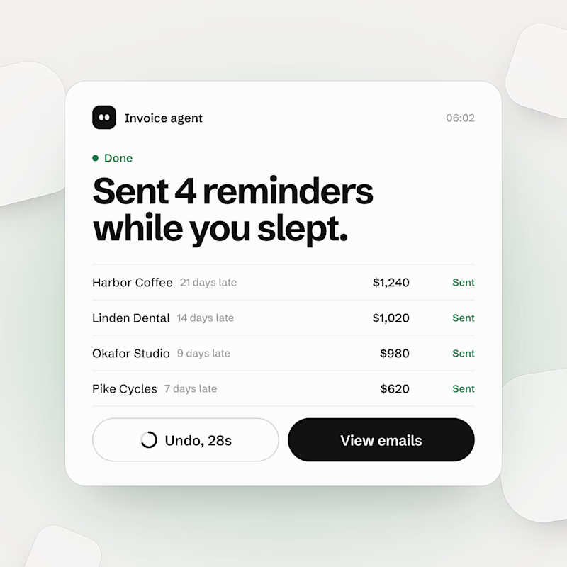
3 votes
Closed

I modeled both bottle options for pit to explore two different directions. Which one would you pick?
Let me know your preference and share what draws you to it before I take this project further!
0 voted
0%
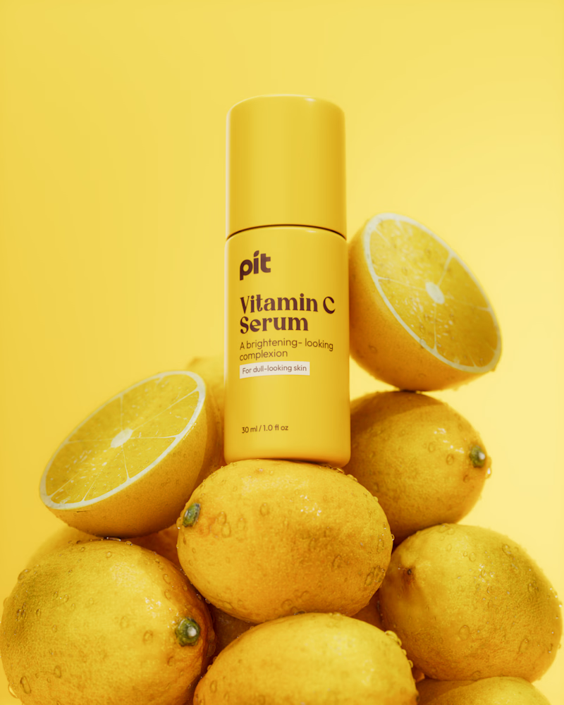
1 voted
100%
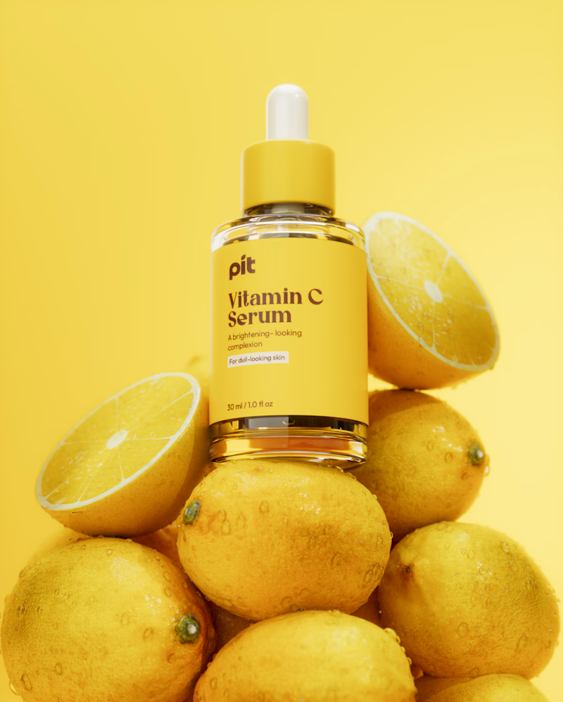
1 vote
Closed

So pretty